The redesign for this device seeks to:
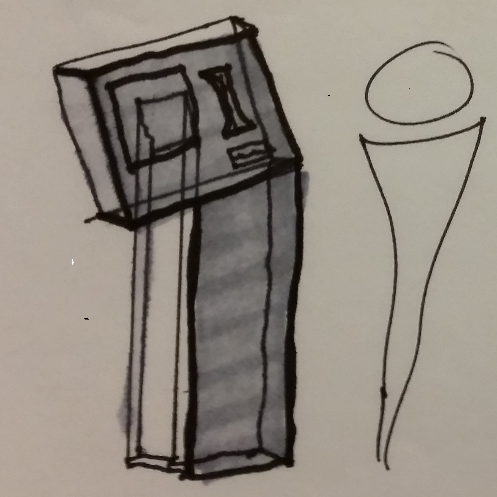
The ticket machine has been adapted to a single stand with a large touch screen. The top face of the device would include the touch screen, RFID reader, credit card reader/bill acceptor, while the stand of the device would include a Charlie card distributor and acceptor for buying and returning the cards.
This design would require a change from paper tickets and Charlie cards to only RFD Charlie cards. RFD cards are easy to dispense from the machine, can be returned to a machine for a refund of a small deposit. This also reduces the time to print the physical tickets and the space necessary for the device to contain a printer. Each of these changes will reduce the size of the machines, thereby allowing stations to have more ticket machines and reduce wait times.
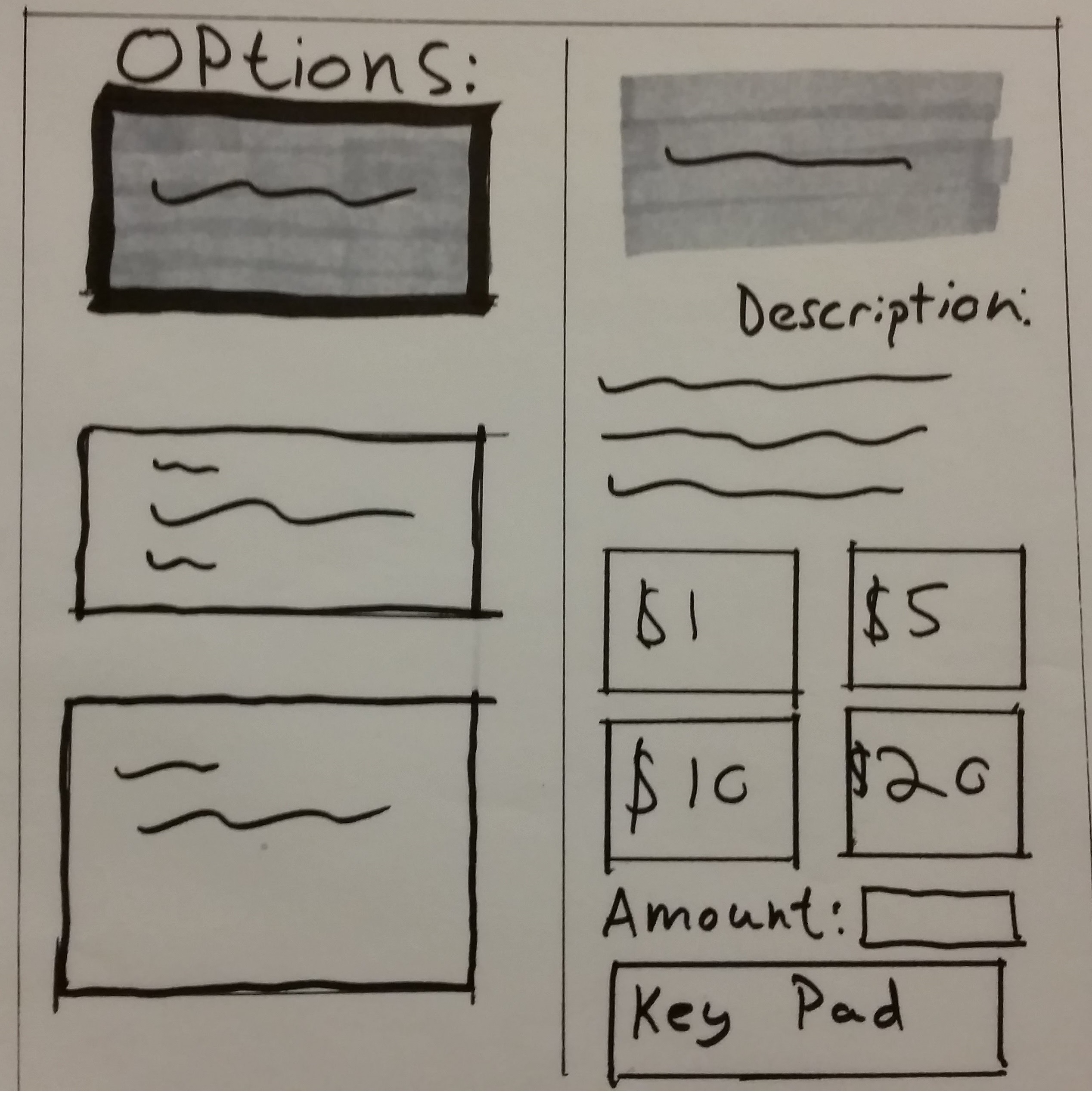
The user interface has also been redesigned to a single screen, eliminating the home screen which only served as a barrier between customers and the main menu. The user will be able to select options from the left side of the page which then provides a description and purchase options on the right side of the screen. This reduces the need to sift through several layers of menu and allows the customer to quickly compare different ticket options. The menu will default to add value so that the customers can quickly refill their Charlie Cards using cash or card, for every machine. The user interface should also include several options for different major languages.
The smaller form of the machine also makes use easier for the visually impaired as there is less need to search the larger surface area of the older design in order to find different parts of the machine.
Reduce the number of layered menus
Provide the user with information for each option
Maximize use of space of the machine
This design would require a change from paper tickets and Charlie cards to only RFD Charlie cards. RFD cards are easy to dispense from the machine, can be returned to a machine for a refund of a small deposit. This also reduces the time to print the physical tickets and the space necessary for the device to contain a printer. Each of these changes will reduce the size of the machines, thereby allowing stations to have more ticket machines and reduce wait times.
The user interface has also been redesigned to a single screen, eliminating the home screen which only served as a barrier between customers and the main menu. The user will be able to select options from the left side of the page which then provides a description and purchase options on the right side of the screen. This reduces the need to sift through several layers of menu and allows the customer to quickly compare different ticket options. The menu will default to add value so that the customers can quickly refill their Charlie Cards using cash or card, for every machine. The user interface should also include several options for different major languages.
The smaller form of the machine also makes use easier for the visually impaired as there is less need to search the larger surface area of the older design in order to find different parts of the machine.

