Improvements
Option 1: Keep the same idea, but make it simpler

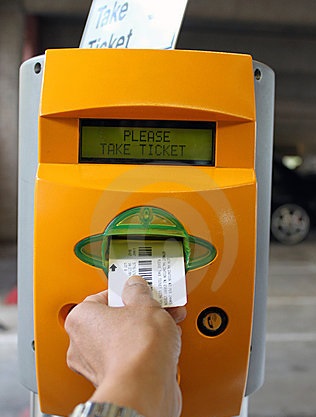
Another side of reducing the error rate of the users is to make the machine more robust to deviations from the "desired" order of operations. First, we can simply remove the "Push here for ticket button" when a simple car-detecting sensor can be installed so cheaply and eliminate the effort. Then, can we make one slot accept bills, cards, tickets, and parking passes, in any order, and still let the driver pay? These types of machines can cost upwards of $8000, so it's rather suprising how rudimentary the technology still is.

The second critical failure of this system is its organization. To assuage this, we can eliminate all the extraneous prompts, words, boxes, and buttons to make the machine extremely simple (and quick) to understand. Second, considering our usuage scenario (people reaching out the windows of cars), we can reduce the size of the machine to keep all the affordances within an easy reach. Third, we can reorganize the layout to exhibit better symmetry and linearity. This last point may seem ridiculous, but our brains love symmetry and make the design feel more familiar.
Taking the aforementioned points into account, we can make a rough outline of what a recommended design could be:
Option 2: Rethink the whole concept

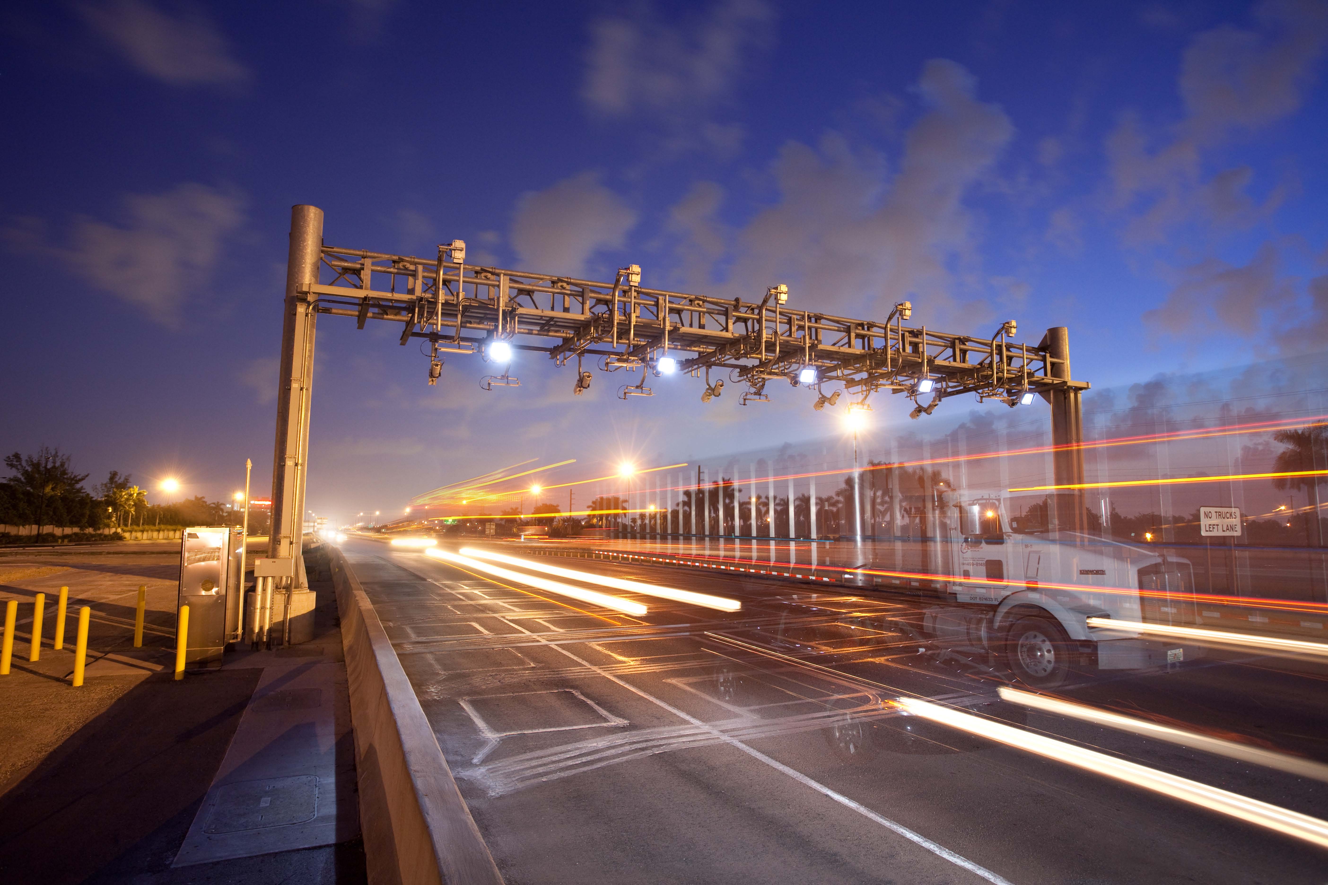
People really don't like the tickets from garages. One possible solution is to implement a toll-by-plate system similar to what is being currently implemented on some toll roads. You would simply drive up to the gate, park, and drive out when you're ready to leave. You are then send a bill that you can pay later at your convenience. If we integrated this idea with an app, you could link your preferred payment method and email to the system, and then you just get a notification from the system and can easily manage your charge with Google Pay, Android Pay, or any other mode of payment.
Hotel guests or parking pass owners could be integrated into this system, or you could implement some sort of RFID system. Generation 2 RFID tags have ranges up to 12 meters, so one could develop a system whereby the gate would seemlessly open for those users without any need to scan, swipe, or tap any cards. You could even perhaps integrate the parking pass and room key together so the guests would have one less thing to lose.