User Experience
The Woeful Experience
Parking should be easy: you drive in, you pay, and you drive out. However, at most parking garages, drivers are confronted with a dizzying array of buttons, kiosks, and prompts which at best leave them puzzled, and at worst, stuck. The transaction is broken into two main stages - the entrance, and the exit.The Entrance
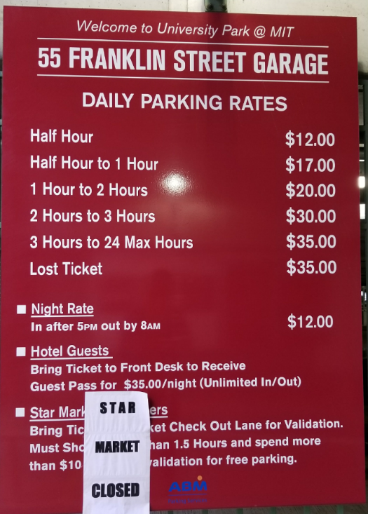
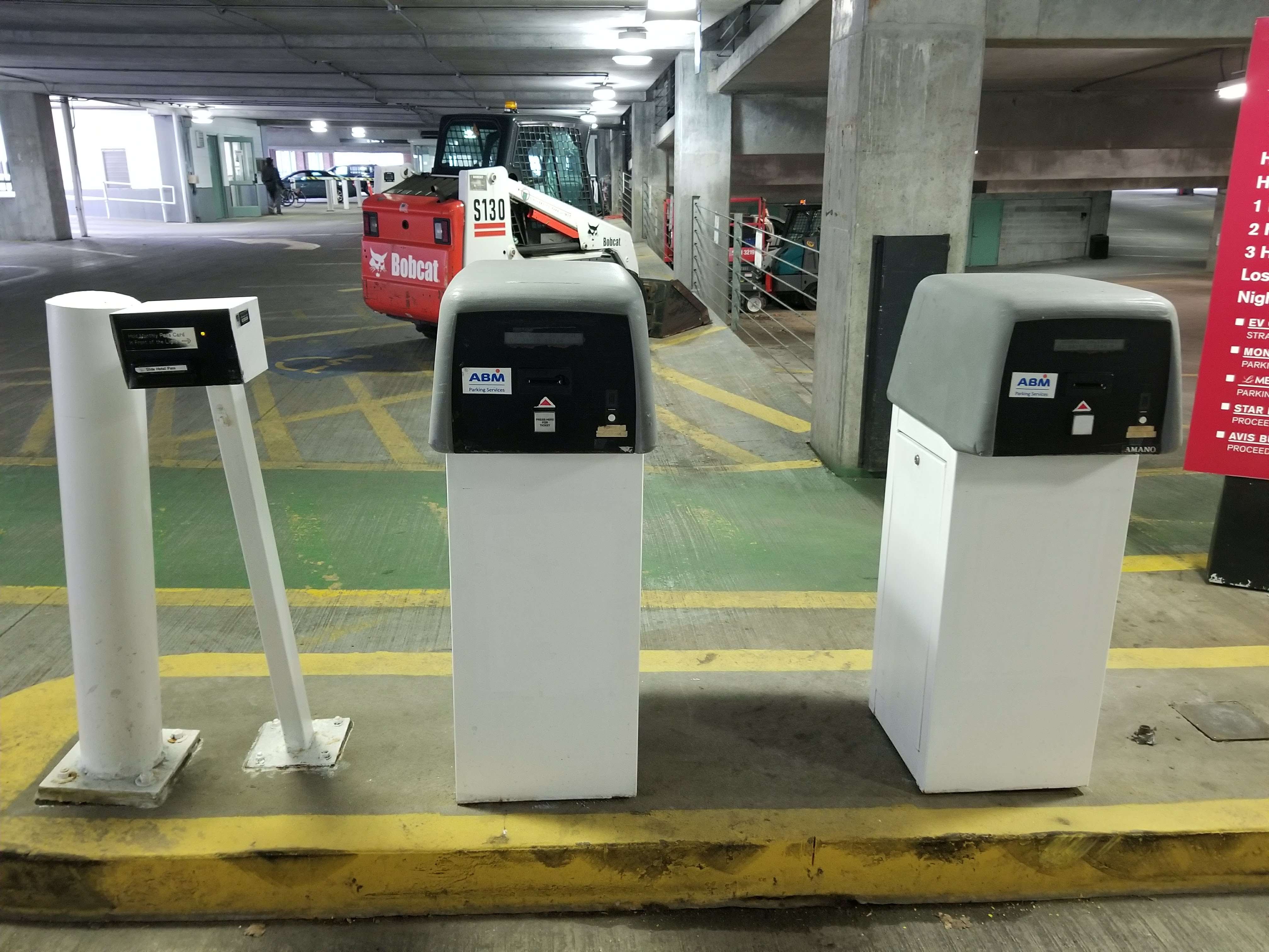
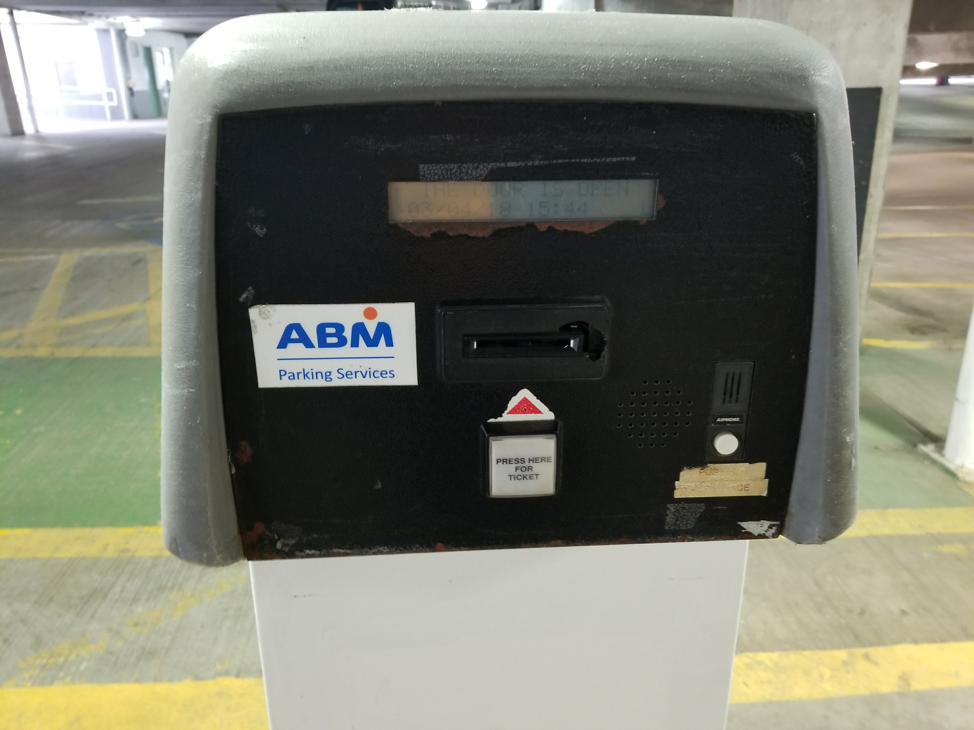
When you enter the garage, you are confronted with two sights which begin our transaction on a sour note. The first of these is the pricing list. This list is absolutely perplexing. At this garage, the first hour costs $17, the second costs an additional $3, the third costs an additional $10, and anything more costs an additional $10. Aside from the seemingly completely abritrary way these prices are structured, the fact that they are in discrete, hour-long chunks means that parkers will often find themselves running to their car after 1 hour, 59 minutes desperately trying to exit before the third hour rolls around. The ticket printer is the next step on our descent into madness. People are greeted by two exact replica machines which serve the same function, creating a source of confusion for anyone driving up to the gate. Fortunately, the interaction on either of these two devices is minimal - you push a big white button and a ticket is dispensed, however some of these machines lift the gate before you take your ticket, resulting in some less-experienced drivers pulling through and realizing later the cost (literally!) of their error.
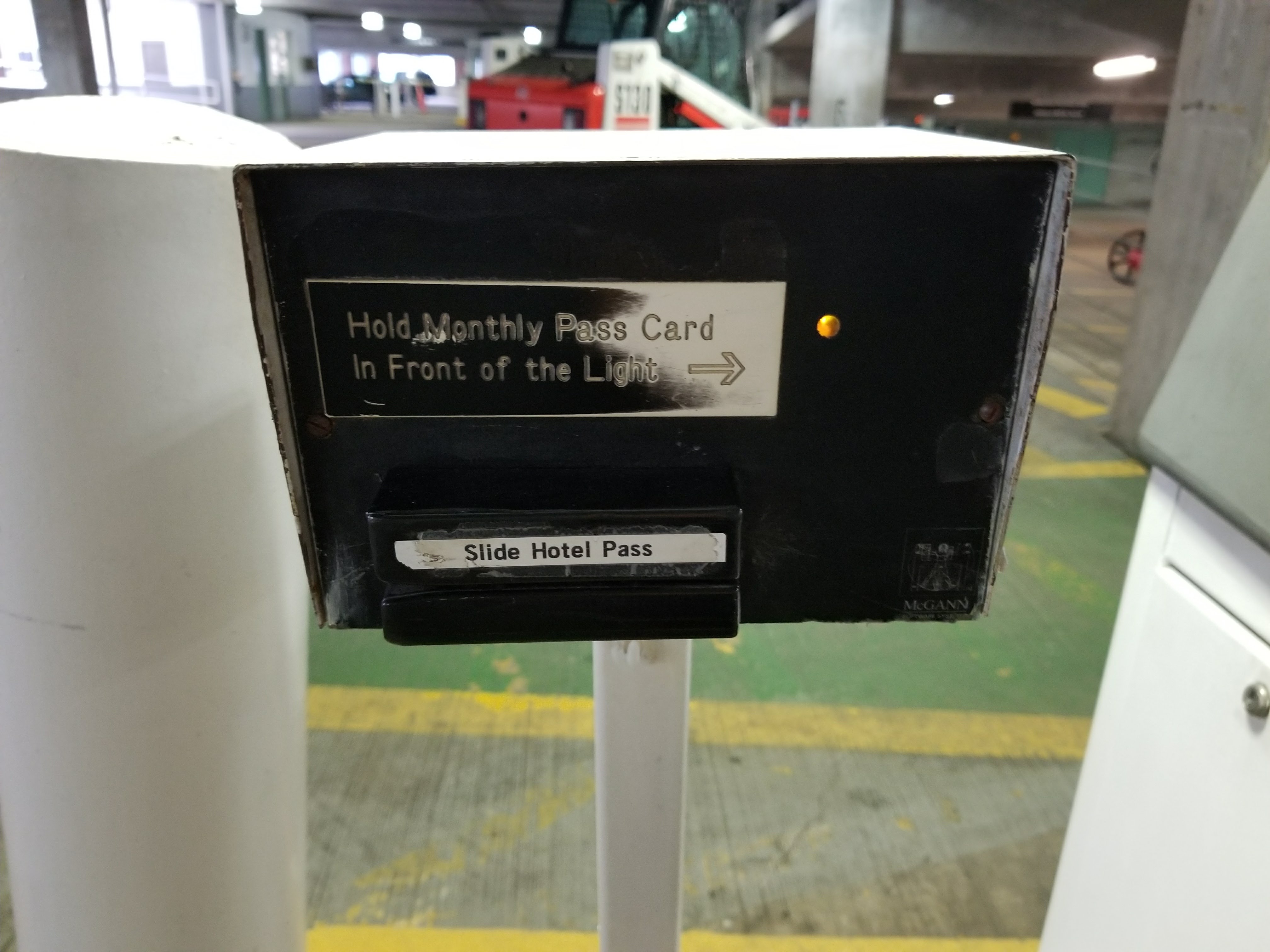
The box for monthly and hotel pass users is small, obscured with lots of text, and for some reason features both RFID and magnetic swipe cards to serve the same function. Additionally, this box is located further back than the larger, more conspicuous terminals, leading to multiple drivers pulling all the way forward, remembering they had the hotel card, and then backing up to the other box. Terrible design! Fortunately, everyone I witnessed did eventually make it through the gate, so it did succeed in performing its most basic function.
The Exit
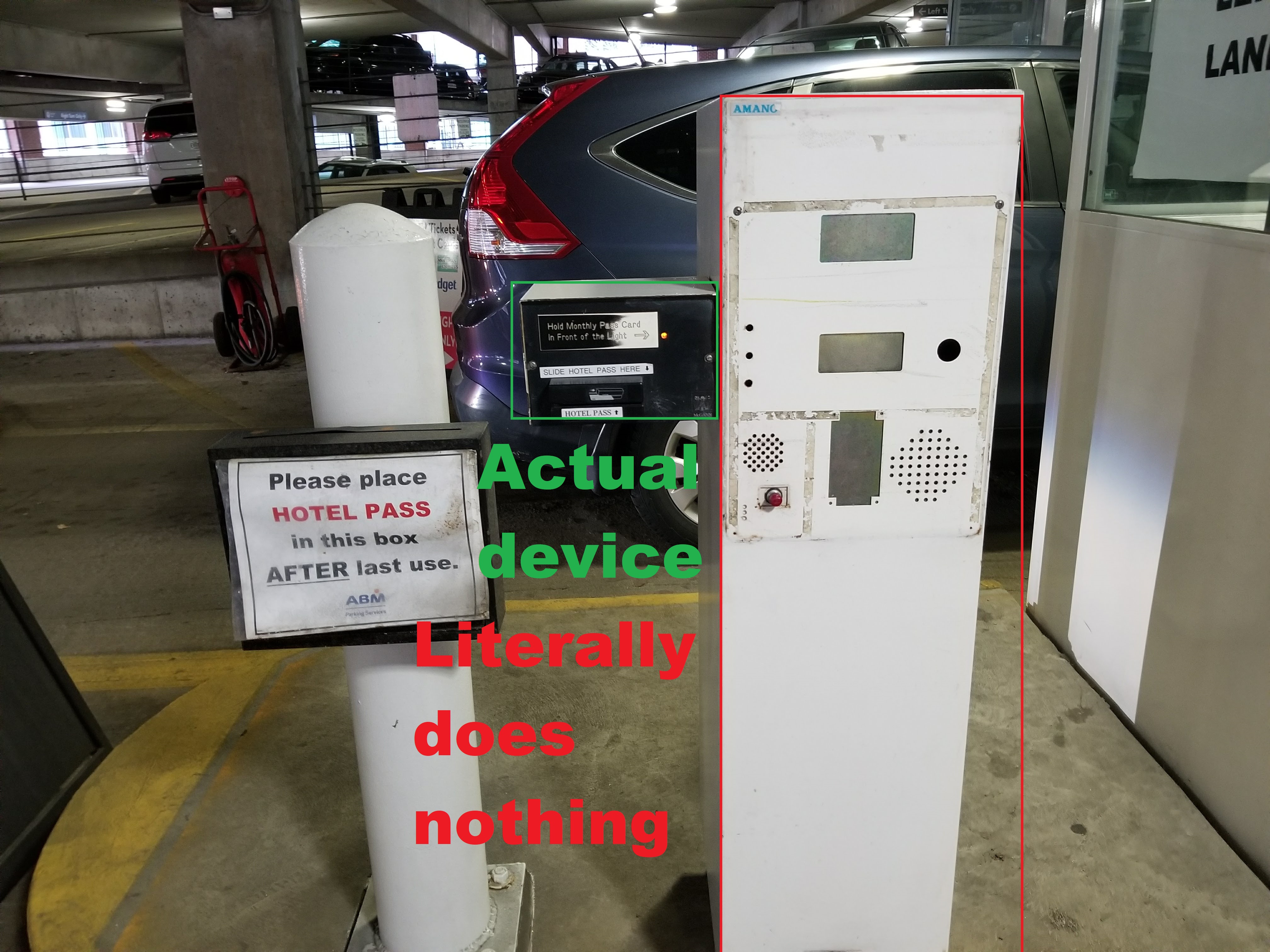
The situation is much more complicated at the exit. First of all, there are seperate lines for the monthly versus hourly parkers because they require different machines to process their transactions. The hotel/monthly pass line at least has the same (albeit woeful) reader that we saw at the entrance, so we don't have to reread all the text to figure whether to swipe or tap (assuming we remembered). Here, though, we have two fatal design errors committed. When a hotel guest leaves the garage for the last time, they are supposed to drop their key card in the little box which hideously reminds us of that fact. BUT, 1) it is very likely that the guest will either forget to do that, or not read the sign and 2) the box is located prior to the place where it needs to be scanned, forcing the driver to either reach or back up to drop it off. This doesn't even mention the huge, distracting white monolith right next to it which literally serves no function. This is confusing and unnecessary.
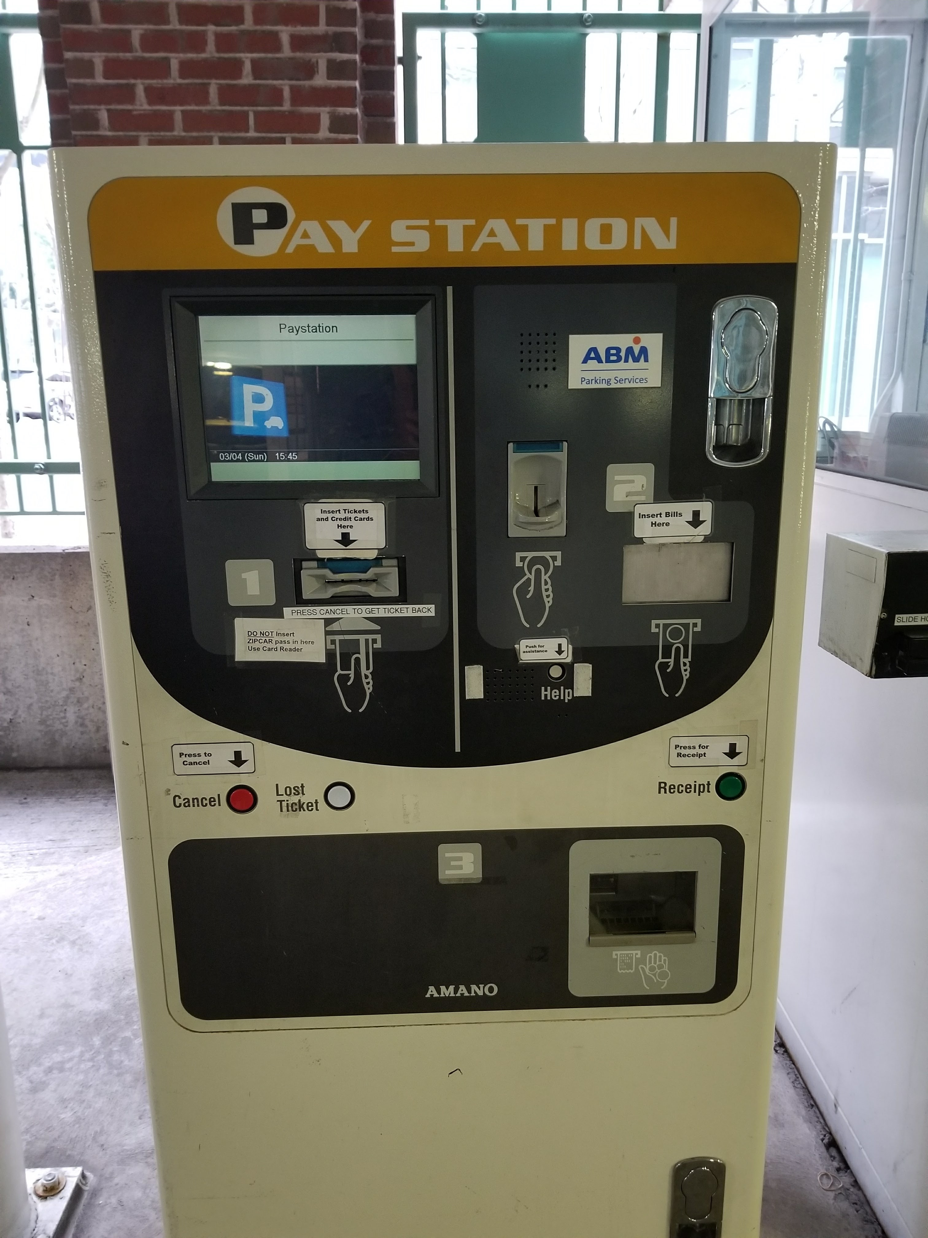
Is the daily parking machine any better? Considering that the number of permissible actions is greater, it at least is somewhat competent. You first put your ticket in slot (it has to go the right way!), then the screen tells you your bill. You then are prompted to insert your credit card in the same slot as before or insert bills into the slot on the right, and then you get your receipt and the gate opens. Simple enough, correct?
The sins of this machine come from a combination of many small, avoidable design errors:
- The machine DOES NOT like it when you put your credit card in first
- An over-reliance on text. Look at all the little labels!
- The seeming randomness with which the slots are arranged, e.g. the coins/bills not being beside each other
- The large distance between interfaces forces the driver to strain themselves to reach the various steps
- Lack of feedback or cues on the next step except for small text on the screen and grey, bland labels
- The odd, distracting metallic component in the upper right which serves no discernible function
Most people are able to figure this process out, but it's shocking how difficult they are able to make simply paying for parking. And perhaps the greatest vice of all is forcing you to remember the ticket! When somebody behind you honking, you're fumbling with your credit cards, and struggling to remember where you put your ticket, little design errors can create major headaches.
In short, we can summarize the current design:
| Positives | Negatives |
|---|---|
| Accepts many payment methods | Overcomplicated, distracting interface |
| Relatively simple to enter garage | Requires quick decision making and has consequences for error |
| Can accomodate those with passes | Relies on easy-to-lose tickets |
| Monthly, hotel, and daily parkers have separate interfaces | |
| Relies on easy-to-lose tickets |
The Consequences
All of this may seem like nit-picking on trivial features, but even a few lost seconds per person when 1,000 cars need to leave a garage after a football game can lead to a lot of irate drivers and lost time. Customers may be even so angered by payment woes that they seek alternative transportation like Uber or the T, and worst case not even go to the destination in the first place. I got to experience this first hand at the Franklin Street Garage; despite it being a lazy Sunday afternoon with no reason to have congestion, 6 cars were waiting to exit the garage, and they had to have a teller help them anyways! I stood there for a minute listening to a particularly irritated man attempt to decipher the myriad of text cues and prompts, but he didn't have much luck. I left before he could figure it out.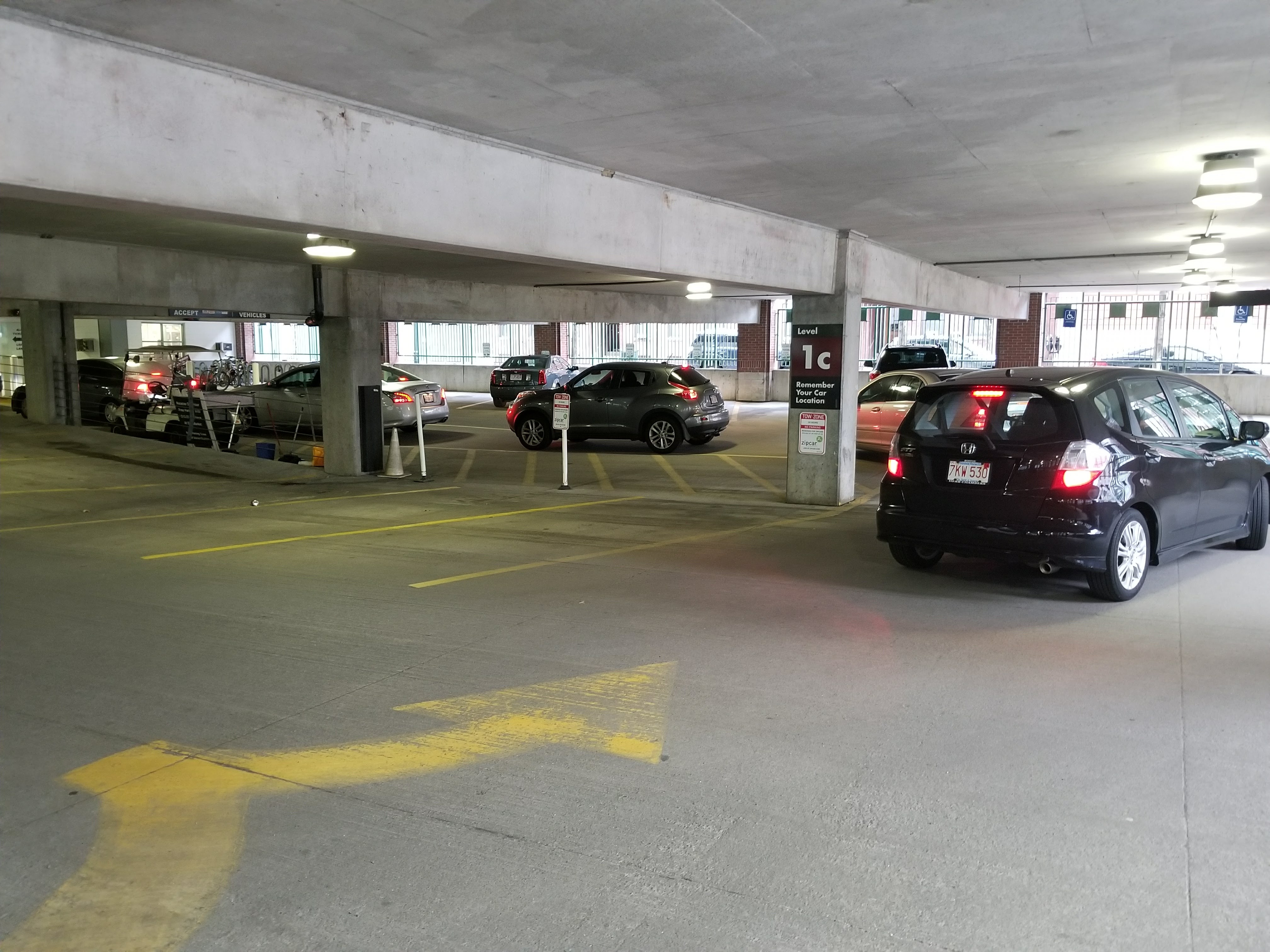
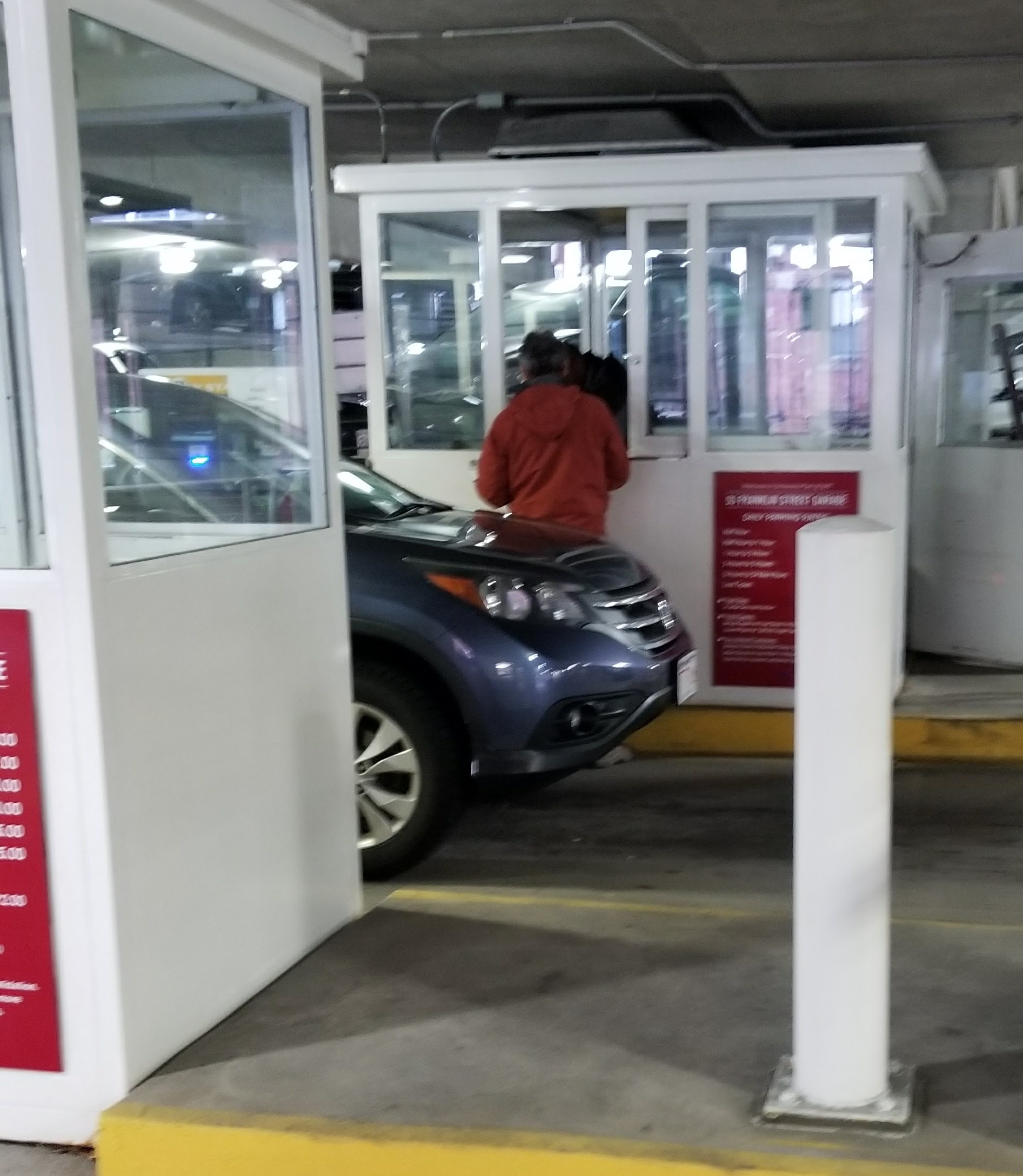
This conclusion isn't just something unique to the 55 Franklin Garage, it's relatively universal. Personally, I once accidently paid three times to leave a garage, since the machine provided no feedback to let you know your transaction had succeded, and my experience is hardly unique. The same Tampa parking survey that interviewed parkers about their use cases also asked about satisfaction levels, and around 55% of people in Tampa were "Unsatisfied" or "Very Unsatisfied" with the parking situation, compared to only around 25% "Satisfied" or "Very Satisfied" [1].