Your Friendly Eversource Bill
Human Use Experience Analysis by Yakov Berenshteyn


Introduction: Digital Transformation of the Electric Utility Industry
The utility industry has faced accelerating change over the last 5-10 years, in particular towards three emerging pillars of transformation: Digitization, Decentralization, and Consumer Empowerment. Across the operations of a complex utility, these trends could manifest themselves in anything from distribution automation, to rooftop solar leasing, to smart thermostats, and beyond.
Despite massive investments by utilities across these fronts, they still flounder when it comes to the most prevalent customer touchpoint - the monthly utility bill. Historically, energy consumers have had no insight into their day-to-day consumption, hoping for the best before receiving a bill at the end of the month. Apart from being able to access bills online, this reality has not changed for the majority of electric utility customers.
In this human use experience analysis, I explore the payment of my monthly utility bill to Eversource, one of the largest utilities in New England. Though the process of transferring money to Eversource is simple, the entire experience leaves much to be desired.

A pretty decent-looking home page!
Approach
While I have a number of years of experience working with and for utilities in several capacities, I attemped to consider what the bill payment experience is like for a non-expert. Among other things, this means (a) considering the use of technical jargon, (b) looking for an intuitive, easy-to-navigate web interface, and (c) thinking from the perspective of a less-than-comfortable web user, such as a senior citizen.
I assessed the experience around the following three actions:
Pay Bill: The simplest task, this is something I can do fairly directly from the email I received from Eversource when my bill became available.
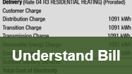
Understand Bill: Assuming I'm cost-conscious or just curious about how my bill works, I obeserved the mechanisms to better understand the various elements of the bill.
View Usage: Assuming I'm a relatively advanced user or just an energy nerd, I examined what the potential is to get a more granular view of my usage (as opposed to just the total consumption from the last month).
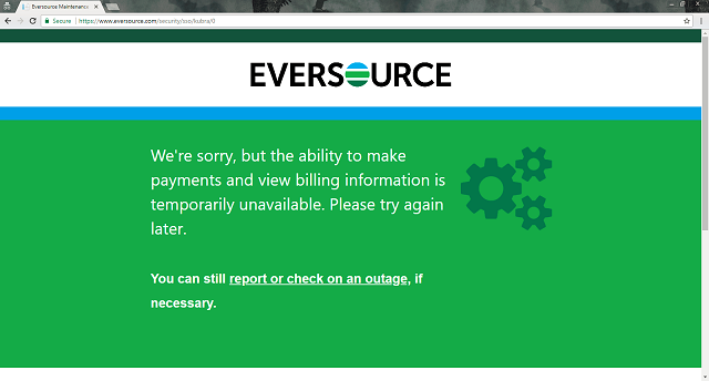
Note that there are several other common use cases for a utility website, in particular reporting an issue such a power outage or requesting service. It would be unethical to falsify an issue in order to follow the experience through the Eversource website; however, I will say anecdotally that Eversource has been responsive to my questions in the past, both by telephone and social media.
Off to a good start...
Conclusion and Recommendations
Specific findings for each of the three activities listed above are shown on the individual pages for those tasks. Use the icons at top or below to toggle across these experiences.
In general, the Eversource website is painfully lacking in usability. As a regulated monopoly, the utility has little incentive to innovate or improve customer satisfcation, even in a liberal market like Massachusetts. This is manifested in the fact that the only simple task - of those examined - is to pay the full amount of the monthly bill. The icons directing one to pay the bill stand out compared to the rest of the site, and assuming a bank account is already stored, it is extremely simple and takes just a few clicks after log-in to pay the bill.
On the other hand, it is virtually impossible to learn more about one's usage or understand how that translates into the final bill. The pages supporting these tasks are not intuitively linked from the bill viewing page, there is an embarrassingly small amount of data available given that my building has smart meters, and when presented, relevant information is dense and jargon-rich.
I categorize my overall recommendations for the Eversource site according to three user categories:
The Average User
Make the bill much clearer in terms of formatting and detail. Instead of embedding a PDF of the bill, which automatically zooms out to an unreadable font size, display a web-native and interactive version. Perhaps include the functionality to hover over bill components to view what they mean.
The Advanced User
Despite smart meters being installed in my building, which would imply Eversource can collect relatively granular usage data, there is only historical monthly data available on the online bill. Annoyingly, several links direct the user away from the bill to see usage data, which seems to imply there is an opportunity to see more data. In fact, there is not. Numerous tools have long been available to utilities to improve this data collection, aggregation, analysis, and display for consumer consumption. Eversource should catch up to the many utilities who have implemented this.
All Users
Apparently no one at Eversource has heard that "less is more" or to "keep it simple, stupid." There is an incredible amount of redundance and distraction on every page, whether the bill total being featured four times within a few square inches of screen space, 17 separate links showing up in one "My Account" menu, or a bar chart with a single bar being used to display one data point with no scale. Eversource should develop more intuitive menus that follow consumer logic flow and emotion (e.g., "what the heck is this charge?") and take some lessons from lean manufacturing to clean up its burdensome and busy website.
Final thoughts: Having solved several issues with Eversource by phone in the past, I don't doubt that individual employees at the company can competently walk a user through some of the tasks and questions I raised in my experiment here. However, consumer relationships with companies are firmly tied to the web and mobile, and now have been for years. Eversource needs to step up its game in its website experience to meet table stakes requirements for the year 2018.
Continue to "Pay Bill" to see how easy it is for Eversource to take my money...