Paying Your Bill
Straightforward if you don't care about what you're paying for...


Evaluating the Account Landing Page
I recently received an email from Eversource saying my latest bill is ready to pay, so I followed the link in the email to take care of it.
Pay me!
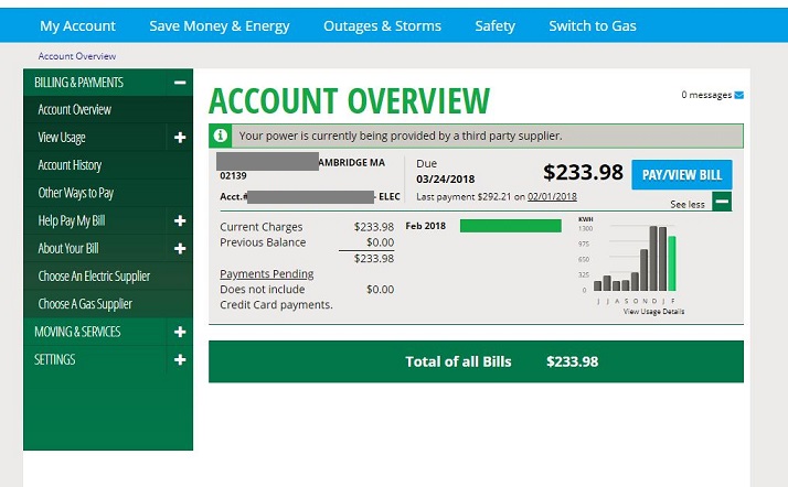
As soon as I log in, I'm greeted by this Account Overview page. It's not terrible. My household's total bill is very prominent in large font, and the Pay/View Bill button is distinct in color and location.
As we'll see in a moment, getting through to actually pay the bill is simple. But, it's important to ask a few questions about how we can make this landing page better...
Does the page need to repeat the finall bill amount in four separate places? Since I always pay in full, could Eversource simplify this page and only offer an alert when you haven't paid your prior bills?
Does the horizontal bar chart made up of one single green bar ("Feb 2018") and no scale tell me anything? No, literally nothing.
And here's something really infuriating: it's painfully difficult to tell what on this page is a hyperlink and what is not, because the page doesn't use the standard "pointing finger" icon that is so ubiquitous just about everywhere on the internet. Nor is there an internally consistent signal (e.g., underlining or changing color when hovering) to suggest what is a link.
In the video below, I repeatedly click on an assortment of items on this page to find the links. While the "pointing finger" shows up at the beginning, clicking on the column chart doesn't do anything. On the other hand, "View Usage Details" turns out to be a link (a useless one - more on that later) and "Payments Pending" turns out to be a link, despite neither one being obviously consistent with typical hyperlinks.
Find the links!
Submitting Payment
After clicking on the nice blue Pay/View Bill button, I'm shown my bill, which I'll cover in more detail in the Understand Bill section, along with a payment window - shown in red outline below.
Here, I can easily select my stored bank account and quickly finalize the transaction. Very few hurdles to handing my money over. Additionally, within this payment frame, it is much more obvious and intuitive as to what are drop-down menus, hyperlinks, radio buttons, and so on - much cleaner and better organized than the initial landing page.
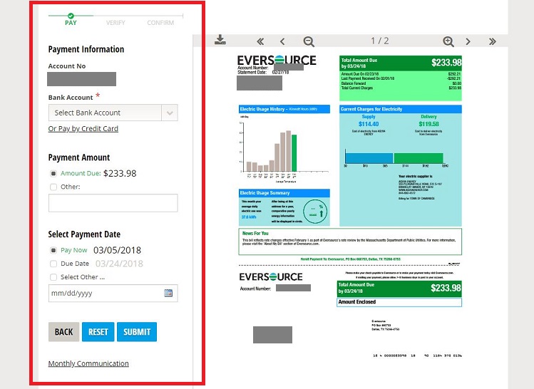
The part where I give them my money is nice and readable.
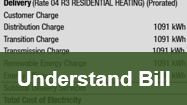
Continue to "Understand Bill" to explore how I try to make sense of this thing...