Can the illusion of aerial perspective persist with color palatte swaps and the removal of blur?


Aerial perspective is a depth cue commonly displayed in art to imply farther away images such as mountains. The classic model is that farther away objects are bluer and blurrier. In two separate papers headed by Robert O'Shea, both color contrast and blur were identified as the chief monocular cues to clue in to the perception of the object as farther away (O'Shea et al. 1994 and 1997). However, O'Shea et al. maintained typical color compositions in testing this perception of aerial perspective. Consequently, it is unseen whether aerial perspective persists if the color arrangement of a scene deviates from the norm.

My initial hypothesis was that color palate swaps for scenes with aerial perspective would not yield the illusion of depth because Bayesian analysis would falter due to a poor likelihood and lack of a prior. Furthermore, introducing blur to an atypically colored scene should improve the illusion of depth. I first created a "control" scene with a gray (textured - for more "realism" to educate the probability) mountain range in the foreground and blue range in the background. I created a few variations with blur on either or both mountain ranges. The participant should judge their perception of depth on each image.

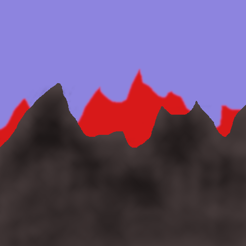
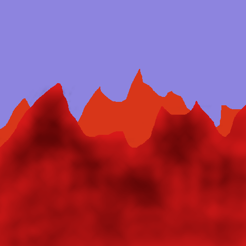
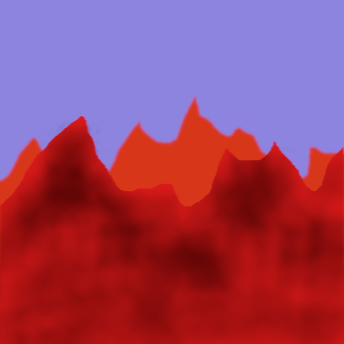
The test case sets of images follow the same pattern of blurs as the control. The only blur that was discontinued was the exclusive foreground blur as it did not appear to be relevant to the illusion. The color arrangements are (in the order of foreground/background) gray/red, gray/brown, red/orange. The rationale for these choices was examining the relationship of colors that are related to each other (gray/brown and red/orange) and those that are fairly different (gray/red). Participants should again judge if the illusion of depth through this aerial perspective is ever introduced or maintained. Each set is in the order of no blur, background blur, and foreground+background blur (with the control set containing the additional exclusive foreground blur.)



<


O'Shea, Robert et al. 1994, "Contrast as a depth cue," Vision Research, vol. 34, no. 12, p. 1595-1604.

O'Shea, Robert et al. 1997, "Blur and contrast as pictorial depth cues," Perception, vol. 26, no. 5, p. 599-612.

Comments


Maddie C

In all of the pictures, I retain at least a minimal sense of depth, in that I see a big shape in front of another shape (some amodal completion going on).
Blurring the front or not isn't very salient to me.
A blurry background seems much farther away. I think blue is farther than green is farther than red.

Your red images have inspired me to look at tons of pictures of desert mountains...

Nicholas Guiliano

c)

@Elian: Your subjective reports for depth perception very closely allign with the hypothesized data. The only exception is the red/orange set, which I predicted should have a small percept of depth perception due to the relationship between those two colors being fairly "believable." All in all, your reports answer the proposed question about the depth cues.

@Katarina: Your reports are the same as mine and what I was generally expecting. Similar to Elian, your data would imply that the blur hypothesis is correct. Contrary to his report, your percept of depth in the red/orange case would also support my "color-similarity" facet of the hypothesis.

In order to test that further:

d) Following up on Elian's lack of depth percept for the red/orange set, I'm led to wonder if the background sky color plays a role. The blue sky implies a regular environment while the red mountains are obviously atypical. Consequently, introducing sky color as a covariate could test whether this influences the depth perception as more likely. I'm imagining a redder/darker sky to imply a more uniform color composition. In order to produce meaningful data, the gray/blue set should also undergo sky color changes to see if this impacts the "control" depth.

Elian Malkin

a) In the first set, the exclusive background blur image produced the strongest perception of depth. Removing the blur seemed to bring the background closer, and adding blur to the foreground slightly diminished the perception of depth. The same was true for the gray/brown set, although the percept was somewhat weaker. All depth perception was lost for me on the sets of red images.

b) The illusion was effective in answering the stated question. Blur proved to be a strong cue for aerial perspective, with lower blur disparity between foreground and background producing a weaker depth percept.
It seems more important that the color palette consists of natural colors, than similar colors. The lack of prior for red mountains indeed failed to yield the illusion of depth, while the different yet more natural grey/brown combination only slightly diminished the illusion.

Katarina Bulovic

a) For me, the perception of depth was most clear in the images where the background was blurred. It did not seem to matter whether or not the foreground was blurred. For the colored examples, the red/orange and gray/brown images appeared to have depth, while the gray/red did not.

b) As a researcher, this does appear to answer the question. The illusion persists with the removal of blur and a color palate swap that preserves similar colors in the foreground and background (although it is less apparent in these cases) but does not persist with a color palate swap that results in very different foreground/background colors.