9.35 Illusion Laboratory
Spring 2020 Vision Lab
How does an implied global 3D lighting affect perception of local shape from shading?
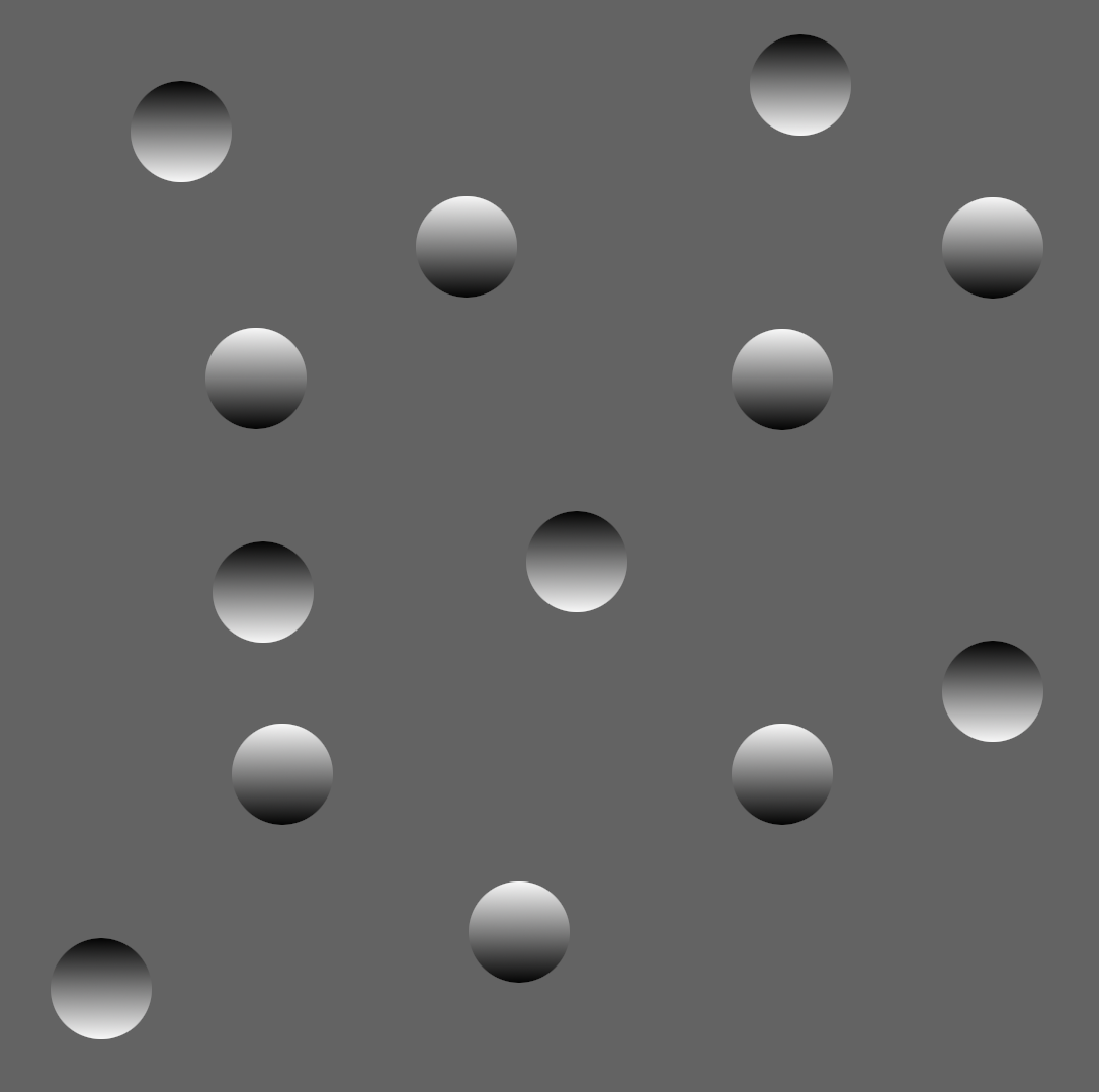
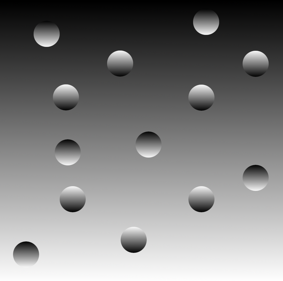
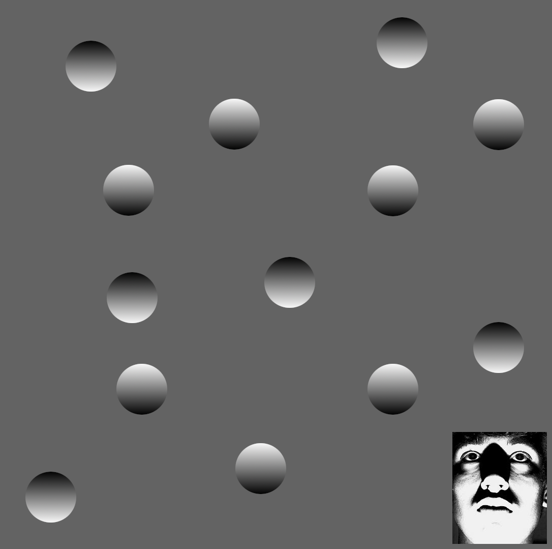
As we saw in class, it is easy to detect 3D shape from shading by knowing a few simple things. First, surfaces tend to be approximately Lambertian, which means that the amount of light reflected towards our eyes depends on the angle of that light with the surface it is hitting. Second, we assume that light sources tend to come from above, because that is what we are used to seeing in our day to day lives. Together, these effects create the illusion we see in the circles/craters example from class. The circles with lighter shading at the top and darker at the bottom appear to be bumps, while the ones with lighter shading at the bottom and darker at the top appear to be craters. The question I ask is the following: what happens when other cues are given that imply some global illumination? For example, if I set a gradient of light to dark shading from bottom to top, does this affect our perception of whether the circles are bumps or craters? What if there is another local cue that happens to be a lot more salient (a face lit from the bottom is much more recognizeable than a simple circle without much detail)? Pay attention to whether or not the different circles either appear to pop out or sink into the page based on the background and cues.

Here we see the standard example we saw in class with circles that appear to bulge out of the screen if the top is lighter than the bottom, and appear to sink into the page when the bottom is lighter than the top.


In the left example, I tried to create the illusion of a "top" light source by putting a gradient on the background. I noticed that it makes the effect seem to pop a little more, but didn't change the nature of it. In the second image, I kept the same circle layout but inverted the gradient on the background to see if it would invert the percept of which circles were "popping out" versus "sinking in". I personally don't notice a huge difference unless I really try to focus on it.

In this final example, I used the exact same image as the first example but with a face in the bottom right that has a strong implication of some sort of "bottom lighting". I personally noticed that although this works fantastically at a local level, making the circle right above the face to appear popping out although the shading is "inverted", it works less well for the inverted circles that are farther from the face, which is interesting.
Inspiration: Ramachandran, V. S. (1988). Perception of shape from shading. Nature, 331(6152)
