- Social Acceptance
- Case Studies
- Urban Wind Behavior
Urban Wind Maps
- Reflections
- Contact

Understanding Urban Wind Behavior: Urban Wind Maps
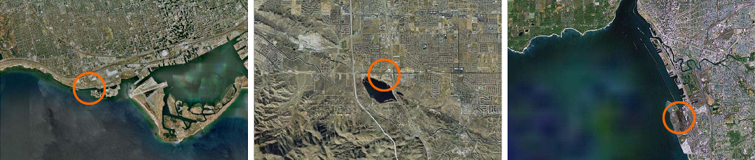
While each of the case studies described here is called an "urban" wind power project, they would more accurately be described as "urban edge" wind power projects. As can be seen in the three aerial photographs above of the North American cases, each of them is located on the north or northeast shore of an adjacent lake. Prevailing winds in all three cases are from the southwest, with available wind speeds dropping off as one moves farther from the shoreline. Toronto/Lake Ontario (left), Palmdale/Lake Palmdale (center) and Lackawanna/Lake Erie (right) are all well located and take advantage of their lakefront locations. It is likely that any further wind turbines in those cities would be located in similar locations.
The diagram on the left below shows the basic principle of wind shadow, which limits the locations in an urban or hilly area where wind turbines could conceivably be placed. It is clear from the diagram that a 20m high obstruction (5 story building) causes a reduction in available wind power over 300m downwind. (1) On the right is the windrose for Buffalo (similar for other sites), showing that the vast majority of annual winds and windpower come from the southwest. (2)
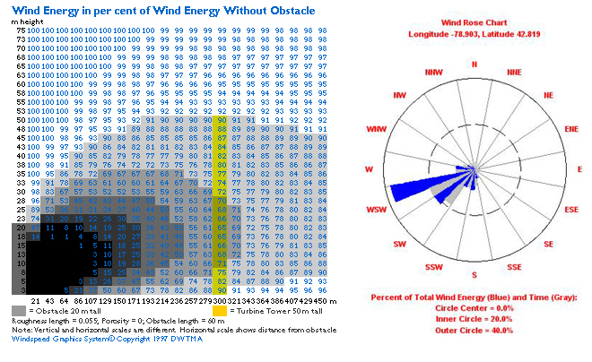
Image credits: www.windpower.org (left), Wind Resource Explorer / AWS Truewind (right)
It is these basic principles that makes lakefront and oceanfront sites more promising for large-scale wind energy in these cases, though other carefully chosen sites could also be possible. The wind maps that are used to predict wind speeds are not specifically designed for the wind conditions in urban areas, and therefore are likely to be inaccurate in some areas. While in some cases, this might mean that actual conditions are more turbulent and less reliable than the maps, in other cases promising sites might be overlooked. Using the Lackawanna site as an example, the maps below show wind data that is available to a community considering a wind power project. (2)
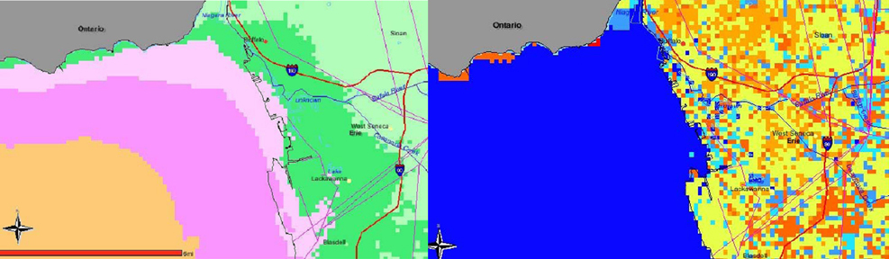
Image credits: Wind Resource Explorer / AWS Truewind
The map to the left shows average annual wind speeds at 70 meters at the northeast edge of Lake Erie, which is the primary consideration affecting the economic viability of the wind turbine project. To the right is a map of surface roughness, which is quite heavy over the urbanized Buffalo/Lackawanna area. The roughness calculations are factored together with the modeled wind speeds to create the wind speed map on the left. More details about these two sytems reveal the scale at which the data is collected and intended to be used:
1. Wind Speed Map: The Mesoscale Atmospheric Simulation System, a numerical weather model, simulates the physics of the atmosphere. MASS is coupled to a simpler wind flow model, WindMap, which refines the spatial resolution of MASS and accounts for simple localized effects of terrain and surface roughness.
2. Surface Rougness Map: This file was created from a land cover/land use image derived from the National Land Cover Dataset, compiled from Landsat satellite TM imagery (circa 1992) with a spatial resolution of 30 meters and supplemented by various ancillary data (where available). The analysis and interpretation of the satellite imagery was conducted using very large, sometimes multi-state image mosaics …thus, the reliability of the data is greatest at the state or multi-state level.
Sources:
1) Danish Wind Energy Association. <www.windpower.org>
2) Wind Resource Explorer / AWS Truewind <www.windexplorer.com/NewYork/NewYork.htm>