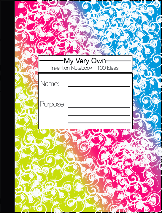
The concept refinement for the cover sought to seek a form that matched both the content and the layout of the notebook. Our market research for the cover involved surveying both "kit" and "craft" books for children (such as Klutz), and academic workbooks for children in our demographic. While the "kit" books had loud and busy covers, and usually included some kind of physical extension of the kit, the workbooks were subdued, hinting at the content of the book and target audience, also catering to the parents. Since our notebook bridges these two arenas of a very hands-on, fun book, and a prescriptive, academic workbook, I tried to combine the styles to bridge the cap between the two categories of books.
The notebook has the form of a composition notebook with a few twists. The first design features a funky, twisted print that should stand out to children. The similarities to a current composition notebook will catch the parents attention, and encourage them to look at the exercises inside. The front cover measures the book's capacity not in number of pages, but number of ideas to maintain levity. The cover also has an area for the child to write his or her name, and "purpose" - whether it be to invent something, brainstorm, or just have fun.
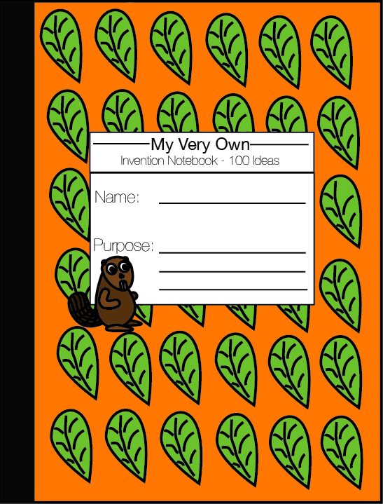
The second design follows the form of the content and design by including the small beaver that guides children through the ideating process. This cover is also bright, with a pattern of a leaf that will appear throughout the remainder of the book. This design can also be adapted to include different patterns pertinent to the content of the book.
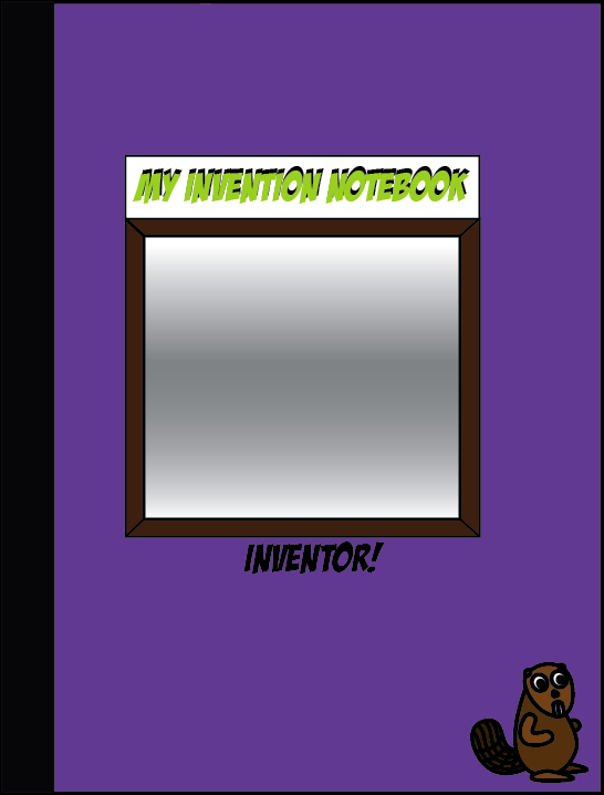
The final design is unique in that it includes a physical object, in addition to the text and design. A mirror in the center will attract children to the book and immediately frame them as "THE inventor" of the ideas to be formed in the notebook.