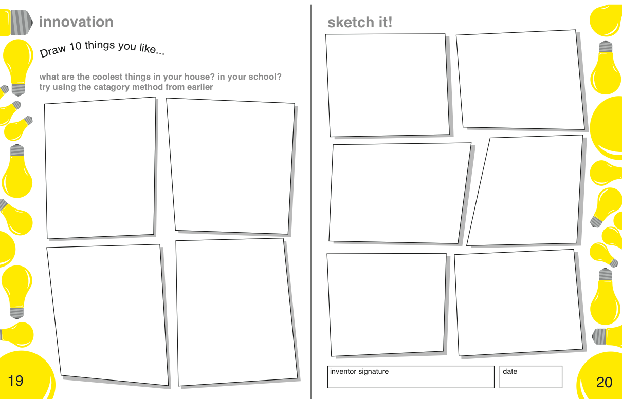

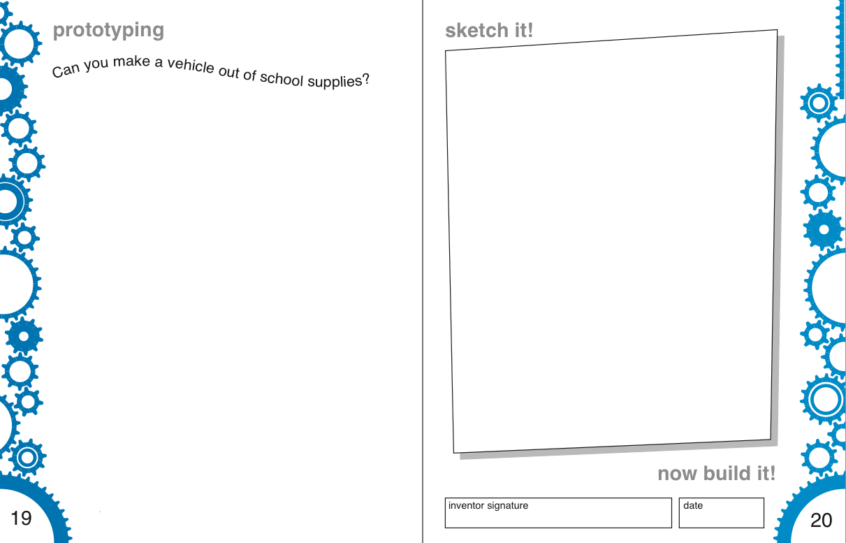
For the notebook layout, I focused primarily on developing a graphic design that would speak to a larger age range. Drawing inspiration from journals, science books, kids books, and comic books, a language was developed that was bubbly and exciting. By not focusing on a specific age demographic, we were able to let the book be as simple or complicated as the reader wants it to be.
My particular contribution to the layout was looking at the page layout and the attitude the team wanted to convey in the journal. I looked at color, font, and formatting of the pages, trying to create a unified style.
Using Adobe Illustrator, pages were developed that combined lab books and comic books style in a way that inspired open-ended creativity.
Depending on what sections are developed by the content team, a different color scheme and border will correspond to each section or chapter. This way you can tell what kind of mindset or stage of the design process you are in. Since the colors go all the way to the edge of the page, it's almost like having tabs or dividers. The team will likely be using a one-color spot and black to keep it simple and inexpensive. Work will be done to look at different color schemes, exploring options for girls and boys.