Lab 4
9.59 Lab in Psycholinguistics
library(tidyverse)Regular Expressions
So far we’ve interacted with strings just by looking at their lengths or some characters at specific indices. How would we do more complicated matching on kinds of strings? Regular expressions are a rich language for specifying patterns to match certain strings.
str_detect(c("cat", "dat", "dog", "mycat"), "cat")## [1] TRUE FALSE FALSE TRUEstr_detect(c("cat", "dat", "dog", "mycat"), "^cat")## [1] TRUE FALSE FALSE FALSEstr_detect(c("cat", "dat", "dog", "mycat"), "g$")## [1] FALSE FALSE TRUE FALSEstr_detect(c("cat", "dat", "dog", "mycat"), "[dc]at")## [1] TRUE TRUE FALSE TRUEstr_detect(c("cat", "dat", "dog", "mycat"), "^[dc]at")## [1] TRUE TRUE FALSE FALSEstr_detect(c("cat", "dat", "dog", "mycat"), "^[^d]at")## [1] TRUE FALSE FALSE FALSEstr_detect(c("cat", "dat", "dog", "mycat"), "^.cat")## [1] FALSE FALSE FALSE FALSEstr_detect(c("cat", "dat", "dog", "mycat"), "^.*cat")## [1] TRUE FALSE FALSE TRUEstr_detect(c("cat", "dat", "dog", "mycat"), "^.+cat")## [1] FALSE FALSE FALSE TRUEUseful resource: http://regexr.com/
Try it yourself…
- Load the
rtsdataset (http://web.mit.edu/psycholinglab/data/rts.csv). - Create a new dataset which only contains words that end with “s” or “r”.
Create another new dataset which only contains words that start and end with a consonant.
data_source <- "http://web.mit.edu/psycholinglab/data/"
rts <- read_csv(file.path(data_source, "rts.csv"))

rts_sr <- rts %>%
  filter(str_detect(Word, "[sr]$"))

rts_consonants <- rts %>%
  filter(str_detect(Word, "^[^aeiou].*[^aeiou]$"))
Parameter estimation
Central Limit Theorem review
To recap, last week we talked about CLT and used a function to sample from a distribution in order to estimate parameters of the distribution. This resampling approach is something we’re going to continue using.
Let’s use our LexDec data and re-use that function from last time that samples from our distribution and outputs means of those samples.
ggplot(rts) + geom_histogram(aes(x = NounFrequency), color = "white")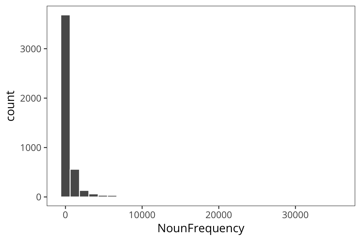
mean(rts$NounFrequency)## [1] 600.1883sd(rts$NounFrequency)## [1] 1858.115sample_mean <- function(values, sample_size) {
samples <- sample(values, sample_size, replace = TRUE)
return(mean(samples))
}
sample_means <- function(values, num_samples, sample_size) {
replicate(num_samples, sample_mean(values, sample_size))
}
means <- data_frame(mean_noun_freq = sample_means(rts$NounFrequency, 1000, 100))
ggplot(means) +
geom_histogram(aes(x = mean_noun_freq), color = "white", bins = 60)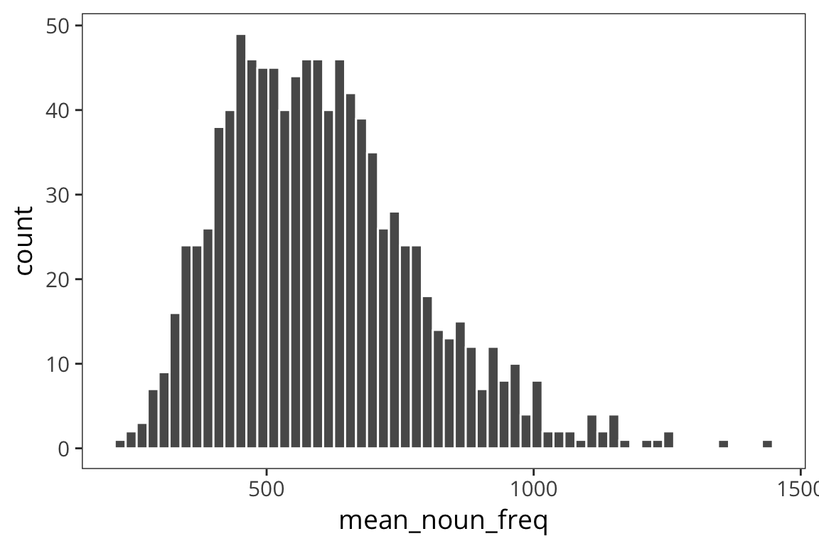
Because of Central Limit Theorem we see that if we take lots of samples of of a decent size, our distribution of means of those samples will end up being normal and centered around the mean. So using the mean of the distribution of the sample means is a good way to estimate, \(\mu\), the true mean of our population.
I also mentioned that you can think of each experiment as an instance of sampling from some distribution and so the goal of experiments is to estimate the underlying parameters.
Confidence intervals
Even if what we really care about is the mean of a sample (for example, what is the average height of humans?), we still need to know how spread out that distribution of the sample means is. In particular we want to know how good our estimate of \(\mu\) is.
Are we in this case?
means_100 <- data_frame(mean_noun_freq = sample_means(rts$NounFrequency, 100, 100))

ggplot(means_100) +
  geom_histogram(aes(x = mean_noun_freq), color = "white", binwidth = 30) +
  coord_cartesian(xlim = c(200, 1200))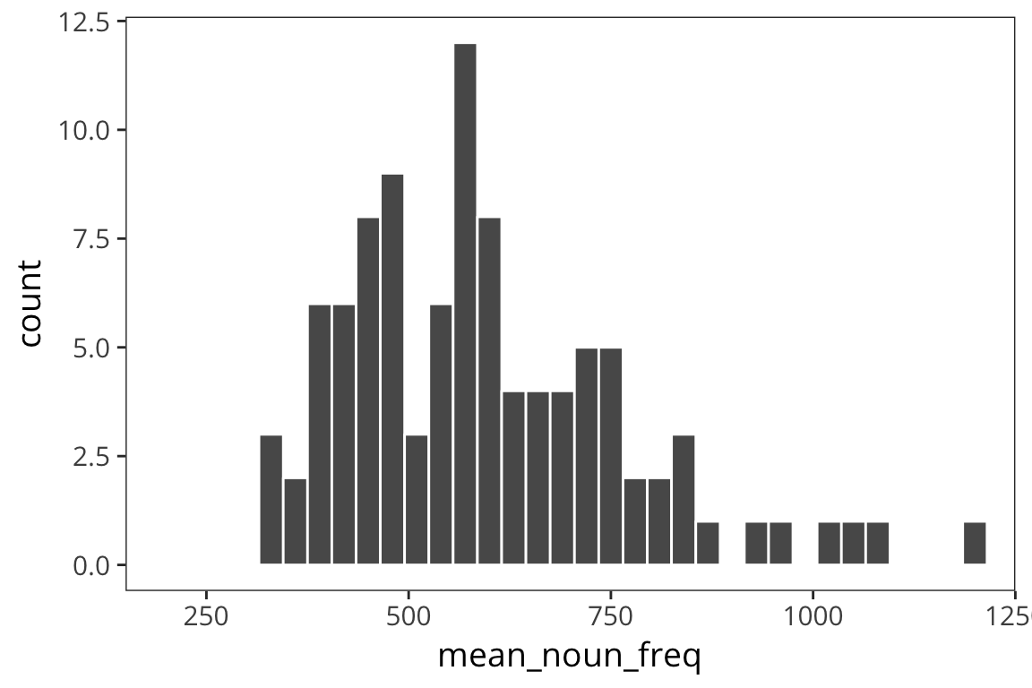
sd(means_100$mean_noun_freq)## [1] 195.664Or this case?
means_10000 <- data_frame(mean_noun_freq = sample_means(rts$NounFrequency, 100, 10000))
ggplot(means_10000) +
  geom_histogram(aes(x = mean_noun_freq), color = "white", binwidth = 30) +
  coord_cartesian(xlim = c(200, 1200))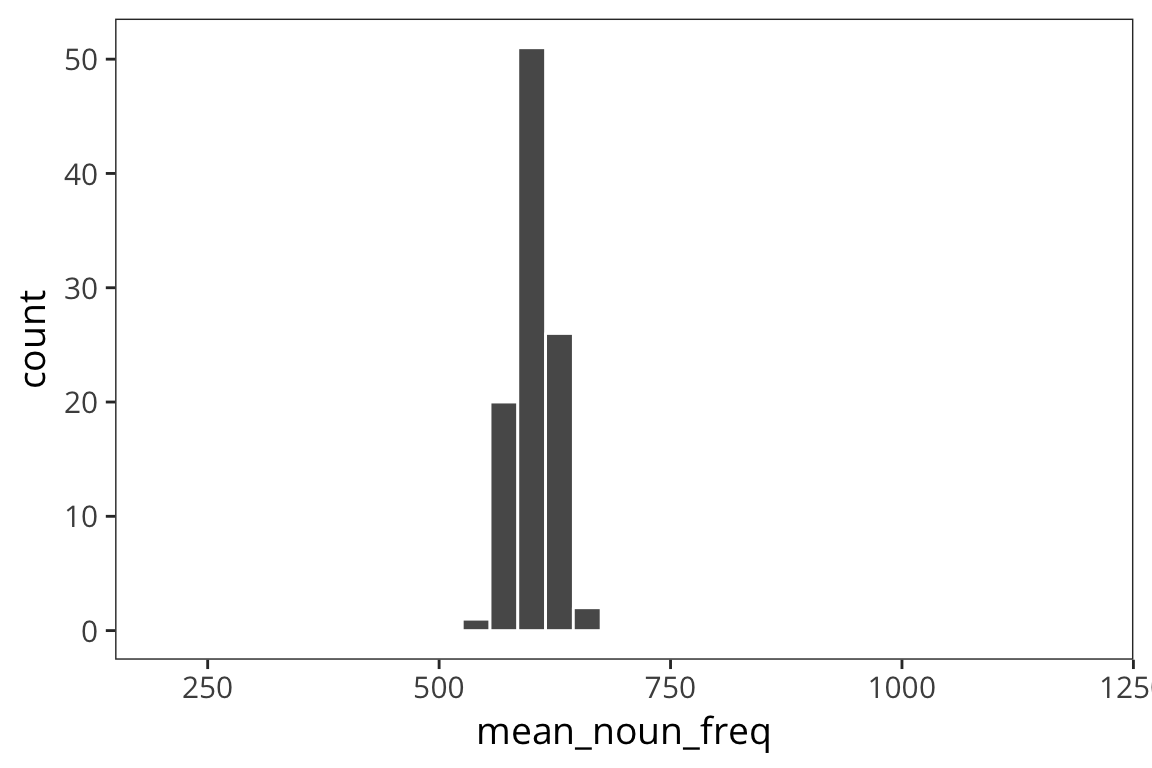
sd(means_10000$mean_noun_freq)## [1] 20.95885As you can see, the spread of the distribution of sample means is much smaller for the second case and the estimate of the mean is closer to the true mean. So the standard deviation of the distribution of sample means, \(\sigma_x\), is inversely related to the size of the sample. When you run an experiment, you can get the standard deviation of that sample, \(s\), but you don’t know \(\sigma_x\), unless you run say 100 experiments. The best you can do with one experiment is to estimate \(\sigma_x\) with the standard error, \(SE = \frac{s}{\sqrt{n}}\). This is going to vary from sample to sample and this extra level of uncertainty is why we use the t-distribution for most inferential stats because when you use a small sample size, the estimates are further off. So the t-distribution is introduced as a correction to the normal that places more weight on the tails of the distribution. We’ll come back to this.
If you are getting confused between \(s\) and \(\sigma\) that’s because it is a bit confusing. In practice when you’re calculating the standard error of the data in your experiment, you will take the sd() of your sample values and divide it by the sqrt() of your sample size, n. Or you can bootstrap (see below).
Let’s say we collected some data d (note: when you want to be able to generate random numbers but then reproduce the calculations exactly you can use set.seed(x) where x is a number of your choosing):
set.seed(959)
d <- data_frame(value = rnorm(100, mean = 20, sd = 5))

length(d$value)
## [1] 100mean(d$value)## [1] 20.77984std_error <- function(x) sd(x) / sqrt(length(x))
std_error(d$value)## [1] 0.5000739ggplot(d) +
geom_histogram(aes(x = value), color = "white") +
geom_vline(xintercept = 20, linetype = "dotted")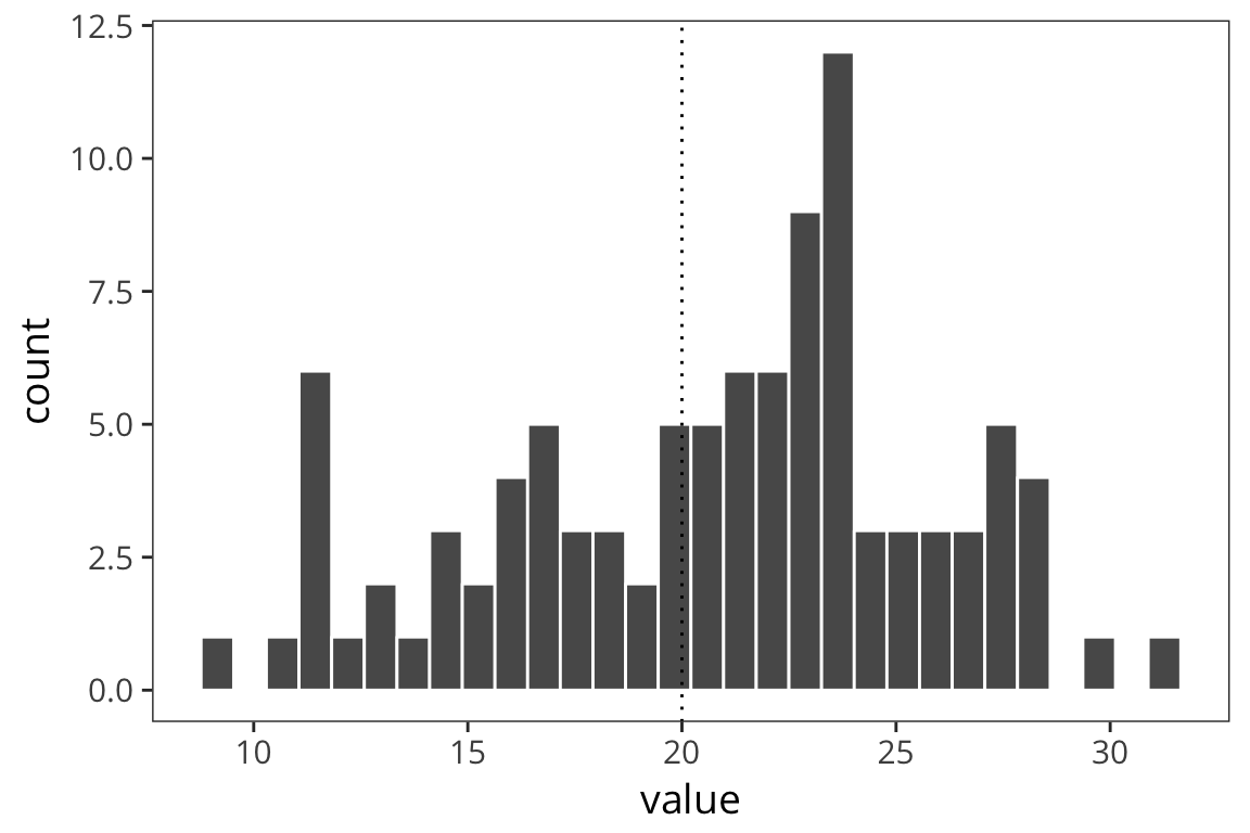
Since \(SE\) is an estimate of the SD of the distribution of the sample means, you can use it to identify the amount of data that fall between the mean and the mean + 1 SE or the mean - 1 SE. If you created an interval centered around the sample mean with 1 SE on each side, 68% of the data should fall in that interval, and about 95% lies between mean - 2 SE and mean + 2 SE. This is what people call a 95% Confidence Interval.
ci_upper <- mean(d$value) + qnorm(0.975) * std_error(d$value)
ci_upper
## [1] 21.75997ci_lower <- mean(d$value) - qnorm(0.975) * std_error(d$value)
ci_lower## [1] 19.79971So the interpretation is that we can have 95% confidence that the true mean of d lies between 19.8 and 21.76. We can compare this to what we would get if we just resampled from data d and got a distribution of sample means and looked at the interval centered at the mean that would contain 95% of the values.
d_means <- data_frame(mean_value = sample_means(d$value, 1000, nrow(d)))

ci_upper_boot <- mean(d$value) + qnorm(0.975) * sd(d_means$mean_value)
ci_upper_boot
## [1] 21.73544ci_lower_boot <- mean(d$value) - qnorm(0.975) * sd(d_means$mean_value)
ci_lower_boot## [1] 19.82424ggplot(d_means) +
geom_histogram(aes(x = mean_value), color = "white") +
geom_vline(xintercept = ci_upper_boot, color = "red") +
geom_vline(xintercept = ci_lower_boot, color = "red") +
geom_vline(xintercept = 20, linetype = "dotted")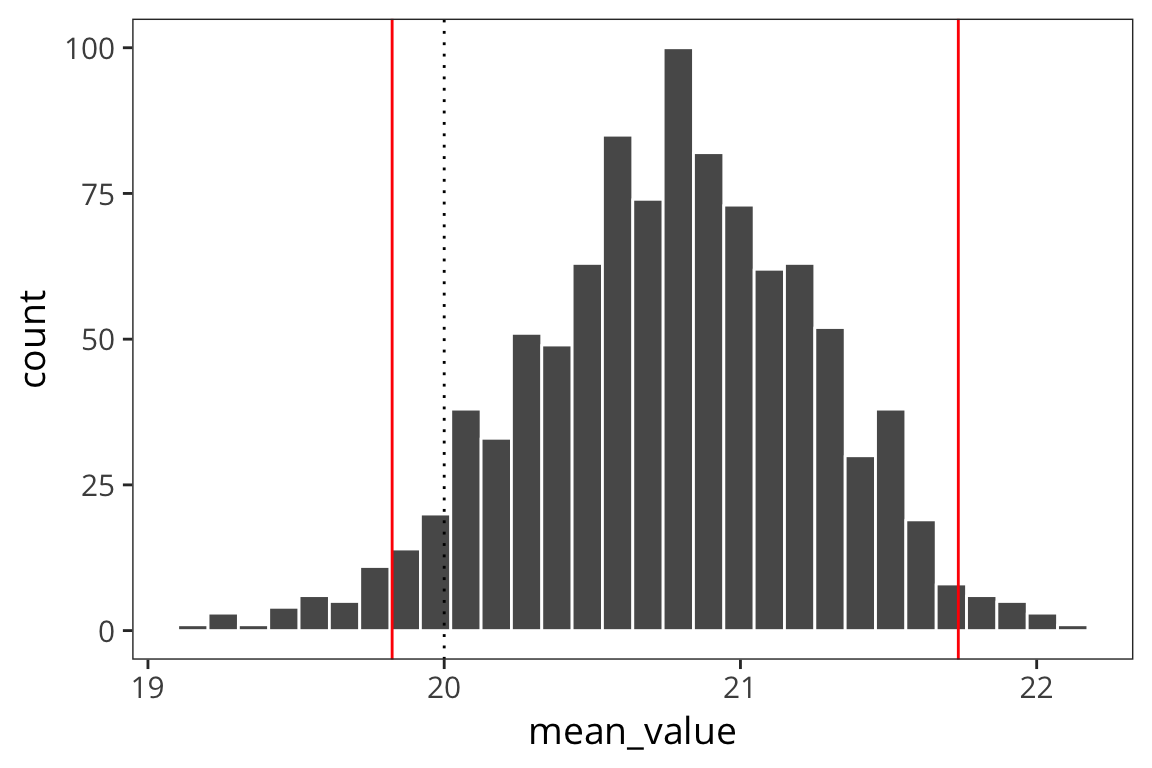
ggplot(d_means) +
  geom_histogram(aes(x = mean_value), color = "white") +
  geom_vline(xintercept = ci_upper_boot, color = "red") +
  geom_vline(xintercept = ci_lower_boot, color = "red") +
  geom_vline(xintercept = ci_upper, color = "blue") +
  geom_vline(xintercept = ci_lower, color = "blue") +
  geom_vline(xintercept = 20, linetype = "dotted")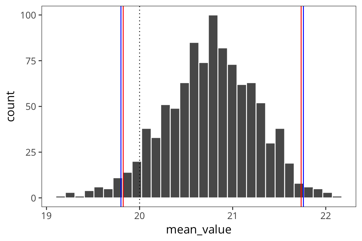
So the way to interpret these confidence intervals is that you can think of a researcher running experiments over and over to get at the true mean of some distribution of response times, let’s say. Every time the researcher runs an experiment, i.e. takes a sample form the distribution, she gets a mean and an SE and computes a 95% CI. In the long run, 95% of those CIs will contain the true mean of the population.
See also:
Error bars
I mentioned before when we were talking about data visualization, that often we want to provide some information about the spread of the data as well as the average. Now that we know how to compute CIs we can add them to our plots in the form of error bars.
category_rts <- rts %>%
  group_by(WordCategory) %>%
  summarise(mean_rt = mean(RTlexdec),
            se_rt = sd(RTlexdec) / sqrt(n()))

ggplot(category_rts, aes(x = WordCategory, y = mean_rt)) +
  geom_point()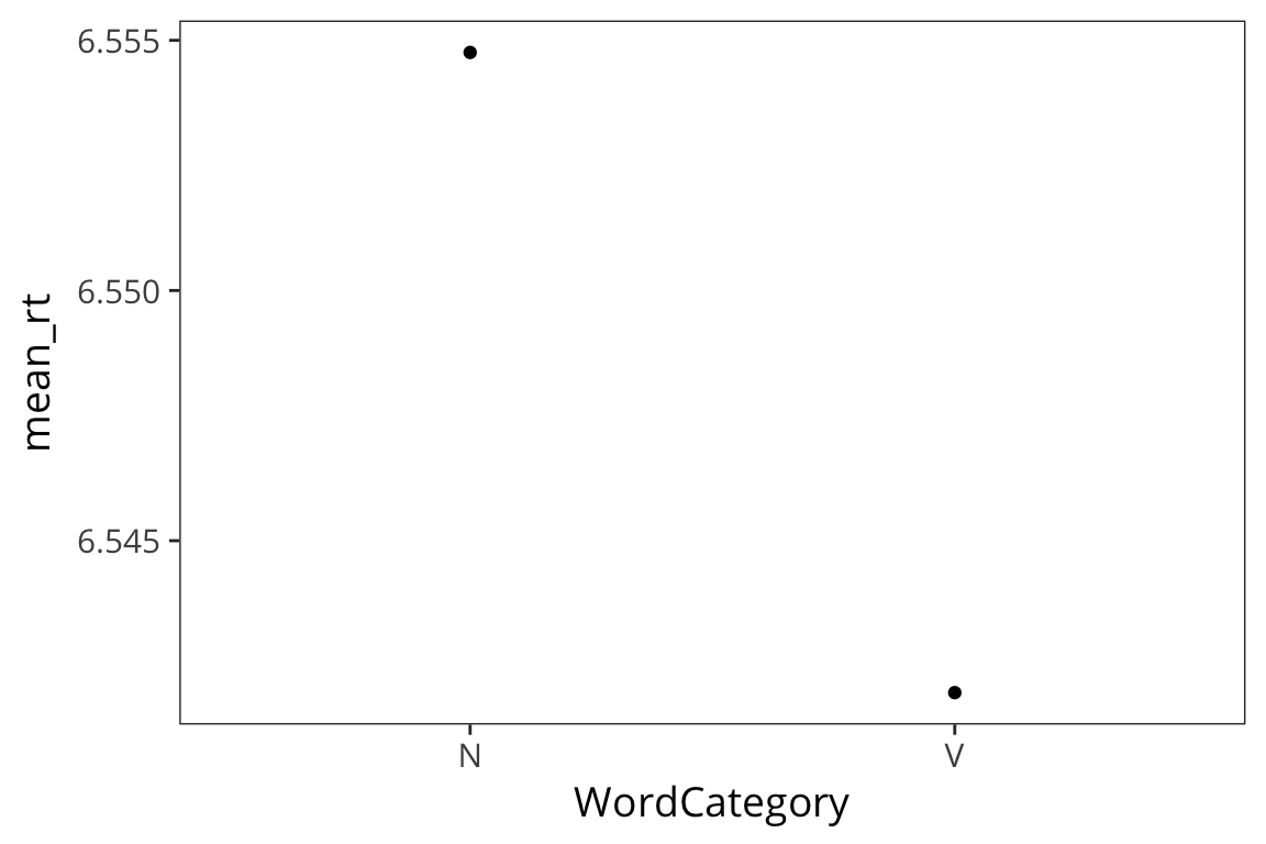
ggplot(category_rts, aes(x = WordCategory, y = mean_rt)) +
  geom_pointrange(aes(ymin = mean_rt - se_rt * 1.96,
                      ymax = mean_rt + se_rt * 1.96))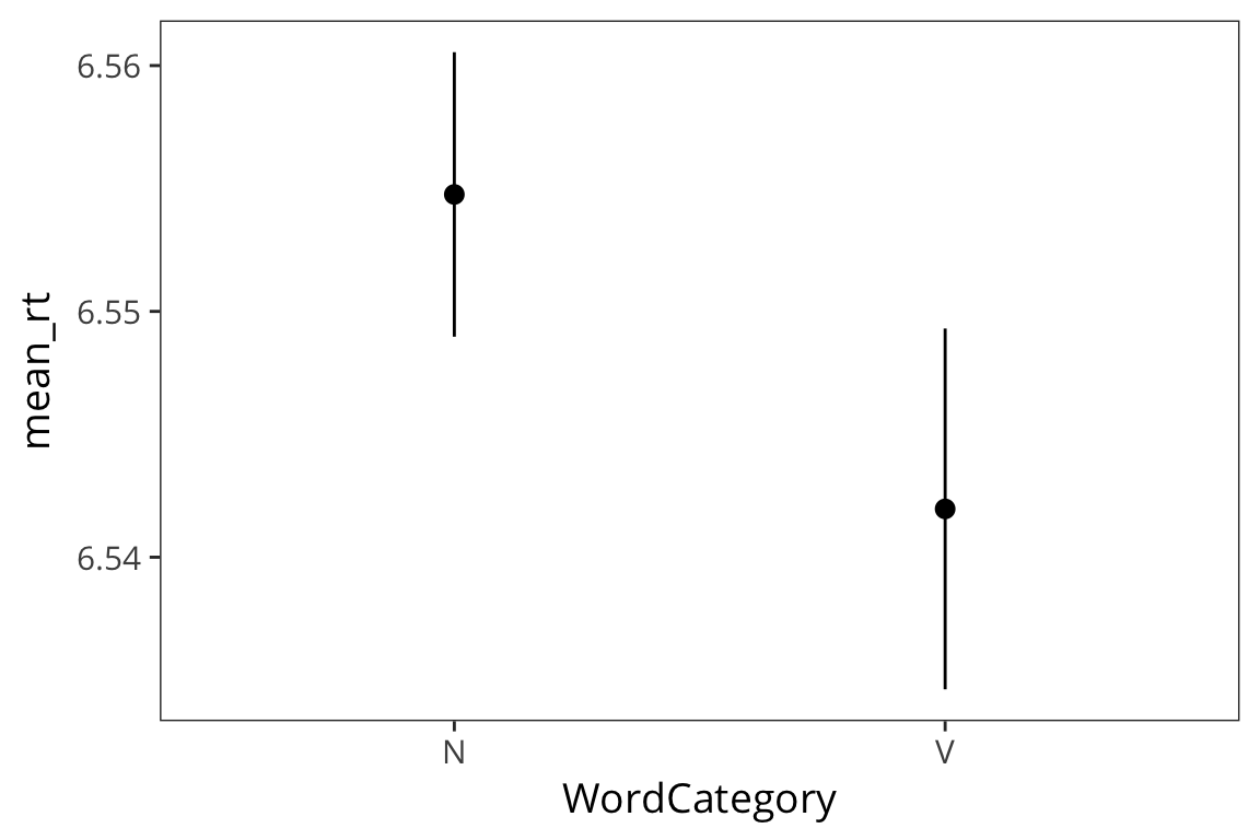
Try it yourself…
Using the in-class RT data, make a plot with the mean RT for each subject and 95% CI error bars.
in_lab_rts <- read_csv(file.path(data_source, "in_lab_rts_2018.csv"))

subject_rts <- in_lab_rts %>%
  group_by(subject) %>%
  summarise(mean_rt = mean(rt),
            se_rt = sd(rt) / sqrt(n()))

ggplot(subject_rts, aes(x = subject, y = mean_rt)) +
  geom_pointrange(aes(ymin = mean_rt - se_rt * 1.96,
                      ymax = mean_rt + se_rt * 1.96))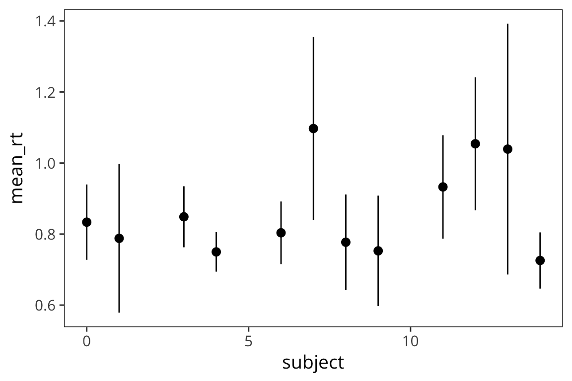
The \(t\) distribution
We used a fairly large sample size in the previous example. What if we have a smaller sample size?
set.seed(43)
d_5 <- data_frame(value = rnorm(5, mean = 20, sd = 5))

length(d_5$value)
## [1] 5mean(d_5$value)## [1] 17.463std_error(d_5$value)## [1] 1.754804ggplot(d_5) +
geom_histogram(aes(x = value), color = "white") +
geom_vline(xintercept = 20, linetype = "dotted")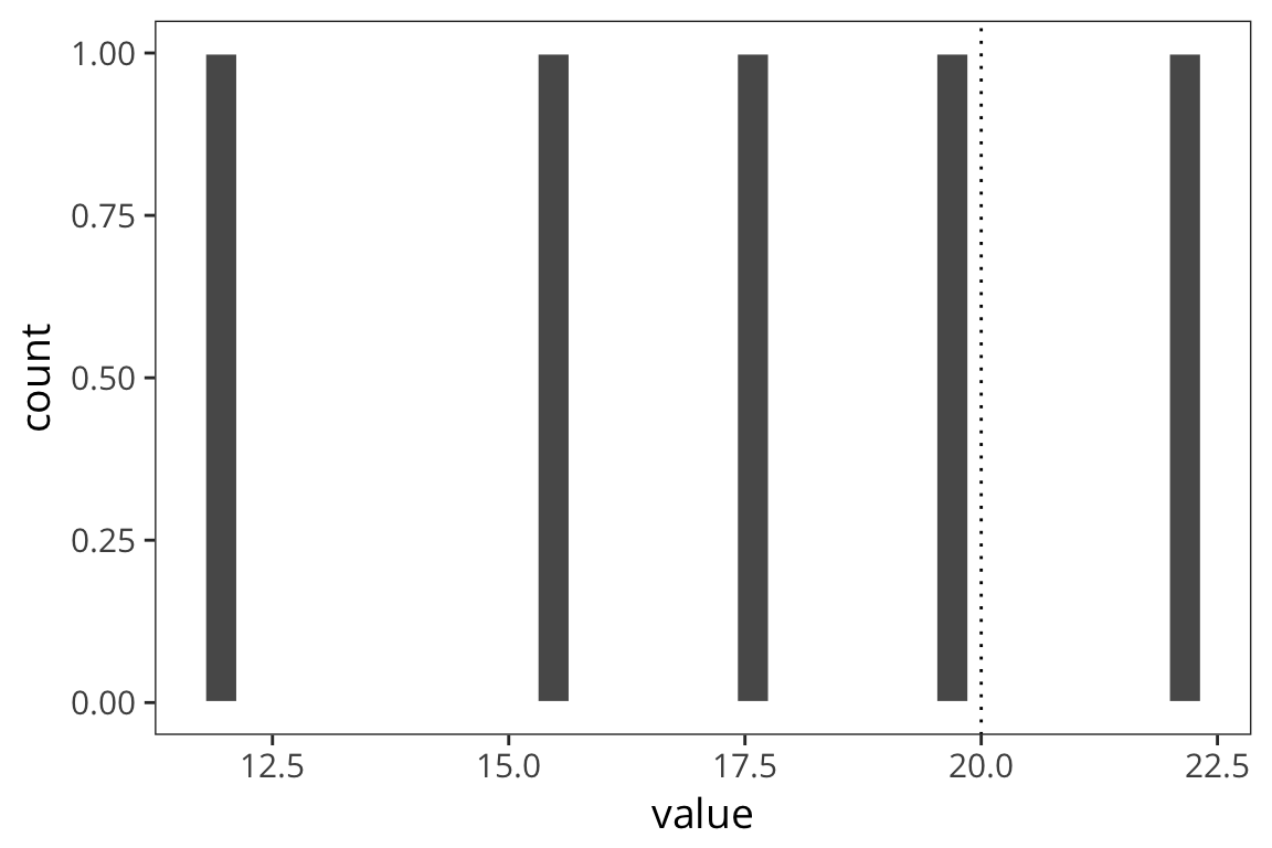
ci_upper_5 <- mean(d_5$value) + qnorm(0.975) * std_error(d_5$value)
ci_upper_5
## [1] 20.90236ci_lower_5 <- mean(d_5$value) - qnorm(0.975) * std_error(d_5$value)
ci_lower_5## [1] 14.02365d_5_means <- data_frame(mean_value = sample_means(d_5$value, 1000, nrow(d_5)))
ci_upper_boot_5 <- mean(d_5$value) + 1.96 * sd(d_5_means$mean_value)
ci_upper_boot_5## [1] 20.60838ci_lower_boot_5 <- mean(d_5$value) - 1.96 * sd(d_5_means$mean_value)
ci_lower_boot_5## [1] 14.31762ggplot(d_5_means) +
geom_histogram(aes(x = mean_value), color = "white", binwidth = 0.1) +
geom_vline(xintercept = ci_upper_boot_5, color = "red") +
geom_vline(xintercept = ci_lower_boot_5, color = "red") +
geom_vline(xintercept = 20, linetype = "dotted")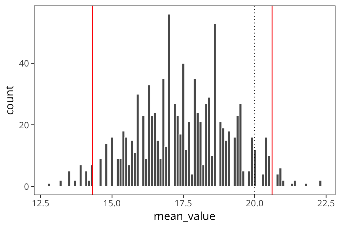
ggplot(d_5_means) +
  geom_histogram(aes(x = mean_value), color = "white", binwidth = 0.1) +
  geom_vline(xintercept = ci_upper_boot_5, color = "red") +
  geom_vline(xintercept = ci_lower_boot_5, color = "red") +
  geom_vline(xintercept = ci_upper_5, color = "blue") +
  geom_vline(xintercept = ci_lower_5, color = "blue") +
  geom_vline(xintercept = 20, linetype = "dotted")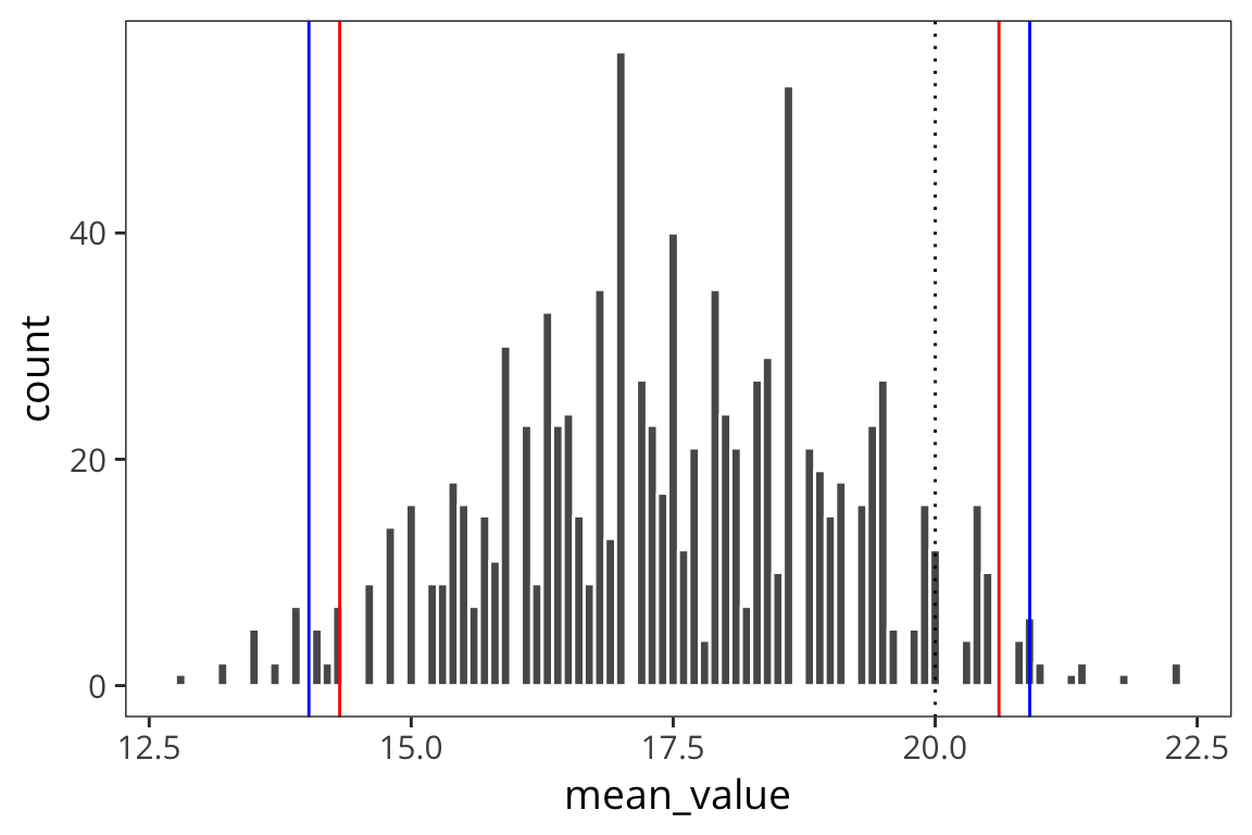
When you use a small sample size, the estimates are further off. The sd is going to vary more with each sample, so the t-distribution is introduced as a correction to the normal that places more weight on the tails of the distribution. This t-distribution is formally defined by the degrees of freedom (sample size minus 1).
t_ci_upper_5 <- mean(d_5$value) + qt(0.975, df = 4) * std_error(d_5$value)
t_ci_upper_5
## [1] 22.33512t_ci_lower_5 <- mean(d_5$value) - qt(0.975, df = 4) * std_error(d_5$value)
t_ci_lower_5## [1] 12.59088ggplot(d_5_means) +
geom_histogram(aes(x = mean_value), color = "white") +
geom_vline(xintercept = ci_upper_boot_5, color = "red") +
geom_vline(xintercept = ci_lower_boot_5, color = "red") +
geom_vline(xintercept = ci_upper_5, color = "blue") +
geom_vline(xintercept = ci_lower_5, color = "blue") +
geom_vline(xintercept = t_ci_upper_5, color = "blue", linetype = "dotted") +
geom_vline(xintercept = t_ci_lower_5, color = "blue", linetype = "dotted")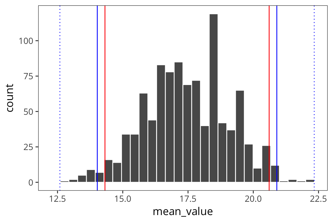
You can see that the interval is wider which is good because it reflects our greater uncertainty about the estimates. The t-distribution becomes more like the normal distribution in shape as sample size increases (see http://rpsychologist.com/d3/tdist/ for a visualization).
R has a series of functions for the t-distribution, same as for the normal:
ggplot(data_frame(value = rt(1000, df = 9)), aes(x = value)) +
  geom_histogram()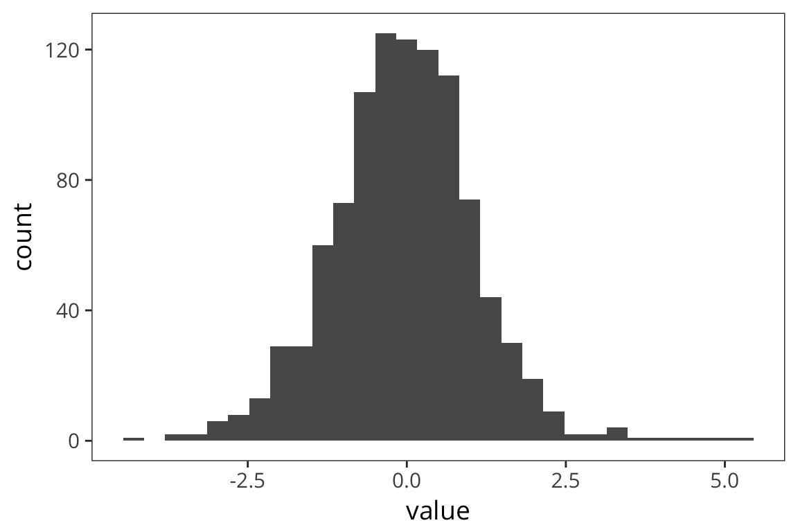
We get the probability of values of x or lower under a t-distribution using pt:
pt(2, df = 9)## [1] 0.9617236We can get the value such that 97.5% of values drawn from a t-distribution are less than that value – the quantile – with qt:
qt(0.975, df = 9)## [1] 2.262157Hypothesis testing
t-values and p-values
Now when we were working with the normal distribution, we converted data to the standard normal distribution so we could reason about probabilities. We called this z-scoring, and the resulting values are called z-values. We can think of the distances of sample means from the true mean \(\mu\) (in the case of known \(\sigma\)) as z-values. Now with the t-distribution, rather than z-values, we have t-values. A t-value is: \(\frac{\bar{x}-\mu}{\frac{s}{\sqrt{n}}}\)
or mean(X) - mu / (sd(X) / sqrt(length(X)))
For example we might be interested in if the true mean \(\mu\) is or is not equal to zero. Maybe we want to know if one group of participants is faster to respond than another on lexical decision. You can compute the differences in response times for a word, then we could look at the distribution of these differences in RTs and ask if the true mean of the differences is zero. If it is zero, then that would indicate the groups are equally fast.
Suppose we get a sample mean from our measurements. Then we can convert that into a t-value relative to zero (substituting zero for \(\mu\)). Suppose the t-value is 2 and we have 10 data points. Supposing the true value of \(\mu\) is 0, we can figure out what is the probability of my sample mean having a t-value of 2 or more:
1 - pt(2, df = 9)## [1] 0.03827641We see that the probability of my getting a t-value of 2 was 0.038, if my true value of \(\mu\) is 0. That’s pretty unlikely. So I’d say the true value of \(\mu\) is probably something other than 0.
This is the logic of a p-value. Assume the true value of \(\mu\) is zero, or some other uninteresting value (the null hypothesis). Now get the probability of the t-value of my sample mean under that assumption. If it’s low, then I say that assumption was probably wrong.
Essentially, we convert our mean into a t-statistic, which is distributed according to a t-distribution with degrees of freedom. Then we get the probability of a t-distribution generating our t-value or greater, or -t-value or lesser.
This is called a t-test and you can do one much more straightforwardly in R.
d_test <- t.test(d$value)
d_test
##
## One Sample t-test
##
## data: d$value
## t = 41.554, df = 99, p-value < 2.2e-16
## alternative hypothesis: true mean is not equal to 0
## 95 percent confidence interval:
## 19.78758 21.77209
## sample estimates:
## mean of x
## 20.77984This gives you the t-value of the sample mean. It is 41.55; degrees of freedom is 99. So if the true mean is 0, then the probability that I would get this t-value for the mean of a sample is… really really really small.
In this case this is not particularly surprising since we were sampling the values of d from a normal distribution with \(\mu\) set to be 20.
The t.test() function also displays the confidence intervals calculated using the t-distribution. Here we are interested in whether this includes 0 or not. If the 95% confidence interval includes 0, then we cannot say with 95% confidence that the true \(\mu\) is not 0. If it does not include 0, then we can in fact say that.
t.test(d_5$value)##
## One Sample t-test
##
## data: d_5$value
## t = 9.9515, df = 4, p-value = 0.0005727
## alternative hypothesis: true mean is not equal to 0
## 95 percent confidence interval:
## 12.59088 22.33512
## sample estimates:
## mean of x
## 17.463This confirms our previously obtained CIs.
It’s actually very rare in psycholinguistics or psychology in general, that you would be interested in checking if some distribution is different from 0. More often you’ll want compare the means of two samples.
Let’s use the Baayen LexDec data again. Let’s say we want to test if people respond faster to nouns or verbs.
First plot the distributions of RTlexdec values, split up by whether they’re a noun or a verb…
ggplot(rts, aes(x = RTlexdec)) +
  geom_histogram(bins = 60, color = "white") +
  facet_wrap(~WordCategory)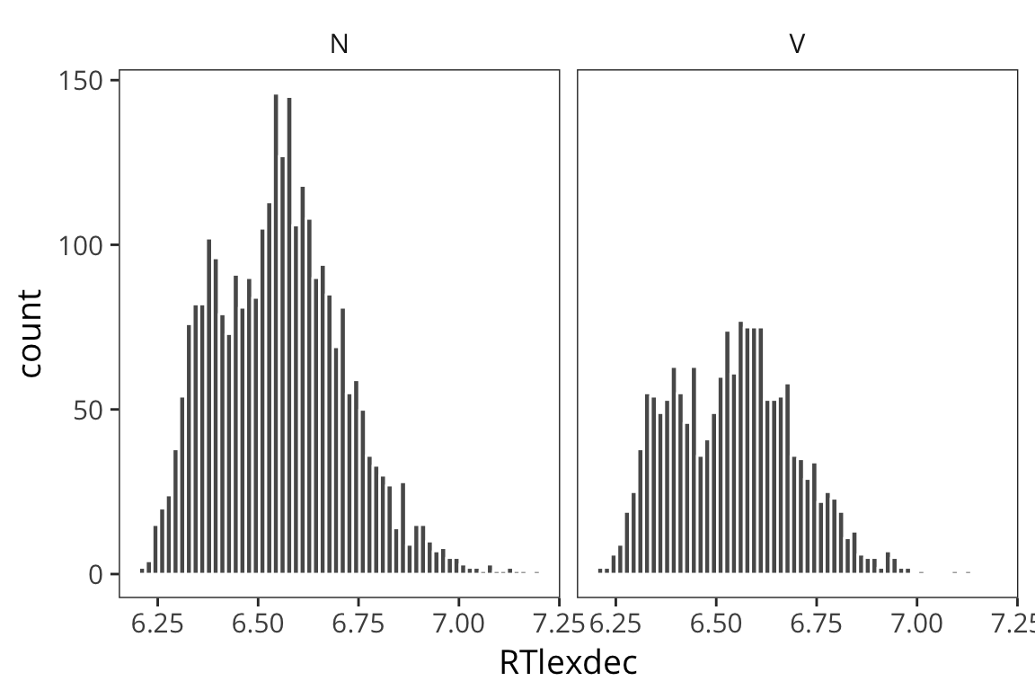
As you can see it’s pretty unclear just from looking at these whether these are drawn from distinct distributions with distinct \(\mu\)s, or if they are just all samples from the same distribution.
Now let’s separate out our data and run a t-test.
verbs <- rts %>% filter(WordCategory == "V")
nouns <- rts %>% filter(WordCategory == "N")

verbs_rt <- verbs$RTlexdec
nouns_rt <- nouns$RTlexdec


t.test(verbs_rt, nouns_rt)
##
## Welch Two Sample t-test
##
## data: verbs_rt and nouns_rt
## t = -2.6829, df = 3580.9, p-value = 0.007331
## alternative hypothesis: true difference in means is not equal to 0
## 95 percent confidence interval:
## -0.022141948 -0.003444228
## sample estimates:
## mean of x mean of y
## 6.541964 6.554758What you see is that relative to the one-sample t-test, your alternative hypothesis is now that the “true difference in means is not equal to 0” and you have a confidence interval for the difference of the means.
You might also notice that this is being called a Welch t-test which is different from a Student’s t-test. The Students t-test assumes that the 2 distributions have equal variances. You could run it that way:
t.test(verbs_rt, nouns_rt, var.equal = TRUE)##
## Two Sample t-test
##
## data: verbs_rt and nouns_rt
## t = -2.6534, df = 4566, p-value = 0.007997
## alternative hypothesis: true difference in means is not equal to 0
## 95 percent confidence interval:
## -0.02224543 -0.00334075
## sample estimates:
## mean of x mean of y
## 6.541964 6.554758And you get a very similar answer because these are large sample sizes. But it’s not clear that the variances are equal so the Welch version pools the variance across the two distributions.
(mean(verbs_rt) - mean(nouns_rt)) /
  sqrt(std_error(verbs_rt) ^ 2 + std_error(nouns_rt) ^ 2)
## [1] -2.682944There are tests to check if your variances are the same first but it actually makes much more sense to just default to the Welch test (which R does for you) because the Welch test does the right thing if your variances are different and it is basically identical to the Student’s t-test when the variances are the same. You can read more here: http://daniellakens.blogspot.com/2015/01/always-use-welchs-t-test-instead-of.html.
Using the combined standard errors, you can put a 95% confidence interval on the difference in true means here. We see that it does not include 0. So we can say with 95% confidence that there is some real difference between these groups, i.e. that these data were not generated from one call to rnorm with the same \(\mu\), but rather from someone calling rnorm twice, with two different \(\mu\) values. So we infer from this that there is some difference in the causal process that gave rise to our data.
The t-test also has alternative syntax. In the previous example, I split the data up into a vector of verb RTs and a vector of noun RTs and had them both entered as arguments. This extra step was kind of unnecessary because you could also write:
t.test(RTlexdec ~ WordCategory, data = rts)##
## Welch Two Sample t-test
##
## data: RTlexdec by WordCategory
## t = 2.6829, df = 3580.9, p-value = 0.007331
## alternative hypothesis: true difference in means is not equal to 0
## 95 percent confidence interval:
## 0.003444228 0.022141948
## sample estimates:
## mean in group N mean in group V
## 6.554758 6.541964This syntax will actually align better with other tests we will run.
Another version you might encounter is the paired t-test. This is what you would use if each individual datapoint in x corresponds to a datapoint in y. For example if you have data from a pre-test and a post-test with some intervention in between and you want to see if that intervention had an effect on the means. Then you use t.test(x, y, paired = TRUE).
Null hypothesis testing and p-values
This is the basic logic of how we do frequentist statistics. We choose some uninteresting NULL HYPOTHESIS, like the difference is 0.
Then we show that, under this uninteresting hypothesis, the data that we have are very unlikely. If the probability of our data under the null hypothesis is below some threshold, we say that we have a SIGNIFICANT EFFECT. The idea is that the observed difference leads us to conclude, from the sheer unlikeliness of our data under the null hypothesis, that the null hypothesis is false, and something else must be true.
IMPORTANT: Finding a p-value < 0.05 does NOT mean that there is a 95% chance there really is a difference.
You should think critically about whether this is a good way to draw inferences. In particular, does it make sense to have a constant threshold for significance. Typically we want p is less than .05. This is equivalent to saying some 95% confidence interval does not include 0.
Try it yourself…
Compare the naming response times (RTnaming) of old and young participants in the
rtsdataset.Write down in English what, test you used, what the stats are, and what you can conclude on the basis of this test.
t.test(RTnaming ~ AgeSubject, data = rts)## ## Welch Two Sample t-test ## ## data: RTnaming by AgeSubject ## t = 226.19, df = 4335.5, p-value < 2.2e-16 ## alternative hypothesis: true difference in means is not equal to 0 ## 95 percent confidence interval: ## 0.3390249 0.3449533 ## sample estimates: ## mean in group old mean in group young ## 6.493500 6.151511A Welch Two Sample t-test reveals that younger participants were significantly faster to respond than older participants (t(4335.5) = 226.19, p < 0.001).
Power
Let’s think about the long-run distributions of p-values. Let’s say we have samples from 2 different distributions, we test if they are different, and we replicate 1000 times.
experiment <- function() {
  sample1 <- rnorm(1000, 20, 10)
  sample2 <- rnorm(1000, 21, 10)
  p_value <- t.test(sample1, sample2)$p.value
  return(p_value)
}

p_values <- replicate(100, experiment())

ggplot(data_frame(p_value = p_values), aes(x = p_value)) +
  geom_histogram() +
  lims(x = c(0, 1))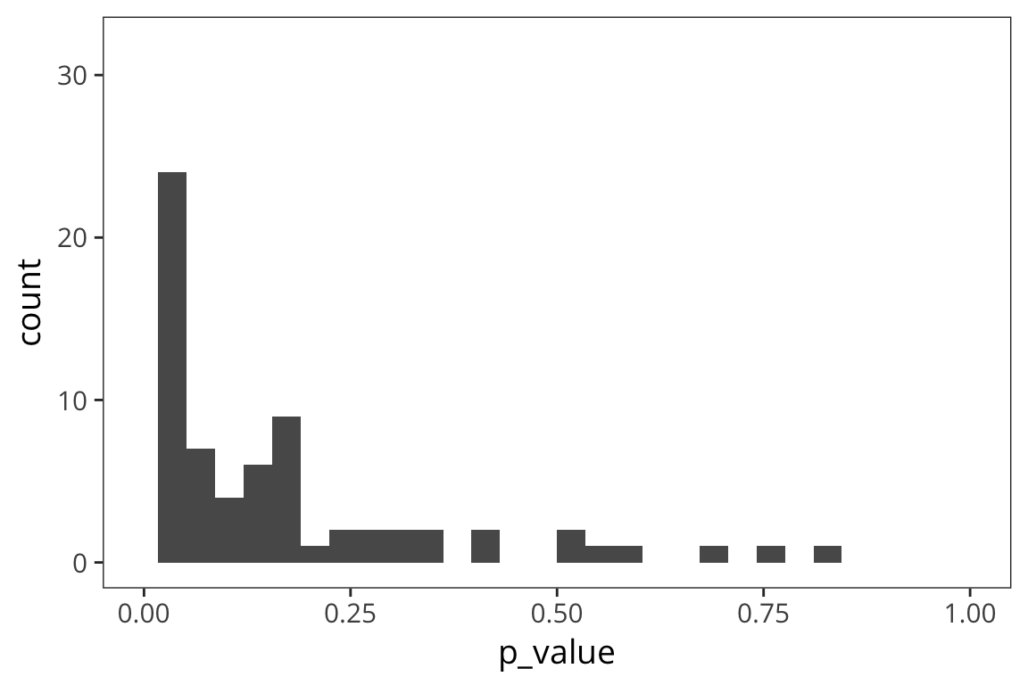
So here we have a real effect but maybe it’s on the small side, so the majority of p-values falls between 0 and 0.05 but there’s a few that are above 0.05 and in fact, some are quite large. This is showing that if you have a small difference, if you replicate your experiment or other labs replicate your experiment, some proportion of the time, you will get a p-value > 0.05 just by chance. These are Type II errors: cases where you are not rejecting the null but actually there is a difference.
But if your effect is bigger…
experiment_2 <- function() {
  sample1 <- rnorm(1000, 20, 10)
  sample2 <- rnorm(1000, 22, 10)
  p_value <- t.test(sample1, sample2)$p.value
  return(p_value)
}

p_values_2 <- replicate(100, experiment_2())

ggplot(data_frame(p_value = p_values_2), aes(x = p_value)) +
  geom_histogram()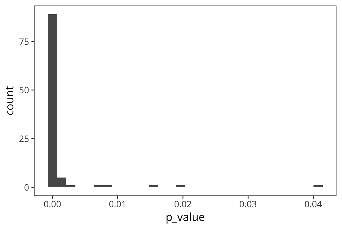
You can see that there are way more effects between 0 and 0.05. In fact many of these are less than 0.01.
Now let’s try a tiny effect…
experiment_3 <- function() {
  sample1 <- rnorm(1000, 20, 10)
  sample2 <- rnorm(1000, 20.5, 10)
  p_value <- t.test(sample1, sample2)$p.value
  return(p_value)
}

p_values_3 <- replicate(100, experiment_3())

ggplot(data_frame(p_value = p_values_3), aes(x = p_value)) +
  geom_histogram() +
  lims(x = c(0, 1))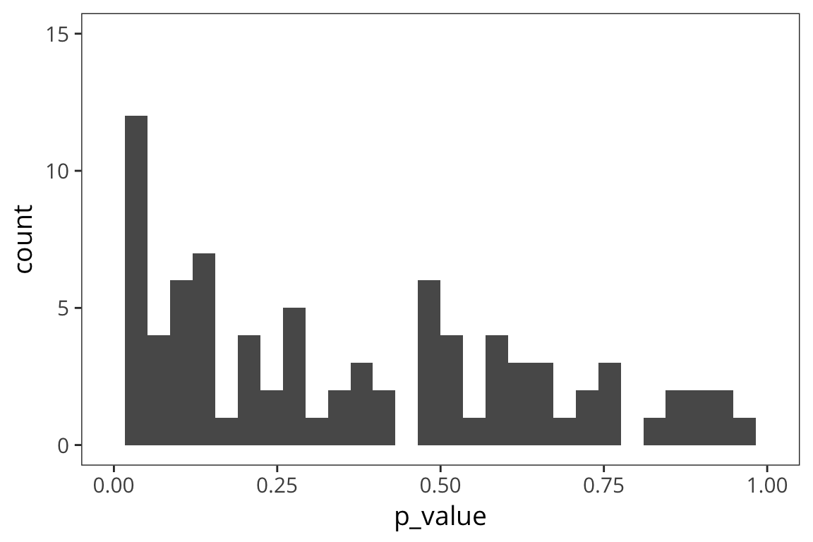
The smaller the effect, the larger the proportion of p-values above 0.05.
And of course when there is no effect…
experiment_4 <- function() {
  sample1 <- rnorm(1000, 20, 10)
  sample2 <- rnorm(1000, 20, 10)
  p_value <- t.test(sample1, sample2)$p.value
  return(p_value)
}

p_values_4 <- replicate(100, experiment_4())

ggplot(data_frame(p_value = p_values_4), aes(x = p_value)) +
  geom_histogram() +
  lims(x = c(0, 1))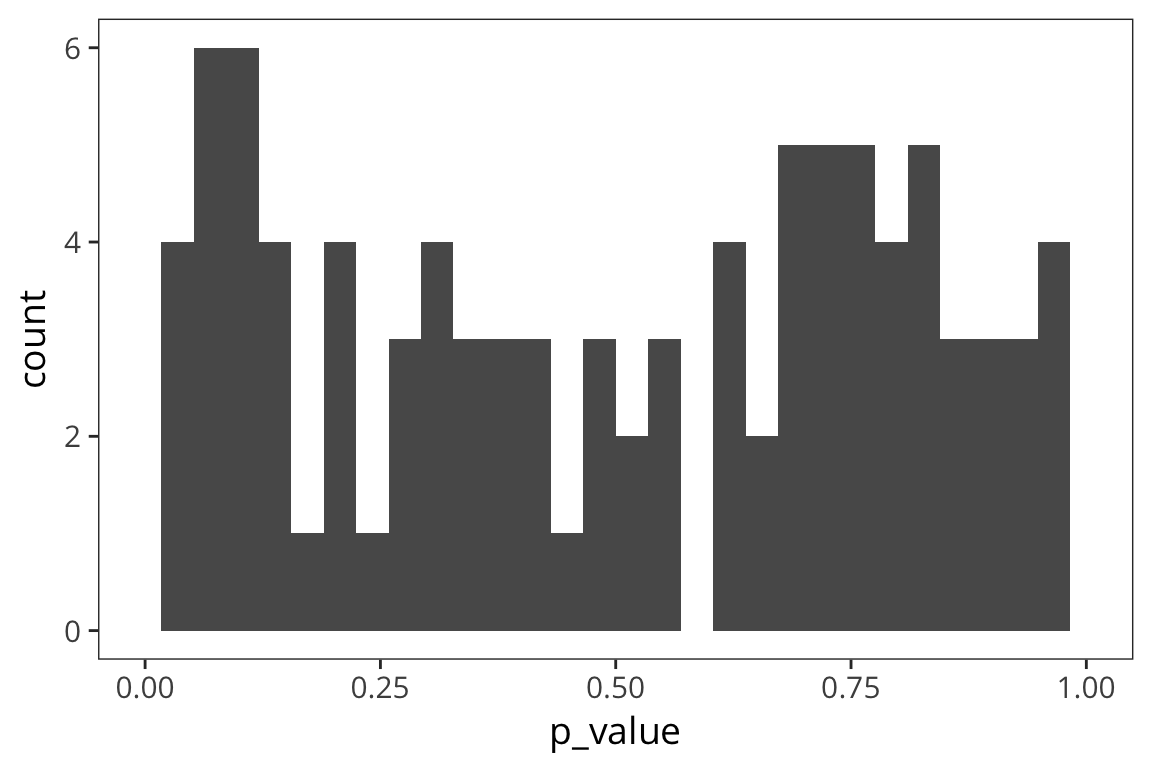
The p-values are uniformly distributed.
Note that some proportion of p-values, specifically 5%, is below 0.05 – these are Type I errors: cases where you are rejecting the null despite the fact that there is no effect.
Returning to Type II errors: when you fail to reject the null when the null hypothesis is false (\(\beta\)).
1-\(\beta\) is what is called power. Said another way, power is the probability that if an effect exists, you will find it – clearly you want power to be as high as possible for any test you run.
Effect size and sample size
Very briefly, measures of effect size, such as Cohen’s \(d\) can give you a standardized measure of how big a difference is that you can compare across studies, measures, sample sizes, etc. If you have some information about the size of the effect you’re after, either from your own prior work, or the literature, you can use that to plan an appropriately powered study:
power.t.test(delta = 1, sd = 5, power = 0.8)##
## Two-sample t test power calculation
##
## n = 393.4067
## delta = 1
## sd = 5
## sig.level = 0.05
## power = 0.8
## alternative = two.sided
##
## NOTE: n is number in *each* groupThis is saying that you would need ~393 people per condition to detect a difference in means of 1 with 80% power.
Try it yourself…
What factors affect power and how? Do some simulations to answer.
- effect size
- sample size
- alpha
So what conclusions can we draw about how we should design experiments as researchers in psycholinguistics?
- can’t do too much about \(\alpha\) because of convention and because it’s a reasonable convention that affords a good balance between Type I and Type II error rates
- you can increase your sample size
- you can try to get good measurements of your effect, with sensitive designs, so the effect size is bigger