Lab 3
Lab 2 review
Read in the data we collected in lab on the first day (
in_lab_rts_2020.csv) asrt_data.Make a new dataset
rt_data_wide, which a) doesn’t contain the “time” column and b) in which there’s one column for each word.Now take
rt_data_wideand make a new dataset,rt_data_long, which has a column for word and a column for trial. HINT: the argumentnames_sepmight be helpful.Create a new dataframe
word_typesthat has a row for every word inrt_dataand columns for the word and for indicating whether the word is real or fake.Join
rt_data_longandword_typestogether intort_data_coded.How many real and fake words were there in the experiment? How many real and fake trials were there?
library(tidyverse)

data_source <- "http://web.mit.edu/psycholinglab/www/data/"
rt_data <- read_csv(file.path(data_source, "in_lab_rts_2020.csv"))

rt_data_wide <- rt_data %>%
  select(-time) %>%
  pivot_wider(names_from = c(trial, word), values_from = rt)

rt_data_long <- rt_data_wide %>%
  pivot_longer(names_to = c("trial", "word"), names_sep = "_",
               values_to = "rt", cols = -subject)
words <- unique(rt_data$word)

word_types <- tribble(
  ~word, ~word_type,
  "book", "real",
  "noosin", "fake",
  "eat", "real",
  "goamboozle", "fake",
  "condition", "real",
  "xdqww", "fake",
  "word", "real",
  "retire", "real",
  "feffer", "fake",
  "fly", "real",
  "qqqwqw", "fake",
  "coat", "real",
  "condensationatee", "fake",
  "sporm", "fake",
  "art", "real",
  "goam", "fake",
  "gold", "real",
  "three", "real",
  "seefer", "fake",
  "sqw", "fake",
  "encyclopedia", "real",
  "understandable", "real"
)

rt_data_coded <- left_join(rt_data_long, word_types)

rt_data_coded %>%
  group_by(word_type) %>%
  summarise(n_trials = n())
## # A tibble: 2 x 2 ## word_type n_trials ## <chr> <int> ## 1 fake 160 ## 2 real 192## # A tibble: 2 x 2 ## word_type n_words ## <chr> <int> ## 1 fake 10 ## 2 real 12
Normal distribution
Normal distribution review
data_source <- "http://web.mit.edu/psycholinglab/www/data"
rts <- read_csv(file.path(data_source, "rts.csv"))

rts <- rts %>%
  mutate(RTlexdec_z = (RTlexdec - mean(RTlexdec)) / sd(RTlexdec)) %>%
  arrange(RTlexdec_z)
ggplot(rts, aes(x = RTlexdec_z)) + geom_histogram(color = "white", bins = 60)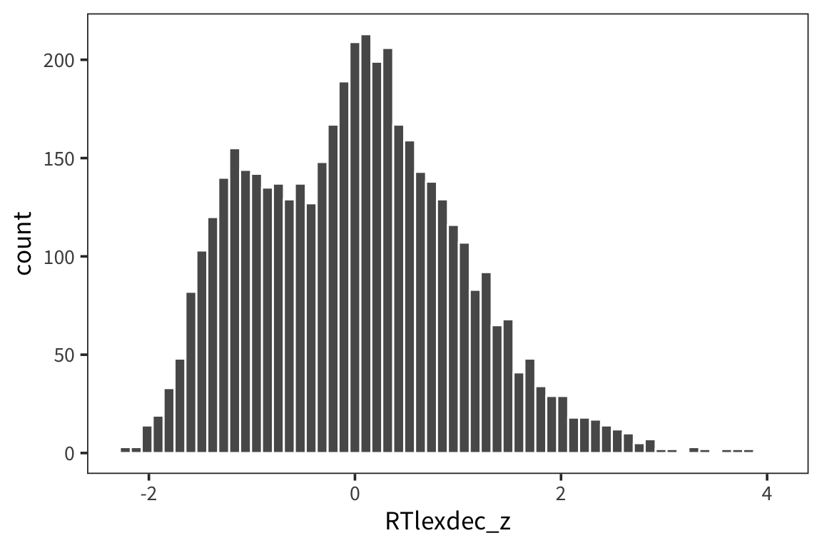
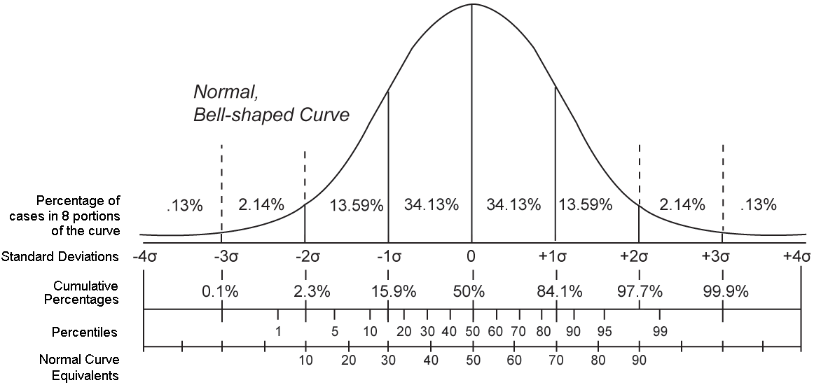
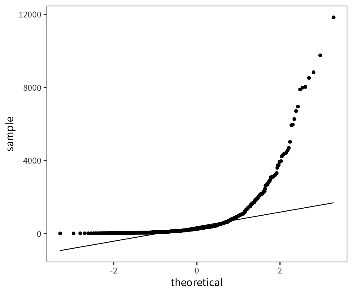
If we order all the z-scores from smallest to biggest, what z-score value do we expect 97.5th percentile.
## [1] 2.089744## [1] 1.959964And conversely we can get the proportion of values below a particular score:
## [1] 0.9676007## [1] 0.9750021R gives us this function pnorm(), which says the probability that a number drawn from the standard normal distribution is this value or lower.
Try it yourself…
What is the probability that a number drawn from a standard normal is smaller than 3 and larger than -3?
## [1] 0.9973002Central Limit Theorem
The amazing thing about the normal distribution is how often it comes up. Possibly the most fundamental concept in statistics is the Central Limit Theorem and it explains why we see normal distributions everywhere when we are sampling and summarizing data.
The Central Limit Theorem tells us the following: Given any distribution of some data (including very non-normal distributions), if you take samples of several data points from that distribution and get means of those samples, those means will be normally distributed. This is also true of sds, sums, medians, etc. In addition, the larger the number of data points in your samples, the more the distribution of sample means will be more tightly centered around \(\mu\).
Let’s look at an example to see why this is true.
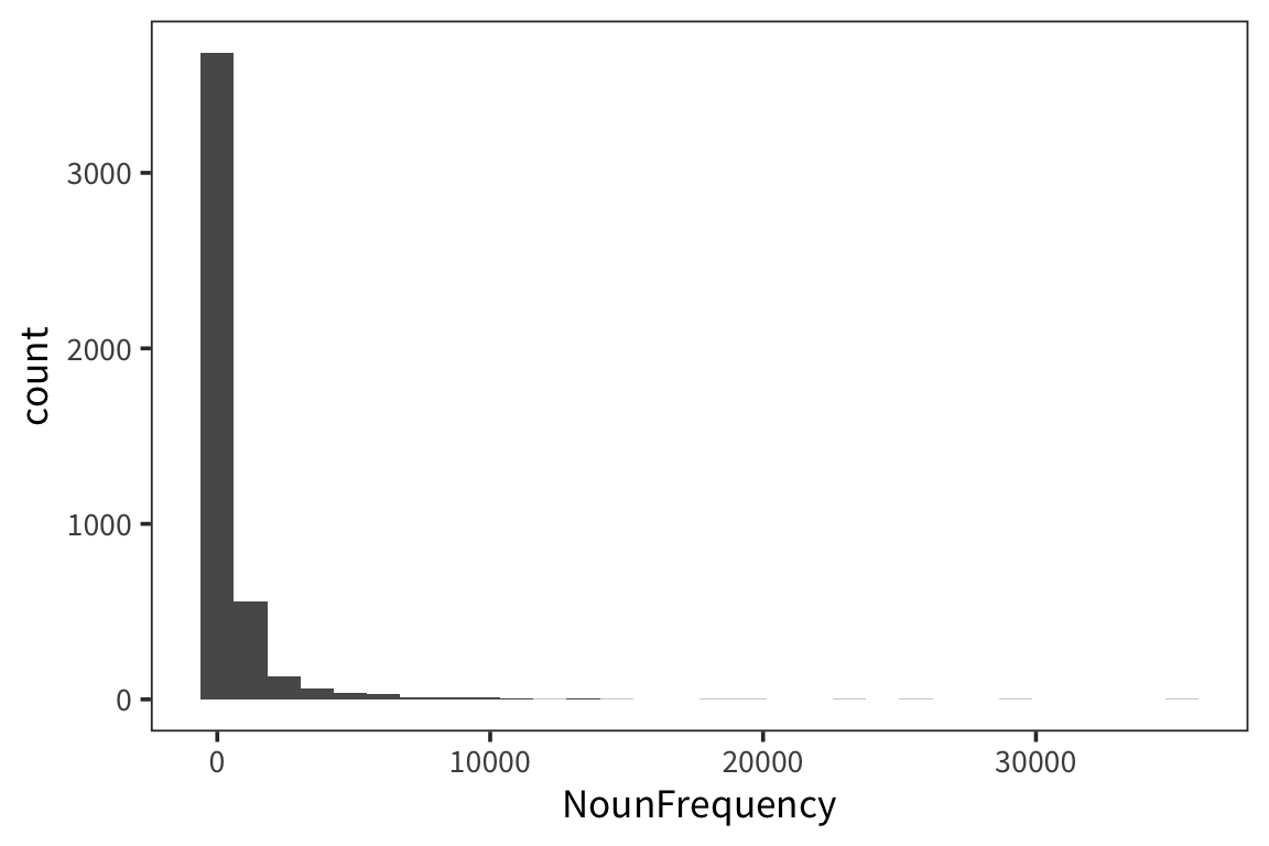
## [1] 600.1883Let’s draw a bunch of subsamples of the data, and take the mean of each subsample. Then we can look at the distribution over means.
## [1] 584.6526## [1] 644.1147 558.5267 587.0854 559.3321 605.4606 608.6640 568.6243
## [8] 597.8654 588.7524 676.0407sample_mean <- function(values, sample_size) {
samples <- sample(values, sample_size, replace = TRUE)
return(mean(samples))
}
sample_means <- function(values, num_samples, sample_size) {
replicate(num_samples, sample_mean(values, sample_size))
}I’m estimating what the distribution of NounFrequency sample means looks like by looking at some number num_samples of samples of size size_of_sample drawn with replacement from my dataset.
Now let’s look at a few different distributions to get a sense of how the estimation is affected by the size of the samples and the amount of resampling.
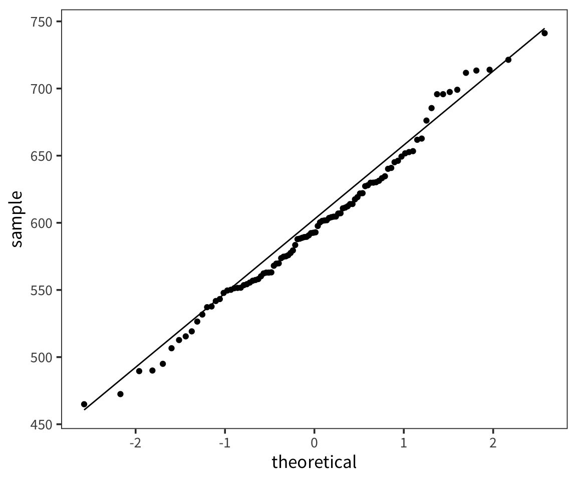
So we can think of data collection during experiments as samples from that underlying distribution. Our goal is to find out its parameters, usually we’re most interested in the location (e.g. mean) but not always. You can see that the size of our sample is going to have an effect on how close we are to the true mean. When we “collected data” from 3 participants we got some pretty out there sample means and so our estimate was way off. But when we “collected” larger samples we were approximating the true mean much more closely.
Try out different distributions and statistics: http://onlinestatbook.com/stat_sim/sampling_dist/.
Parameter estimation
Confidence intervals
Even if what we really care about is the mean of a sample (for example, what is the average height of humans?), we still need to know how spread out that distribution of the sample means is. In particular we want to know how good our estimate of \(\mu\) is.
Are we in this case?
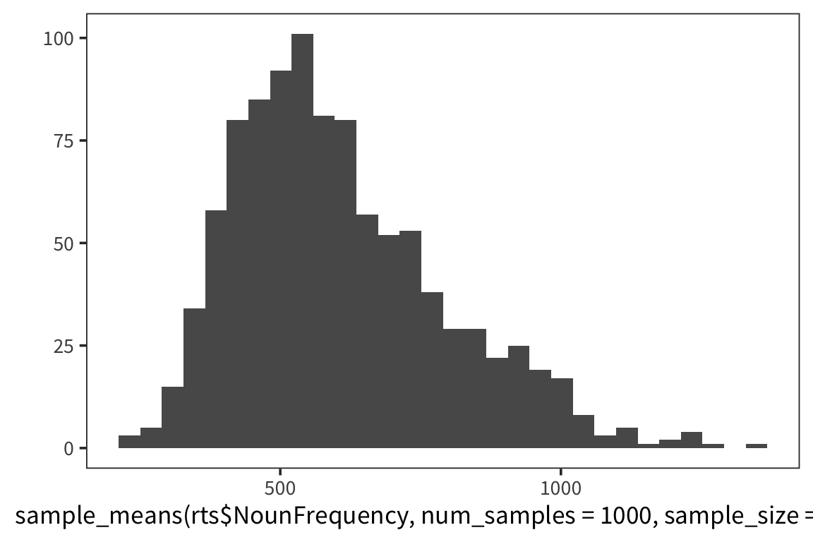
means_100 <- sample_means(rts$NounFrequency, 100, 100)
qplot(means_100, geom = "histogram") +
  lims(x = c(200, 1200))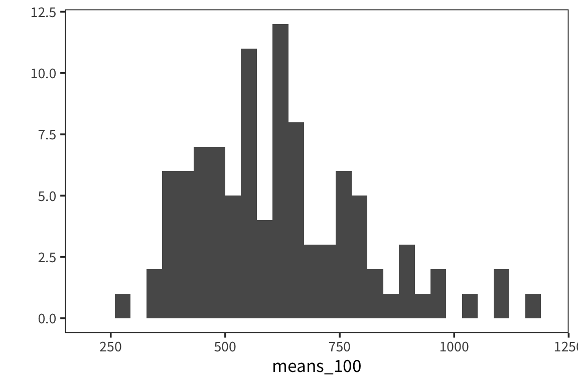
## [1] 162.6519Or this case?
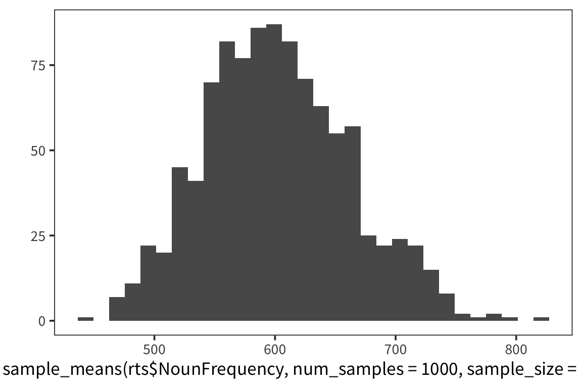
means_10000 <- sample_means(rts$NounFrequency, 100, 10000)
qplot(means_10000, geom = "histogram") +
  lims(x = c(200, 1200))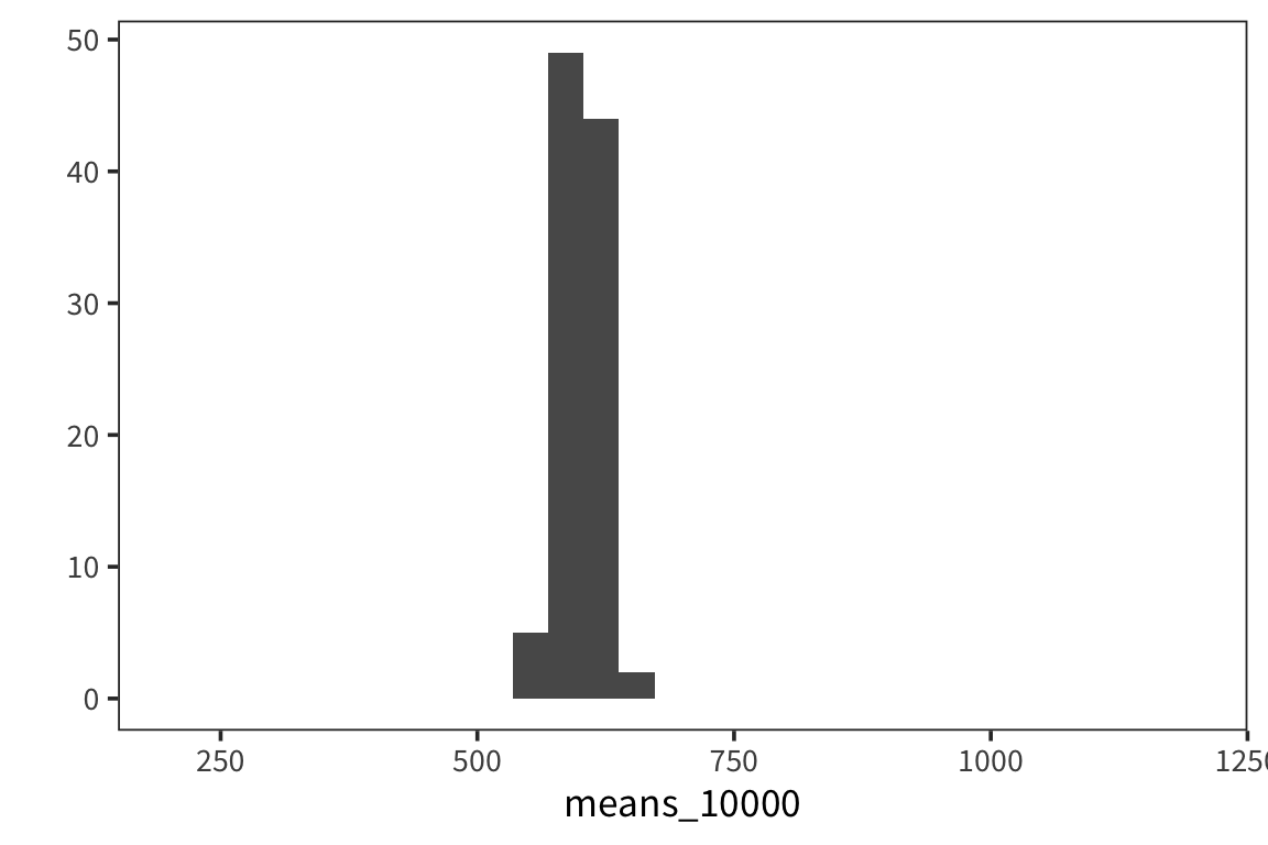
## [1] 18.51507As you can see, the spread of the distribution of sample means is much smaller for the second case and the estimate of the mean is closer to the true mean. So the standard deviation of the distribution of sample means, \(\sigma_x\), is inversely related to the size of the sample. When you run an experiment, you can get the standard deviation of that sample, \(s\), but you don’t know \(\sigma_x\), unless you run say 100 experiments. The best you can do with one experiment is to estimate \(\sigma_x\) with the standard error, \(SE = \frac{s}{\sqrt{n}}\). This is going to vary from sample to sample and this extra level of uncertainty is why we use the t-distribution for most inferential stats because when you use a small sample size, the estimates are further off. So the t-distribution is introduced as a correction to the normal that places more weight on the tails of the distribution. We’ll come back to this.
If you are getting confused between \(s\) and \(\sigma\) that’s because it is a bit confusing. In practice when you’re calculating the standard error of the data in your experiment, you will take the sd() of your sample values and divide it by the sqrt() of your sample size, n. Or you can bootstrap (see below).
Let’s say we collected some data d (note: when you want to be able to generate random numbers but then reproduce the calculations exactly you can use set.seed(x) where x is a number of your choosing):
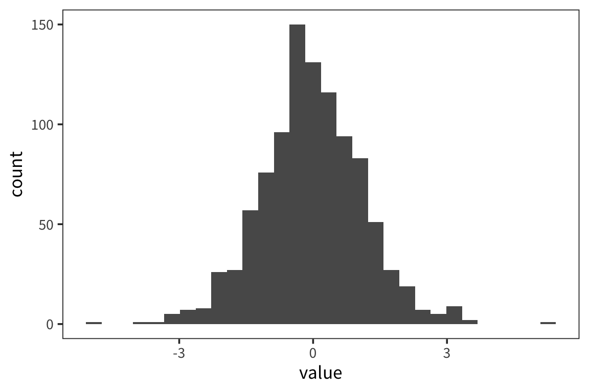
## [1] 100## [1] 20.77984## [1] 0.5000739ggplot(d) +
geom_histogram(aes(x = value), color = "white") +
geom_vline(xintercept = 20, linetype = "dotted")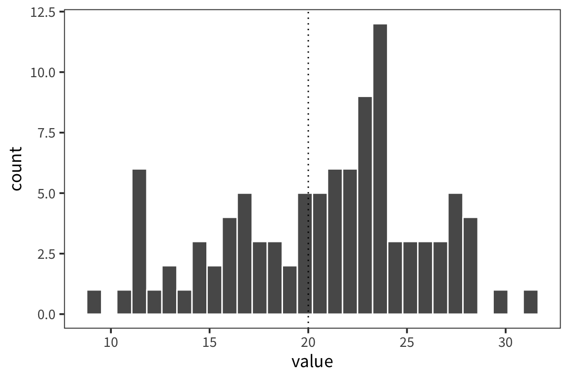
Since \(SE\) is an estimate of the SD of the distribution of the sample means, you can use it to identify the amount of data that fall between the mean and the mean + 1 SE or the mean - 1 SE. If you created an interval centered around the sample mean with 1 SE on each side, 68% of the data should fall in that interval, and about 95% lies between mean - 2 SE and mean + 2 SE. This is what people call a 95% Confidence Interval.
## [1] 21.75997## [1] 19.79971So the interpretation is that we can have 95% confidence that the true mean of d lies between 19.8 and 21.76. We can compare this to what we would get if we just resampled from data d and got a distribution of sample means and looked at the interval centered at the mean that would contain 95% of the values.
d_means <- tibble(mean_value = sample_means(d$value, 1000, nrow(d)))

mean(d$value) + qnorm(0.975) * sd(d_means$mean_value)
## [1] 21.81186## 97.5%
## 21.84143## [1] 21.81186## 2.5%
## 19.78541ggplot(d_means) +
geom_histogram(aes(x = mean_value), color = "white") +
geom_vline(xintercept = ci_upper_boot, color = "red") +
geom_vline(xintercept = ci_lower_boot, color = "red") +
geom_vline(xintercept = 20, linetype = "dotted")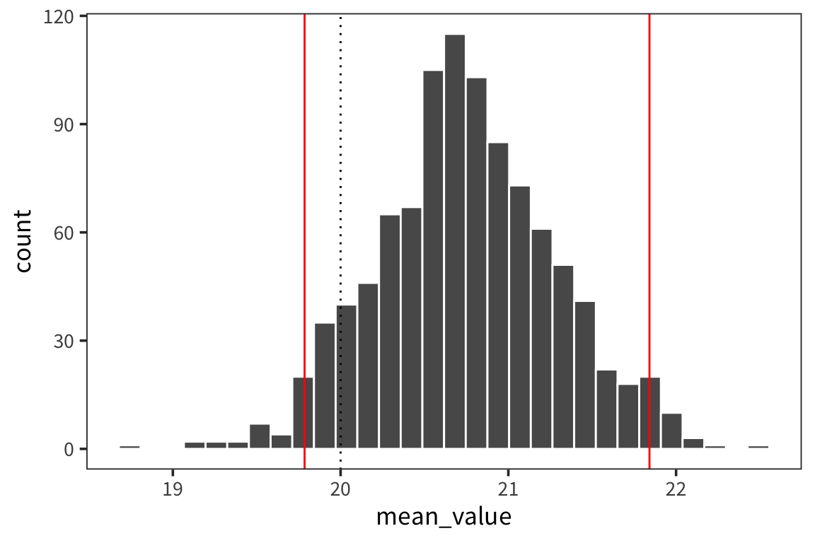
ggplot(d_means) +
  geom_histogram(aes(x = mean_value), color = "white") +
  geom_vline(xintercept = ci_upper_boot, color = "red") +
  geom_vline(xintercept = ci_lower_boot, color = "red") +
  geom_vline(xintercept = ci_upper, color = "blue") +
  geom_vline(xintercept = ci_lower, color = "blue") +
  geom_vline(xintercept = 20, linetype = "dotted")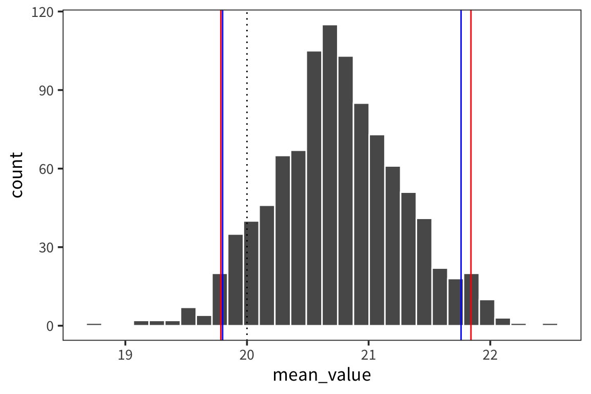
So the way to interpret these confidence intervals is that you can think of a researcher running experiments over and over to get at the true mean of some distribution of response times, let’s say. Every time the researcher runs an experiment, i.e. takes a sample form the distribution, she gets a mean and an SE and computes a 95% CI. In the long run, 95% of those CIs will contain the true mean of the population.
See also:
Error bars
I mentioned before when we were talking about data visualization, that often we want to provide some information about the spread of the data as well as the average. Now that we know how to compute CIs we can add them to our plots in the form of error bars.
category_rts <- rts %>%
  group_by(WordCategory) %>%
  summarise(mean_rt = mean(RTlexdec),
            se_rt = sd(RTlexdec) / sqrt(n()))

ggplot(category_rts, aes(x = WordCategory, y = mean_rt)) +
  geom_point()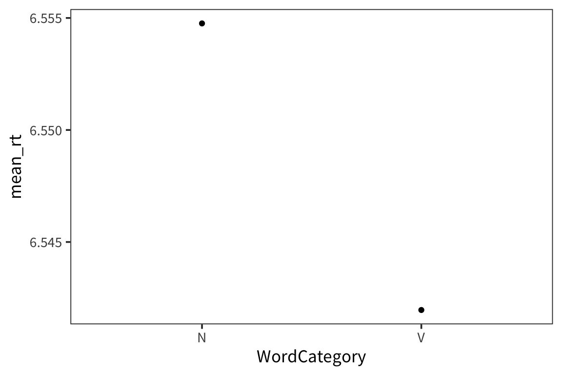
ggplot(category_rts, aes(x = WordCategory, y = mean_rt)) +
  geom_pointrange(aes(ymin = mean_rt - se_rt * 1.96,
                      ymax = mean_rt + se_rt * 1.96))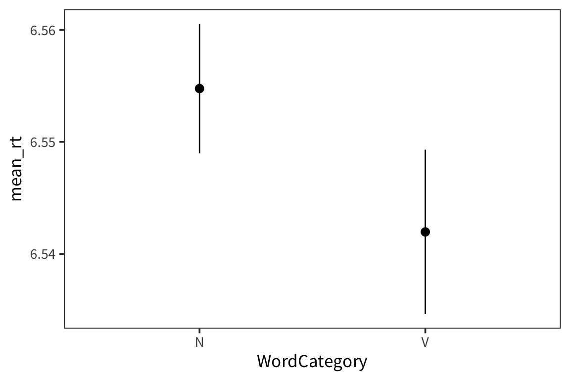
Try it yourself…
Using the in-class RT data, make a plot with the mean RT for each subject and 95% CI error bars.
in_lab_rts <- read_csv(file.path(data_source, "in_lab_rts_2020.csv"))

subject_rts <- in_lab_rts %>%
  group_by(subject) %>%
  summarise(mean_rt = mean(rt),
            se_rt = sd(rt) / sqrt(n()))

ggplot(subject_rts, aes(x = subject, y = mean_rt)) +
  geom_pointrange(aes(ymin = mean_rt - se_rt * 1.96,
                      ymax = mean_rt + se_rt * 1.96))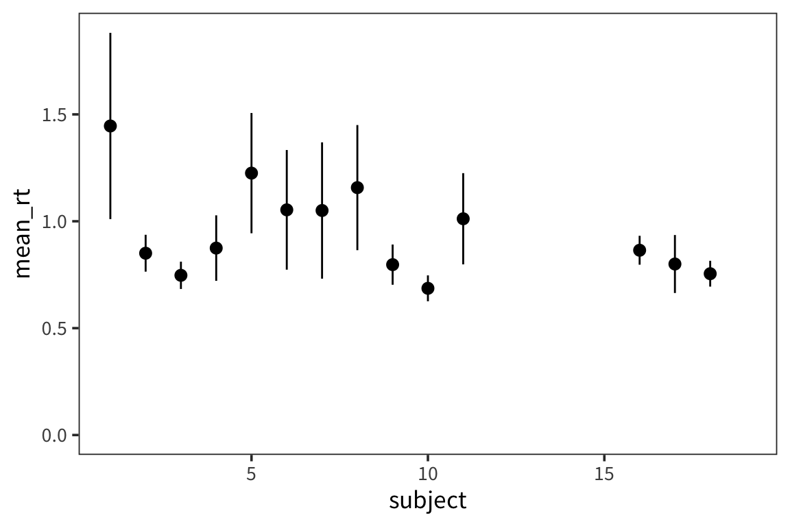
The t-distribution
We used a fairly large sample size in the previous example. What if we have a smaller sample size?
## [1] 5## [1] 17.463## [1] 1.754804ggplot(d_5) +
geom_histogram(aes(x = value), color = "white") +
geom_vline(xintercept = 20, linetype = "dotted")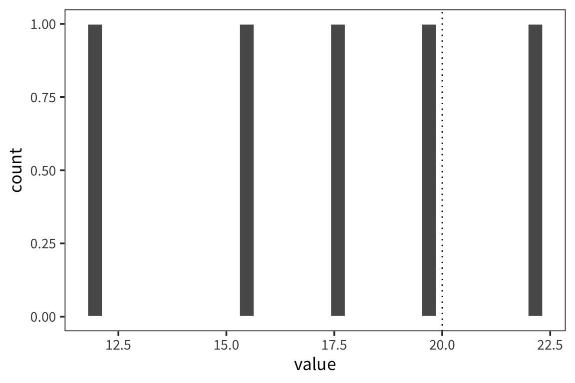
## [1] 20.90236## [1] 14.02365d_5_means <- tibble(mean_value = sample_means(d_5$value, 1000, nrow(d_5)))
mean(d_5$value) + qnorm(0.975) * sd(d_5_means$mean_value)## [1] 20.46471## 97.5%
## 22.07458## [1] 14.46129## 2.5%
## 12.46223ggplot(d_5_means) +
geom_histogram(aes(x = mean_value), color = "white", binwidth = 0.1) +
geom_vline(xintercept = ci_upper_boot_5, color = "red") +
geom_vline(xintercept = ci_lower_boot_5, color = "red") +
geom_vline(xintercept = 20, linetype = "dotted")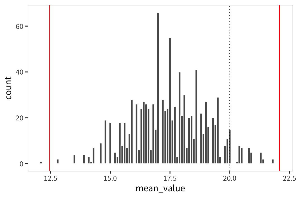
ggplot(d_5_means) +
  geom_histogram(aes(x = mean_value), color = "white", binwidth = 0.1) +
  geom_vline(xintercept = ci_upper_boot_5, color = "red") +
  geom_vline(xintercept = ci_lower_boot_5, color = "red") +
  geom_vline(xintercept = ci_upper_5, color = "blue") +
  geom_vline(xintercept = ci_lower_5, color = "blue") +
  geom_vline(xintercept = 20, linetype = "dotted")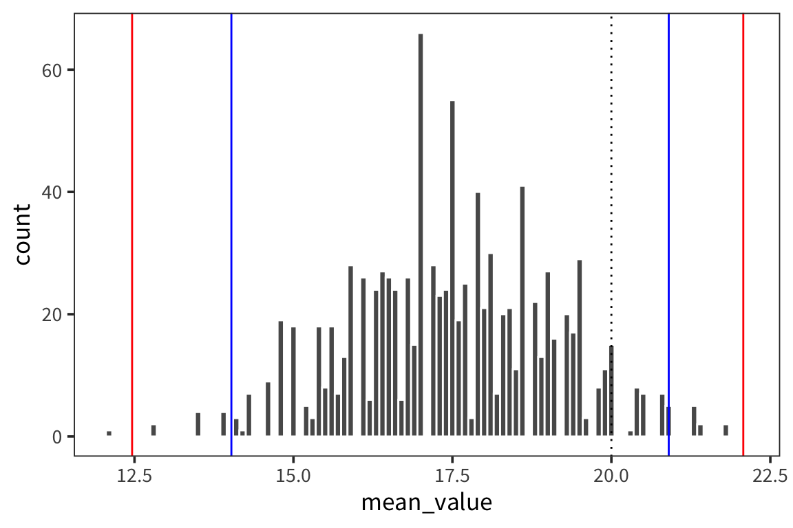
When you use a small sample size, the estimates are further off. The sd is going to vary more with each sample, so the t-distribution is introduced as a correction to the normal that places more weight on the tails of the distribution. This t-distribution is formally defined by the degrees of freedom (sample size minus 1).
## [1] 22.33512## [1] 12.59088ggplot(d_5_means) +
geom_histogram(aes(x = mean_value), color = "white") +
geom_vline(xintercept = ci_upper_boot_5, color = "red") +
geom_vline(xintercept = ci_lower_boot_5, color = "red") +
geom_vline(xintercept = ci_upper_5, color = "blue") +
geom_vline(xintercept = ci_lower_5, color = "blue") +
geom_vline(xintercept = t_ci_upper_5, color = "blue", linetype = "dotted") +
geom_vline(xintercept = t_ci_lower_5, color = "blue", linetype = "dotted")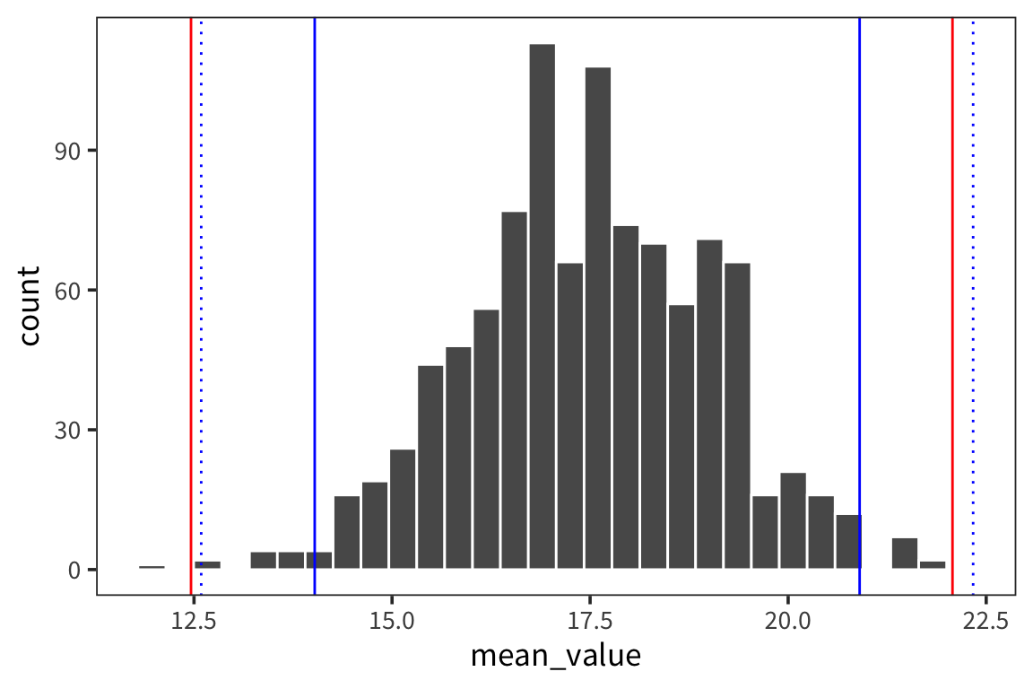
You can see that the interval is wider which is good because it reflects our greater uncertainty about the estimates. The t-distribution becomes more like the normal distribution in shape as sample size increases (see http://rpsychologist.com/d3/tdist/ for a visualization).
R has a series of functions for the t-distribution, same as for the normal:
We get the probability of values of x or lower under a t-distribution using pt:
## [1] 0.9617236We can get the value such that 97.5% of values drawn from a t-distribution are less than that value – the quantile – with qt:
## [1] 2.262157Bootstrapping
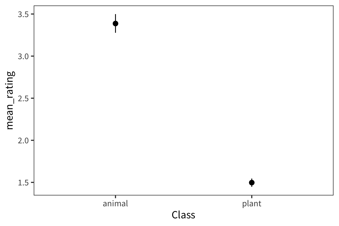
We’re interested in the weight ratings of two different groups of nouns, animals and plants, and in whether the rating of the two groups are significantly different. We can look at the distribution of each group’s ratings.
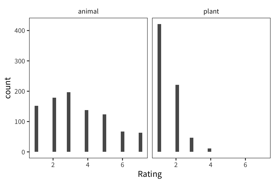
They look pretty different, but how to do we actually compare them? A natural starting point is the mean of the two groups.
## # A tibble: 2 x 2
##   Class  mean_rating
##   <fct>        <dbl>
## 1 animal        3.39
## 2 plant         1.50
This doesn’t let us conclude anything – how far apart do the means have to be to count as same/different? If we took another sample from the same population, how far away would its mean be? So we want some way of knowing how good our sample mean is at estimating the actual true population mean.
If we could take a lot of samples from the underlying population, we could get a pretty good idea. But all we have to work with is the one sample we collected. How can we use that one sample to simulate having many samples? One way to do that is to resample it with replacement and take the mean (or whatever statistic of interest) of the resample. Repeat this many times to get a distribution of resample means (the sampling distribution of the statistic), and use that distribution to derive a confidence interval.
Let’s try this for one group:
## [1] 3.386957## [1] 3.3resample_means <- replicate(1000, mean(sample(animals$Rating, replace = TRUE)))
animal_means <- tibble(mean_rating = resample_means)
animal_lower <- quantile(resample_means, 0.025)
animal_upper <- quantile(resample_means, 0.975)
ggplot(animal_means, aes(x = mean_rating)) +
geom_histogram(colour = "white") +
geom_vline(xintercept = animal_lower, linetype = "dotted") +
geom_vline(xintercept = animal_upper, linetype = "dotted")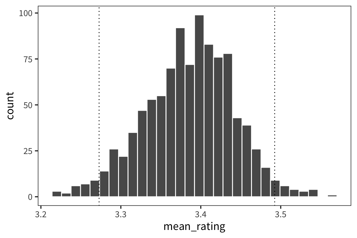
Now let’s set this up in a more general way:
resample_mean <- function(values) {
  samples <- sample(values, replace = TRUE)
  return(mean(samples))
}

resample_means <- function(values, num_samples) {
  replicate(num_samples, resample_mean(values))
}

ci_lower <- function(values) quantile(values, 0.025)
ci_upper <- function(values) quantile(values, 0.975)
What are the CIs of our data?
weight_summary <- weightRatings %>%
  group_by(Class) %>%
  summarise(mean_rating = mean(Rating),
            ci_lower_mean = ci_lower(resample_means(Rating, 1000)),
            ci_upper_mean = ci_upper(resample_means(Rating, 1000)))
weight_summary
## # A tibble: 2 x 4
## Class mean_rating ci_lower_mean ci_upper_mean
## <fct> <dbl> <dbl> <dbl>
## 1 animal 3.39 3.28 3.50
## 2 plant 1.50 1.45 1.55ggplot(weight_summary, aes(x = Class)) +
geom_pointrange(aes(y = mean_rating, ymin = ci_lower_mean,
ymax = ci_upper_mean))