Problem set 3 solutions
The goal of this problem set is to get you comfortable doing some exploratory data analysis and significance testing in R. As usual, you should turn in a knit pdf or html with your code and answers.
In the first problem set, you used the reaction times data set. Look at problem set 1 to figure out how to load the RTs into R. You may want to re-use some of your code from that problem set to answer the questions below. As before, RT refers to RTlexdec.
Plot a histogram to look at the distribution of RTs in the data set. Make sure the number of bins is such that you can clearly see the distribution. Do RTs appear to be normally distributed? How many ‘peaks’ are there in the distribution?
Not normally distributed: 2 peaks.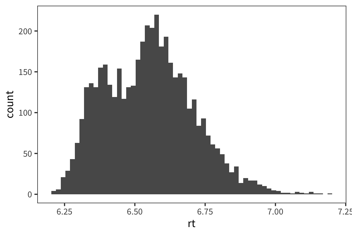
Now use facetting to make separate histograms for young and old subjects. What does this reveal about the first histogram? Do the young person data look normally distributed?
The two peaks are probably due to two different distributions -- one for young, one for old -- being lumped together. The young distribution is not quite normal: it is skewed to the right (so that the weight is to the left).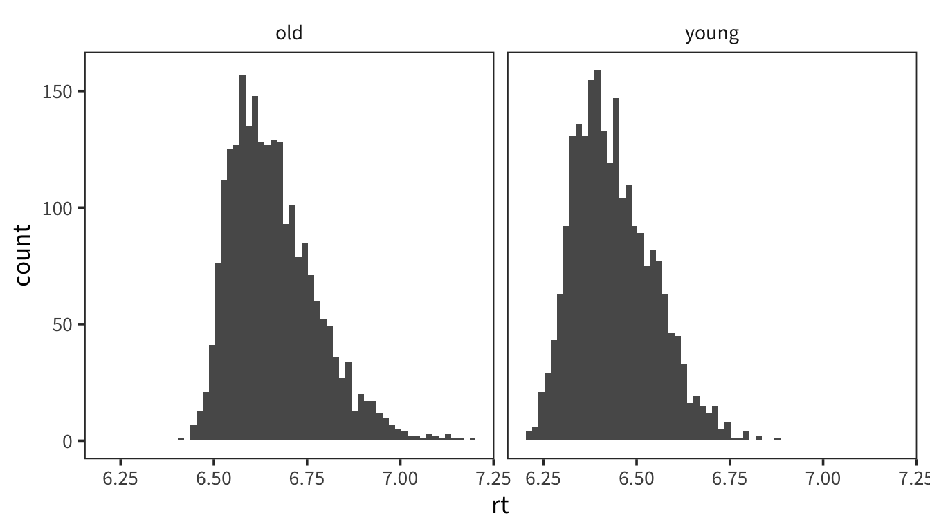
IMPORTANT: For all remaining questions, use only the young subject data. That is, throw out the old subjects. Now (as in problem set 1) calculate z-scores for each of the data points. Remember that the z-score is \(\frac{x - \mu}{s}\). If the data were normally distributed, what percentage of the data would you expect to have a z-score greater than 1.96? Less than -1.96?
If the data were normally distributed, 2.5% of the data would you expect to have a z-score greater than 1.96 and another 2.5% less than -1.96.rts_young <- rts %>% filter(AgeSubject == "young") rts_young_z <- rts_young %>% mutate(z_rt = (rt - mean(rt)) / sd(rt))What percentage of the data actually has a z-score above 1.96? What percentage is actually below -1.96? If one of these things is very different from what you expect (hint, hint), why might that be the case?
2.5
2.5
rts_young_outliers <- rts_young_z %>%
  mutate(place_in_dist = if_else(z_rt > 1.96, "above 1.96",
                                 if_else(z_rt < -1.96, "below -1.96",
                                         "in between")))

rts_young_outliers %>%
  group_by(place_in_dist) %>%
  summarise(count = n(),
            percent = 100 * count / nrow(rts_young_outliers))
More than 2.5% of z-scores are above 1.96 and less than 2.5% of z-scores are below -1.96, which suggest that the distribution is skewed. This may be due to a floor effect: reaction times cannot be negative.What percentage of words, if the data were normally distributed, would have a z-score higher than 3? Look at the words that DO have a z-score higher than 3. Why do you think they do?
0.135
rts_young_high <- rts_young_z %>% mutate(above_3 = z_rt > 3) rts_young_high %>% group_by(above_3) %>% summarize(count = n(), percent = 100 * count / nrow(rts_young_high))0.13% of z-scores would be above 3 in a normal distribution. Here it is 0.39% of z-scores, which points to a non-normal distribution. The words with high z-scores are very low frequency words.Compare the median and mean of young people RTs. How close are they? Now compare the median and mean of the column NounFrequency. What’s going on here? (i.e. why the big difference in one case?). It may be helpful to plot the distribution.
6.439
6.426
600.2
108
The RT mean and median are almost the same. The Noun Frequency distribution appears to be very right skewed because the median is much less than the mean.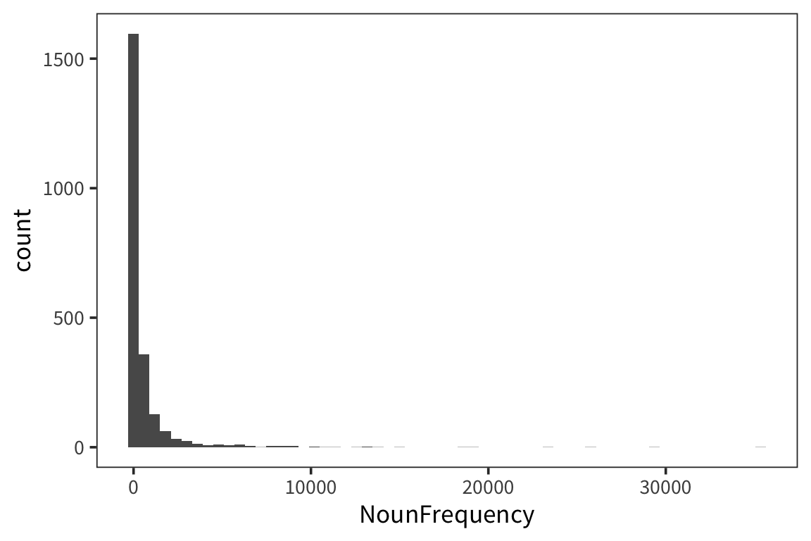
We previously looked at the mean RT for words that start with ‘p’ vs all other words. Do a two-sided (i.e. default) t-test using
t.test()on the ‘p’ word RTs vs the other RTs to see if the difference is significant. Report the t-value and the p-value, and say whether it is significant at 95%. What can we conclude based on this?rts_young_p <- rts_young_z %>% mutate(starts_p = str_sub(Word, 1, 1) == "p") t.test(rt ~ starts_p, data = rts_young_p)
The p-value isn't below 0.05, so we can't conclude anything.## ## Welch Two Sample t-test ## ## data: rt by starts_p ## t = 1.4815, df = 218.81, p-value = 0.1399 ## alternative hypothesis: true difference in means is not equal to 0 ## 95 percent confidence interval: ## -0.003363989 0.023733823 ## sample estimates: ## ## ------------------------------------------ ## mean in group FALSE mean in group TRUE ## --------------------- -------------------- ## 6.44 6.43 ## ------------------------------------------Using
ggplot, create a boxplot comparing noun RTs to verb RTs. Do the outliers generally appear above or below? Why? Run the functionfivenum()on the data and compare to the boxplot values.
6.205, 6.364, 6.431, 6.519 and 6.879
6.205, 6.352, 6.417, 6.496 and 6.825
Outliers appear above, because there is no limit to how slow you can be (but there is a limit to how fast you can be).Create a plot with error bars showing 95% confidence intervals for the mean noun RT vs. the mean verb RT.
rts_young_summary <- rts_young_z %>%
  group_by(WordCategory) %>%
  summarise(mean_rt = mean(rt),
            se_rt = sd(rt) / sqrt(n()),
            ci_upper_rt = mean_rt + 1.96 * se_rt,
            ci_lower_rt = mean_rt - 1.96 * se_rt)

ggplot(rts_young_summary, aes(x = WordCategory, y = mean_rt)) +
  geom_pointrange(aes(ymin = ci_lower_rt, ymax = ci_upper_rt))
There is very little difference between the means.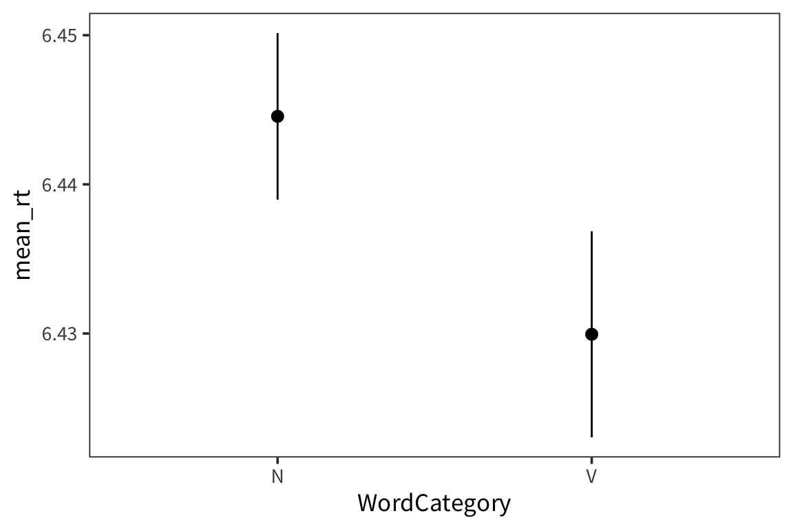
Make a boxplot (one box for each letter) showing the mean RT for each initial letter of the word, i.e. one box for ‘a’, one for ‘b’, one for ‘c’, etc.
rts_young_letters <- rts_young_z %>%
  mutate(starting_letter = str_sub(Word, 1, 1))

ggplot(rts_young_letters, aes(x = starting_letter, y = rt)) +
  geom_boxplot()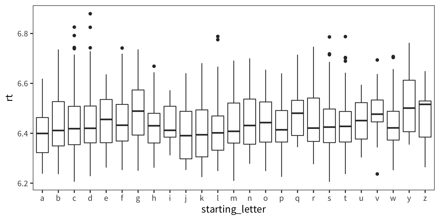
Compare RTs for words that start with 2 consonants to the RTs of all other words (i.e. any word that starts with something other than 2 consonants). Using an appropriate test of your choice, give a reasonable discussion of whether that difference is significant.
rts_young_consonants <- rts_young_z %>%
  mutate(two_consonants = str_detect(Word, "^[^aeiou][^aeiou]"))

t.test(rt ~ two_consonants, data = rts_young_consonants)
The difference is significant by a t-test: responses to words that start with two consonants are slower than responses to other words. Reasonably possible that there is some difference but it could also be frequency or some other confound. Also, huge number of degress of freedom, so even very small differences are significant.## ## Welch Two Sample t-test ## ## data: rt by two_consonants ## t = -3.9715, df = 1832, p-value = 7.419e-05 ## alternative hypothesis: true difference in means is not equal to 0 ## 95 percent confidence interval: ## -0.027113617 -0.009187092 ## sample estimates: ## ## ------------------------------------------ ## mean in group FALSE mean in group TRUE ## --------------------- -------------------- ## 6.432 6.45 ## ------------------------------------------