Lab 5
9.59 Lab in Psycholinguistics
Lab 4 review
Recall that last lab we learned about hypothesis testing, using t-values and p-values. The basic logic of null hypothesis testing is that we choose some uninteresting null hypothesis, like the difference between two group being 0. Then we show that, under this uninteresting hypothesis, the data that we have are very unlikely. If the probability of our data under the null hypothesis is below some threshold (chosen by convention to be 0.05), we say that we have a significant effect. The idea is that the observed difference leads us to conclude, from the sheer unlikeliness of our data under the null hypothesis, that the null hypothesis is false, and something else must be true.
To figure out this probability, we convert our mean into a t-statistic: \(\frac{\bar{x}-\mu}{\frac{s}{\sqrt{n}}}\), which is distributed according to a t-distribution with \(n-1\) degrees of freedom. Then we get the probability of a t-distribution generating our t-value or greater, or -t-value or lesser. This is called a t-test and run with t.test().
We also talked about power – if there is a real effect, how likely are you to detect it? Underpowered studies are likely to be waste of time and resources (and your sanity). To review these concepts, we’re going to run some simulations seeing how power is affected by sample size and effect size.
Simulate how power changes across sample sizes for a two-sample t-test.
Plot your results (sample size on the x axis, power on the y axis). How does sample size affect power?
Abstract the effect size in your experiment into an argument. Simulate and plot how power changes across effect sizes. How does effect size affect power?
experiment <- function(group_size) { # sample data of group size from each of two groups with different means # return p-value of t-test comparing them } power <- function(group_size) { # run experiment 100 times # return the percentage of experiments that have significant p-values } power_n <- tibble(group_size = 2:200) %>% mutate(power = map_dbl(group_size, power)) ggplot(power_n) # add plot structure power_d <- tibble(d = (1:200)/100) %>% mutate(power = map_dbl(d, ~power(20, .))) ggplot(power_d) # add plot structurelibrary(tidyverse) experiment <- function(group_size) { sample1 <- rnorm(group_size, 0, 1) sample2 <- rnorm(group_size, 0.5, 1) p_value <- t.test(sample1, sample2)$p.value return(p_value) } power <- function(group_size) { p_values <- replicate(100, experiment(group_size)) num_sig <- sum(p_values < 0.05) / 100 return(num_sig) } power_n <- tibble(group_size = 2:200) %>% mutate(power = map_dbl(group_size, power)) ggplot(power_n, aes(x = group_size, y = power)) + geom_hline(yintercept = 0.8, colour = "grey", linetype = "dotted") + geom_point() + geom_smooth()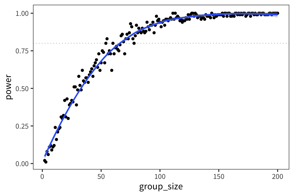
experiment <- function(group_size, d) {
  sample1 <- rnorm(group_size, 0, 1)
  sample2 <- rnorm(group_size, d, 1)
  p_value <- t.test(sample1, sample2)$p.value
  return(p_value)
}

power <- function(group_size, d, alpha) {
  p_values <- replicate(100, experiment(group_size, d))
  num_sig <- sum(p_values < alpha) / 100
  return(num_sig)
}

power_d <- tibble(d = (1:200)/100) %>%
  mutate(power = map_dbl(d, ~power(20, ., 0.05)))

ggplot(power_d, aes(x = d, y = power)) +
  geom_hline(yintercept = 0.8, colour = "grey", linetype = "dotted") +
  geom_point() +
  geom_smooth()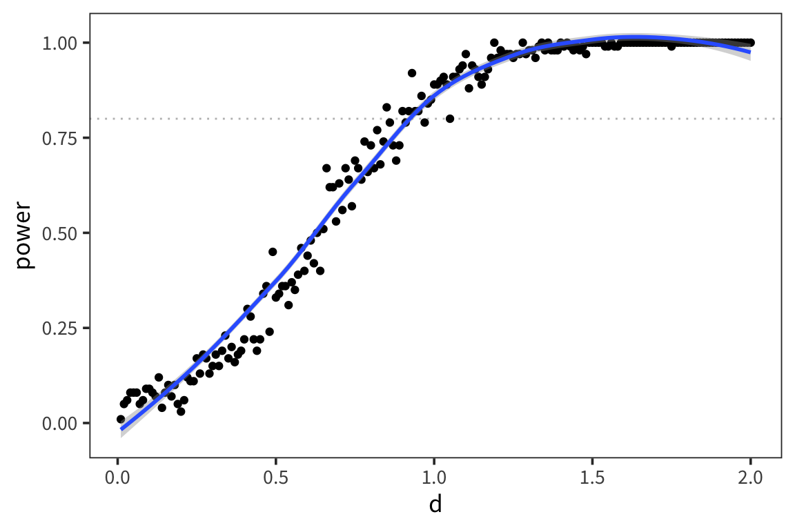
More relevant simulations: http://rpsychologist.com/d3/NHST/
So what conclusions can we draw about how we should design experiments as researchers in psycholinguistics?
- can’t do too much about \(\alpha\) because of convention and because it’s a reasonable convention that affords a good balance between Type I and Type II error rates
- you can increase your sample size
- you can try to get good measurements of your effect, with sensitive designs, so the effect size is bigger / the variability is smaller
Multiple comparisons
One thing that’s come up recently in the literature is the issue of multiple comparisons. Here’s a way researchers sometimes plan studies: I want to see if group A differs from group B in cognitive ability X, but I don’t know exactly how to measure X. I’ll collect response time, and accuracy, and time spent on response, and also, since none of those might work out, I’ll collect some measures of IQ and favorite dog breed. Then I’ll see which of those yields significant differences!
Do you see the problem here?
We know that you can get p-values < 0.05 when the null hypothesis is true, so what happens when we run lots of tests?
experiment <- function() {
  sample1 <- rnorm(50, 0, 1)
  sample2 <- rnorm(50, 0, 1)
  p_value <- t.test(sample1, sample2)$p.value
  return(p_value)
}

tests <- function(num_test) {
  p_values <- replicate(num_test, experiment())
  num_sig <- sum(p_values < 0.05)
  return(num_sig)
}

mult_comp <- tibble(num_test = 1:100) %>%
  mutate(num_sig = map_dbl(num_test, tests))

ggplot(mult_comp, aes(x = num_test, y = num_sig)) +
  geom_point() +
  geom_smooth(method = "lm")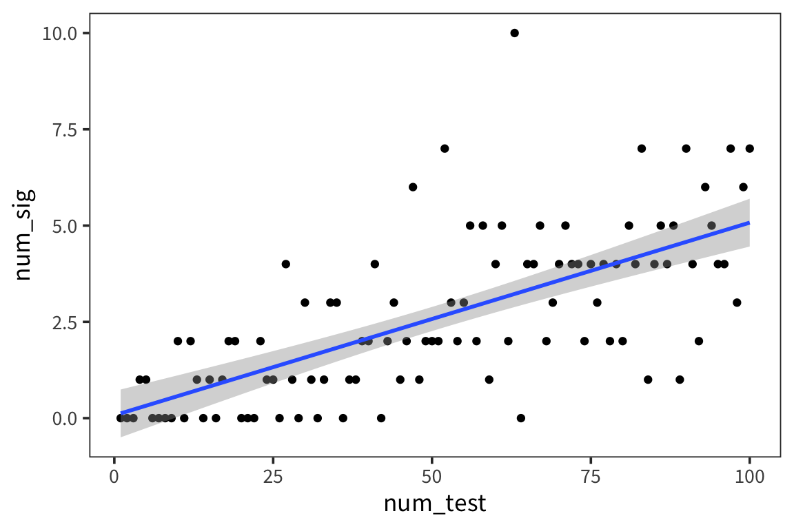
As you can see, as you run more and more tests, the number of significant p-values increases. So if you throw in enough stuff in your experiment, you’re pretty much bound to find a p-value less than 0.05. The lesson isn’t that you should just have lots of comparisons in your experiments. The lesson is that the threshold of 5% is no longer appropriate when you have multiple comparisons.
There are ways to correct alpha level (Bonferroni, FDR, etc..) but they shouldn’t be used as a one-size-fits-all solution.
Linear regression
Continuous predictors
So far we’ve looked at the types of data where you have samples groups and you want to know if they were generated by the same generative process or two separate ones. But a lot of questions in psycholinguists can’t really be answered in this way. For instance, you can’t use a t-test to look at whether lexical decision times increase as word frequency increases. This is a bivariate relationship between 2 numerical variables.
data_source <- "http://web.mit.edu/psycholinglab/www/data"
rts <- read_csv(file.path(data_source, "rts.csv"))

ggplot(rts) +
  geom_histogram(aes(x = RTlexdec), bins = 60, color = "white")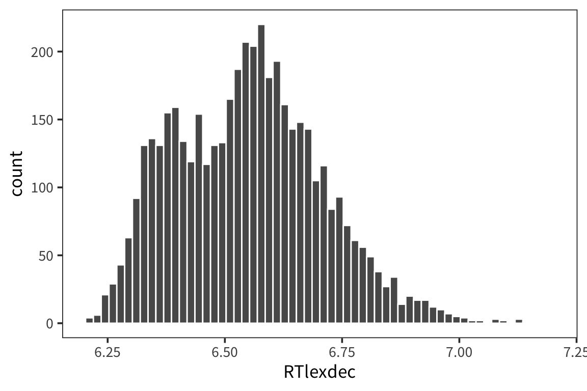
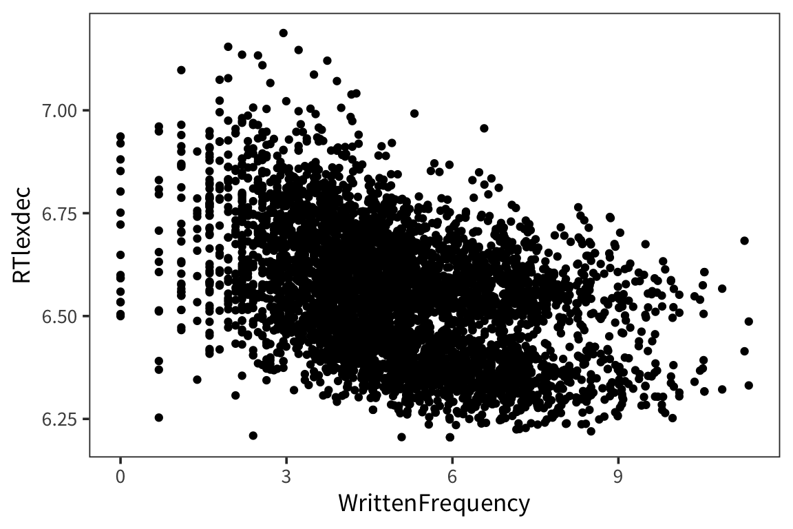
So in the past we’ve looked at this using a correlation which tells us about the strength of the relationship between 2 variables. And you can go beyond that and show whether this relationship is statistically significant, i.e., different from 0 or not using cor.test()
##
##  Pearson's product-moment correlation
##
## data:  rts$RTlexdec and rts$WrittenFrequency
## t = -32.627, df = 4566, p-value < 2.2e-16
## alternative hypothesis: true correlation is not equal to 0
## 95 percent confidence interval:
##  -0.4580397 -0.4109971
## sample estimates:
##       cor
## -0.434815
So this looks similar to the output we got from the t-test because what it’s doing is taking the Pearson’s coefficient, r = -0.43, and finding a corresponding t-statistic (specific formula: \(\frac{r\sqrt{n−2}}{\sqrt{1−r^2}}\)), t = -32.63, based on a t-distribution with df = N-2. For this particular t-statistic, the probability that of it occurring given an r = 0 is very very small. So we can conclude that we have a significant correlation.
Note that, in general, a bigger r value is likely to be significant, but you can have a big r value that’s not significant, if you have a very small sample size. You can also have very tiny r values that are significant if you have a big enough sample size.
This is very useful but it’s telling us about how the 2 variables relate to each other without making any hypotheses about the direction of that relationship. Often in experiments we have more specific questions because we have manipulated some variable and we’re looking at how this affects another variable, or we hypothesize that one variable is driving a change in another variable. Correlation says nothing about that. This is where linear regression comes in. For two continuous variables, linear regression and correlation are almost the same but you’ll see that regression is actually much more general because you can use it with categorical predictors, multiple predictors, etc…
We’ve actually been using regression already when we use geom_smooth() to draw a line to fit the data…
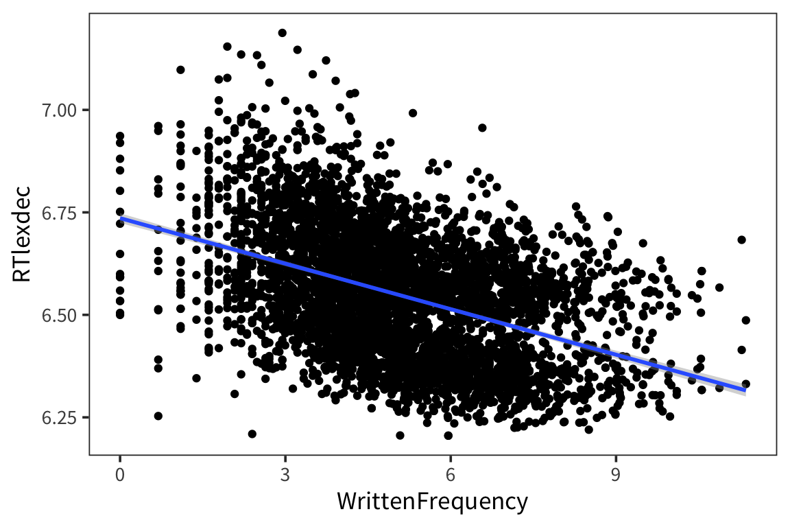
If you remember from high school math class, the formula for a line is \(y = ax + b\). To do linear regression, we’ll use just this:
\[ y_i = \beta_0 + \beta_1 \cdot x_i + \epsilon \]
The \(\beta_0\) is the point at which it intersects with \(x = 0\): the intercept.
The \(\beta_1\) is the change in \(y\) that corresponds to a unit change in \(x\): the slope.
The line that is being drawn by geom_smooth() has an intercept and slope parameter but it also has another key component: error.
##
## Call:
## lm(formula = RTlexdec ~ WrittenFrequency, data = rts)
##
## Residuals:
##      Min       1Q   Median       3Q      Max
## -0.45708 -0.11657 -0.00109  0.10403  0.56085
##
## Coefficients:
##                   Estimate Std. Error t value Pr(>|t|)
## (Intercept)       6.735931   0.006067 1110.19   <2e-16 ***
## WrittenFrequency -0.037010   0.001134  -32.63   <2e-16 ***
## ---
## Signif. codes:  0 '***' 0.001 '**' 0.01 '*' 0.05 '.' 0.1 ' ' 1
##
## Residual standard error: 0.1413 on 4566 degrees of freedom
## Multiple R-squared:  0.1891, Adjusted R-squared:  0.1889
## F-statistic:  1065 on 1 and 4566 DF,  p-value: < 2.2e-16
There’s a lot of information here so let’s focus first on the coefficients.
## # A tibble: 2 x 7
##   term            estimate std.error statistic   p.value conf.low conf.high
##   <chr>              <dbl>     <dbl>     <dbl>     <dbl>    <dbl>     <dbl>
## 1 (Intercept)       6.74     0.00607    1110.  0.          6.72      6.75
## 2 WrittenFrequen…  -0.0370   0.00113     -32.6 4.46e-210  -0.0392   -0.0348
First, let’s look at the estimate: the values here are our intercept and slope defining the best fit line.
Those estimates are being compared to a t-distribution in the same way that we’ve done for previous tests and you obtain a p-value. So here this suggests that:
- The intercept value is significantly different from 0, so words with 0 WrittenFrequency have a predicted RTlexdec value of 6.74 seconds.
- The slope is significantly different from 0, so for every unit increase in WrittenFrequency, you expect a unit decrease of 0.04 units of RTlexdec.
So our linear model is:
\[ \text{RTlexdec} = 6.74 - 0.04 \cdot \text{WrittenFrequency} + \mathcal{N}(0, \sigma)\]
In other words for every value of Written Frequency we can find the value of RTlexdec by taking the Written Frequency, multiplying by -0.04 and subtracting that from 6.74, then drawing from a normal distribution centered on that point. Why the normal distribution? That’s the error…
## # A tibble: 6 x 9
##   RTlexdec WrittenFrequency .fitted .se.fit  .resid    .hat .sigma .cooksd
##      <dbl>            <dbl>   <dbl>   <dbl>   <dbl>   <dbl>  <dbl>   <dbl>
## 1     6.54             3.91    6.59 0.00244 -0.0474 2.98e-4  0.141 1.68e-5
## 2     6.40             4.52    6.57 0.00217 -0.171  2.35e-4  0.141 1.72e-4
## 3     6.30             6.51    6.50 0.00268 -0.190  3.61e-4  0.141 3.27e-4
## 4     6.42             5.02    6.55 0.00209 -0.126  2.19e-4  0.141 8.71e-5
## 5     6.45             4.89    6.55 0.00210 -0.104  2.20e-4  0.141 6.00e-5
## 6     6.53             4.77    6.56 0.00211 -0.0274 2.23e-4  0.141 4.19e-6
## # … with 1 more variable: .std.resid <dbl>ggplot(freq_aug, aes(x = WrittenFrequency, y = RTlexdec)) +
geom_point() +
geom_point(aes(y = .fitted), color = "blue")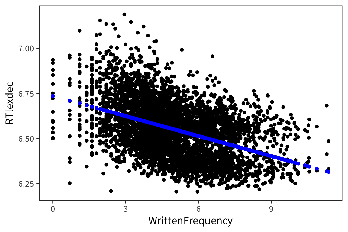
So clearly the real values don’t fall exactly on the line like the predicted values. The line is not a perfect fit and it couldn’t be – there is no line that would fit every single one of those datapoints. The distances between the real datapoints and this line is what’s called error.
errors <- freq_aug$RTlexdec - freq_aug$.fitted
residuals <- freq_aug$.resid
all.equal(errors, residuals)
## [1] TRUE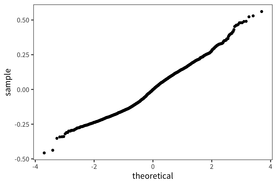
ggplot(freq_aug, aes(x = WrittenFrequency, y = .resid)) +
  geom_point() +
  geom_hline(yintercept = 0, color = "blue")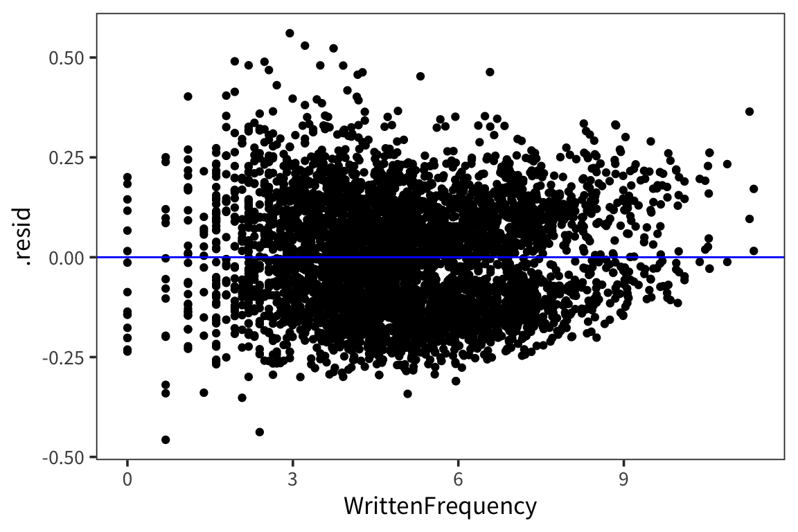
The residuals are normally distributed which is good – this is the mark of an appropriately applied linear regression model. We’re also not seeing any huge differences in the residuals for different values of x (homoscedasticity).
The residuals are the part of the data that we have failed to explain with our model. So we want them to be minimized. In fact, minimizing those residuals is pretty much how the best fit line is picked. (I don’t think we need to get into all the detail about this but sum of the squared distances between each point and the line is what is being minimized: https://seeing-theory.brown.edu/regression-analysis/index.html#section1)
https://tellmi.psy.lmu.de/felix/lmfit/
The deviation in residuals appears in the summary as “residual standard error”.
## [1] 0.1413085##
## Call:
## lm(formula = RTlexdec ~ WrittenFrequency, data = rts)
##
## Residuals:
## Min 1Q Median 3Q Max
## -0.45708 -0.11657 -0.00109 0.10403 0.56085
##
## Coefficients:
## Estimate Std. Error t value Pr(>|t|)
## (Intercept) 6.735931 0.006067 1110.19 <2e-16 ***
## WrittenFrequency -0.037010 0.001134 -32.63 <2e-16 ***
## ---
## Signif. codes: 0 '***' 0.001 '**' 0.01 '*' 0.05 '.' 0.1 ' ' 1
##
## Residual standard error: 0.1413 on 4566 degrees of freedom
## Multiple R-squared: 0.1891, Adjusted R-squared: 0.1889
## F-statistic: 1065 on 1 and 4566 DF, p-value: < 2.2e-16So once you’ve found this optimal line and you have those predicted/fitted values, you can assess whether this line is actually explaining a lot of the variation in the data or not. This is the same as asking whether variation in \(x\) explains variation in \(y\) well or not. You can do this by seeing how close the fitted values are to the actual \(y\) values.
## [1] 0.1890641It is often interpreted as the proportion of data which your model explains. So frequency here explains 18.9% of the observed variation in RTs. The F-test at the very bottom is saying that \(r^2\) is significantly different from 0, i.e. the model is explaining a non-zero portion of the variance.
freq_lm_null <- lm(RTlexdec ~ 1, data = rts)
rss_null <- sum(residuals(freq_lm_null) ^ 2)
rss <- sum(residuals(freq_lm) ^ 2)

n <- nrow(rts)
p_null <- 1
p <- 2
f_value <- ((rss_null - rss) / (p - p_null)) / (rss / (n - p - 1))
pf(f_value, p - p_null, n - p, lower.tail = FALSE)
## [1] 4.906935e-210This is not a particularly useful value for our purposes, it’ll usually be significant…
Try it yourself…
Model the relationship between RTlexdec and WrittenSpokenFrequencyRatio, plot it (using
geom_abline()), and summarize in words what the result means.Now look at the relationship between RTnaming and WrittenSpokenFrequencyRatio. Do you notice anything different?
ratio_lm <- lm(RTlexdec ~ WrittenSpokenFrequencyRatio, data = rts)
ratio_tidy <- tidy(ratio_lm)
ratio_aug <- augment(ratio_lm)
summary(ratio_lm)
## ## Call: ## lm(formula = RTlexdec ~ WrittenSpokenFrequencyRatio, data = rts) ## ## Residuals: ## Min 1Q Median 3Q Max ## -0.34617 -0.12579 0.00009 0.10287 0.63242 ## ## Coefficients: ## Estimate Std. Error t value Pr(>|t|) ## (Intercept) 6.546463 0.002684 2438.935 < 2e-16 *** ## WrittenSpokenFrequencyRatio 0.005364 0.001992 2.693 0.00711 ** ## --- ## Signif. codes: 0 '***' 0.001 '**' 0.01 '*' 0.05 '.' 0.1 ' ' 1 ## ## Residual standard error: 0.1568 on 4566 degrees of freedom ## Multiple R-squared: 0.001586, Adjusted R-squared: 0.001367 ## F-statistic: 7.251 on 1 and 4566 DF, p-value: 0.00711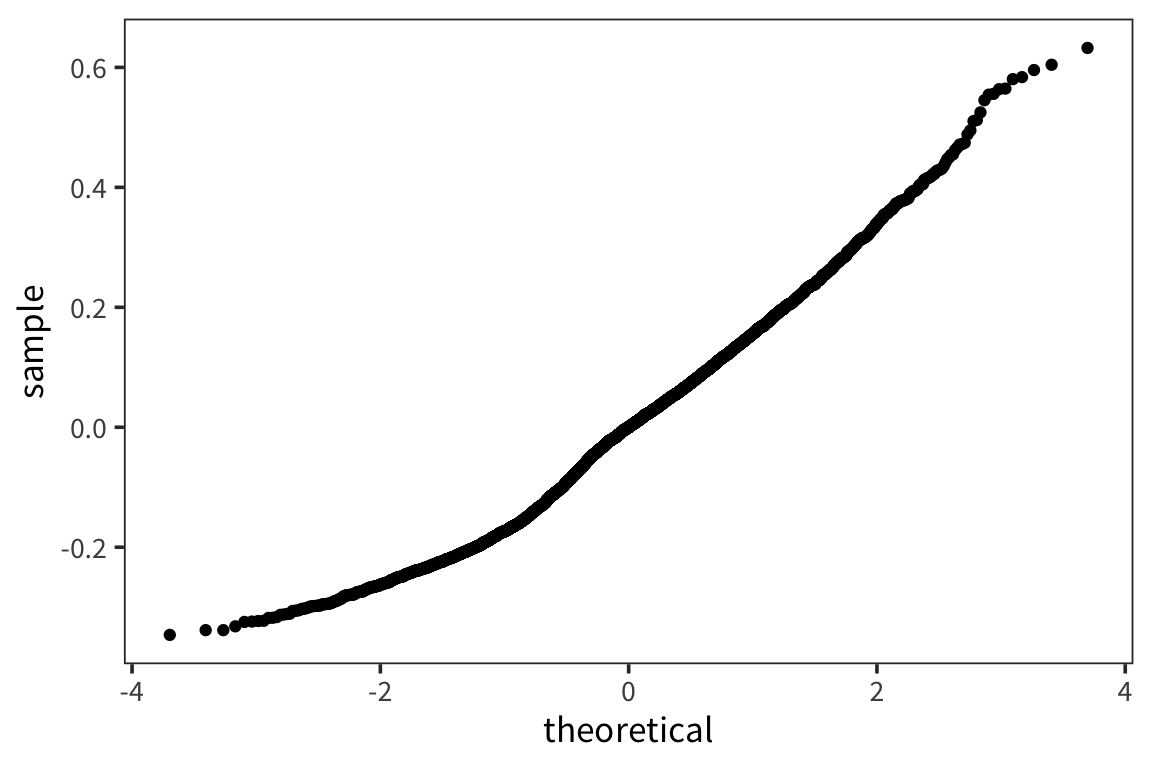
ggplot(ratio_aug, aes(x = WrittenSpokenFrequencyRatio, y = RTlexdec)) +
  geom_point(color = "grey") +
  geom_abline(intercept = filter(ratio_tidy, term == "(Intercept)")$estimate,
              slope = filter(ratio_tidy, term == "WrittenSpokenFrequencyRatio")$estimate,
              colour = "blue") +
  geom_smooth(method = lm, colour = "red")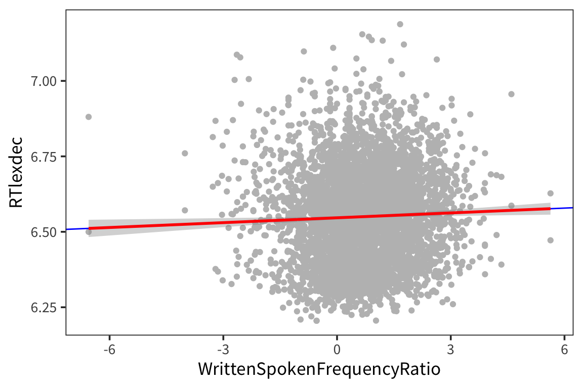
naming_lm <- lm(RTnaming ~ WrittenSpokenFrequencyRatio, data = rts)
naming_aug <- augment(naming_lm)
summary(naming_lm)
## ## Call: ## lm(formula = RTnaming ~ WrittenSpokenFrequencyRatio, data = rts) ## ## Residuals: ## Min 1Q Median 3Q Max ## -0.29190 -0.17437 0.01484 0.16785 0.37799 ## ## Coefficients: ## Estimate Std. Error t value Pr(>|t|) ## (Intercept) 6.318707 0.003053 2069.426 <2e-16 *** ## WrittenSpokenFrequencyRatio 0.005606 0.002266 2.474 0.0134 * ## --- ## Signif. codes: 0 '***' 0.001 '**' 0.01 '*' 0.05 '.' 0.1 ' ' 1 ## ## Residual standard error: 0.1784 on 4566 degrees of freedom ## Multiple R-squared: 0.001339, Adjusted R-squared: 0.00112 ## F-statistic: 6.122 on 1 and 4566 DF, p-value: 0.01339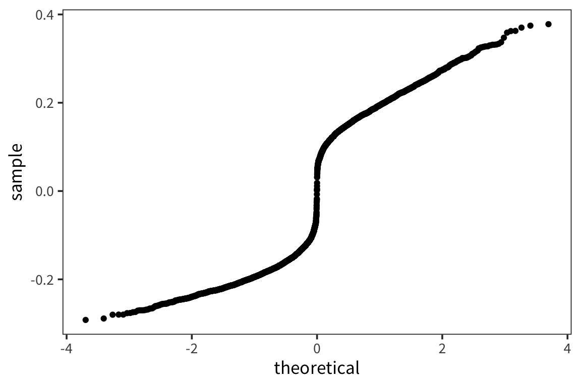
ggplot(naming_aug, aes(x = WrittenSpokenFrequencyRatio, y = RTnaming)) +
  geom_point(color = "grey") +
  geom_smooth(method = lm, colour = "red")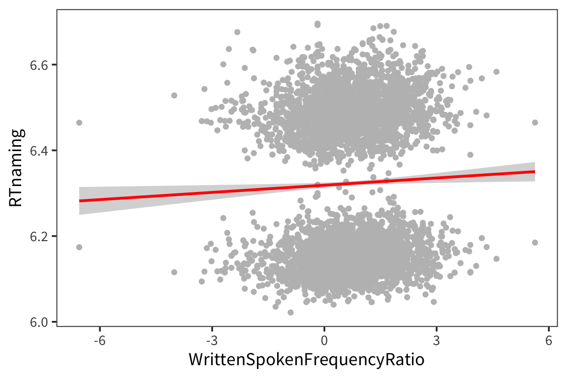
Here we looked at one continuous predictor and a continuous outcome, but regression is much more general than that. So we’re going to look at a few other ways you can use it.
Categorical predictors
Let’s say we want to look at the effect of being in one of 2 (or more) groups on some response. For example, we can look at RTlexdec as a function of the age of the subjects.
rts_age <- rts %>%
  group_by(AgeSubject) %>%
  summarise(mean_rt = mean(RTlexdec))

ggplot(rts, aes(x = AgeSubject, y = RTlexdec)) +
  geom_violin() +
  geom_point(aes(y = mean_rt), data = rts_age, size = 3)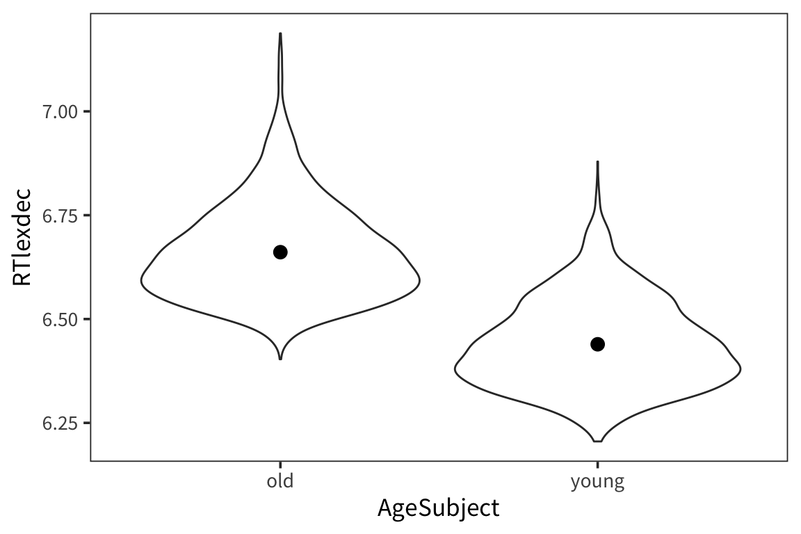
##
## Call:
## lm(formula = RTlexdec ~ AgeSubject, data = rts)
##
## Residuals:
##      Min       1Q   Median       3Q      Max
## -0.25776 -0.08339 -0.01669  0.06921  0.52685
##
## Coefficients:
##                  Estimate Std. Error t value Pr(>|t|)
## (Intercept)      6.660958   0.002324 2866.44   <2e-16 ***
## AgeSubjectyoung -0.221721   0.003286  -67.47   <2e-16 ***
## ---
## Signif. codes:  0 '***' 0.001 '**' 0.01 '*' 0.05 '.' 0.1 ' ' 1
##
## Residual standard error: 0.1111 on 4566 degrees of freedom
## Multiple R-squared:  0.4992, Adjusted R-squared:  0.4991
## F-statistic:  4552 on 1 and 4566 DF,  p-value: < 2.2e-16
This looks very familiar but if we go back to our line equation, something is weird.
\[ \text{RTlexdec} = 6.66 - 0.22 \cdot \text{AgeSubject} + \mathcal{N}(0, \sigma)\]
How do you multiply AgeSubject, which is either the word “old” or the word “young”, by a number?
Turns out R automatically turns “old” and “young” into 0s and 1s.
But you can’t see this until you convert it into a factor…
## [1] "old" "young"## young
## old 0
## young 1It is treating “old” as 0 and “young” as 1 and it just did this alphabetically by default. This is called dummy coding.
So how do we read the output of our model?
## # A tibble: 2 x 5
##   term            estimate std.error statistic p.value
##   <chr>              <dbl>     <dbl>     <dbl>   <dbl>
## 1 (Intercept)        6.66    0.00232    2866.        0
## 2 AgeSubjectyoung   -0.222   0.00329     -67.5       0
The Intercept corresponds to the y value when the dummy coded variable is 0, so the intercept is the average RTlexdec for old people.
## # A tibble: 2 x 2
##   AgeSubject mean_rt
##   <chr>        <dbl>
## 1 old           6.66
## 2 young         6.44
AgeSubjectyoung is the coefficient that you add when the dummy coded variable is 1. So the average RTlexdec for young people is -0.22 less than the intercept.
intercept <- filter(age_tidy, term == "(Intercept)")$estimate
slope <- filter(age_tidy, term == "AgeSubjectyoung")$estimate

old_code <- contrasts(rts$AgeSubject)["old", ]
young_code <- contrasts(rts$AgeSubject)["young", ]

# old RTs
intercept + slope * old_code
## [1] 6.660958## [1] 6.439237Dummy coding vs. effects coding
Another option is to do what is sometimes called effects coding. Instead of the default dummy coding that R assigns, you can change the contrast codes to something that is more meaningful to you.
##   2
## 1 0
## 2 1## [,1]
## 1 1
## 2 -1## [,1]
## old 1
## young -1So now the indicator variable for AgeSubject is 1 for “old” and -1 for “young”.
How will this affect our regression?
##
## Call:
## lm(formula = RTlexdec ~ AgeSubject, data = rts)
##
## Residuals:
## Min 1Q Median 3Q Max
## -0.25776 -0.08339 -0.01669 0.06921 0.52685
##
## Coefficients:
## Estimate Std. Error t value Pr(>|t|)
## (Intercept) 6.550097 0.001643 3986.29 <2e-16 ***
## AgeSubject1 0.110861 0.001643 67.47 <2e-16 ***
## ---
## Signif. codes: 0 '***' 0.001 '**' 0.01 '*' 0.05 '.' 0.1 ' ' 1
##
## Residual standard error: 0.1111 on 4566 degrees of freedom
## Multiple R-squared: 0.4992, Adjusted R-squared: 0.4991
## F-statistic: 4552 on 1 and 4566 DF, p-value: < 2.2e-16As you can see the slope is exactly the same – it’s still telling us that going from old to young (1 unit change) means subtracting -0.22. But note that the intercept is different. Now the intercept is the grand mean (across all conditions).
What if we rewrite our formulas from earlier:
intercept <- filter(age_tidy_2, term == "(Intercept)")$estimate
slope <- filter(age_tidy_2, term == "AgeSubject1")$estimate
old_code <- contrasts(rts$AgeSubject)["old", ]
young_code <- contrasts(rts$AgeSubject)["young", ]
# old RTs
intercept + slope * old_code## old
## 6.660958## young
## 6.439237We still get the exact same thing. In this case, where there’s just one predictor, the choice of contrast coding is entirely a matter of preference. In multiple regression, where you have many predictors potentially interacting, the right contrast coding can make a huge difference for how you interpret what’s going on in your model, specifically whether you are looking at simple effects or main effects.
There are many different coding schemes for testing various hypotheses, more examples: https://stats.idre.ucla.edu/r/library/r-%20library-contrast-coding-systems-for-%20categorical-variables/
Multiple predictors
Now remember when we looked at the histogram, we saw that the RTs aren’t quite normally distributed in that there were two peaks. And now we know that young and old subjects respond differently. Let’s incorporate that into our regression. First some plots:
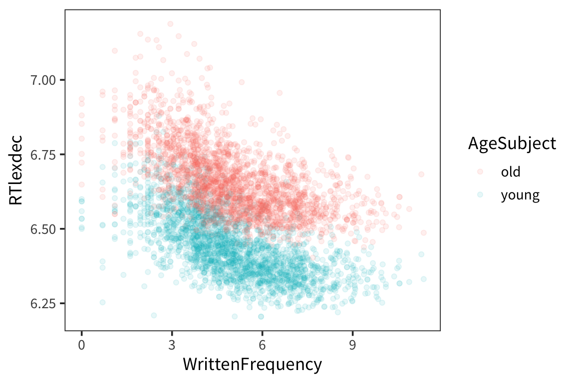
We see there are two groups here. Remember we are evaluating our model by seeing how close the fitted values are to the real data points, and we can get a lot closer if we have different lines for different age.
ggplot(rts, aes(x = WrittenFrequency, y = RTlexdec, colour = AgeSubject)) +
geom_point(alpha = 0.1) +
geom_smooth(method = "lm")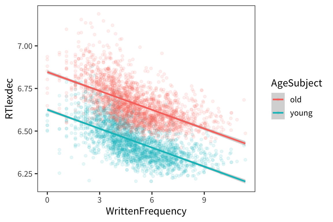
Let’s make a regression model with multiple predictors:
\[ \text{RTlexdec} = \beta_0 + \beta_1 \cdot \text{WrittenFrequency} + \beta_2 \cdot \text{AgeSubject} + \mathcal{N}(0, \sigma)\]
##
## Call:
## lm(formula = RTlexdec ~ WrittenFrequency + AgeSubject, data = rts)
##
## Residuals:
## Min 1Q Median 3Q Max
## -0.34622 -0.06029 -0.00722 0.05178 0.44999
##
## Coefficients:
## Estimate Std. Error t value Pr(>|t|)
## (Intercept) 6.7359314 0.0037621 1790.48 <2e-16 ***
## WrittenFrequency -0.0370103 0.0007033 -52.62 <2e-16 ***
## AgeSubject1 0.1108607 0.0012965 85.51 <2e-16 ***
## ---
## Signif. codes: 0 '***' 0.001 '**' 0.01 '*' 0.05 '.' 0.1 ' ' 1
##
## Residual standard error: 0.08763 on 4565 degrees of freedom
## Multiple R-squared: 0.6883, Adjusted R-squared: 0.6882
## F-statistic: 5040 on 2 and 4565 DF, p-value: < 2.2e-16So now we have the intercept, which is the mean of RTlexdec for WrittenFrequency = 0 and across all AgeSubject (because of the effects coding).
The effect of WrittenFrequency (-0.037) is pretty much the same as before which makes sense because we were seeing the same effect of Written Frequency in both groups
The effect of age is very similar in size to when it was the sole predictor in the model as well.
Note that both the effects of Age and Frequency are significant suggesting that they are both independently contributing to explaining the variance in RTlexdec.
Critically, the \(r^2\) is much larger, suggesting we’re doing a much better job of fitting the data than with the previous model. All that extra variance is now being explained by adding the Age factor.
Linear model: \[ y_i = \beta_0 + \beta_1 \cdot x_{i1} + \beta_2 \cdot x_{i2} + \ldots + \beta_k \cdot x_{ik} + \epsilon_i \]
Interactions
So far in all these models we’ve entered multiple predictors that can exert their effects somewhat independently, but what if things are more complicated and they actually interact?
For example, what if for young people, more frequent words had faster RTs, but for old people, it was the opposite?
This isn’t the case in our data but let’s make it the case for illusrtration purposes.
rts_mod <- rts %>%
mutate(RTfake = if_else(AgeSubject == "old", 14 - RTlexdec, RTlexdec))
ggplot(rts_mod, aes(x = WrittenFrequency, y = RTfake, colour = AgeSubject)) +
geom_point(alpha = 0.2) +
geom_smooth(method = "lm")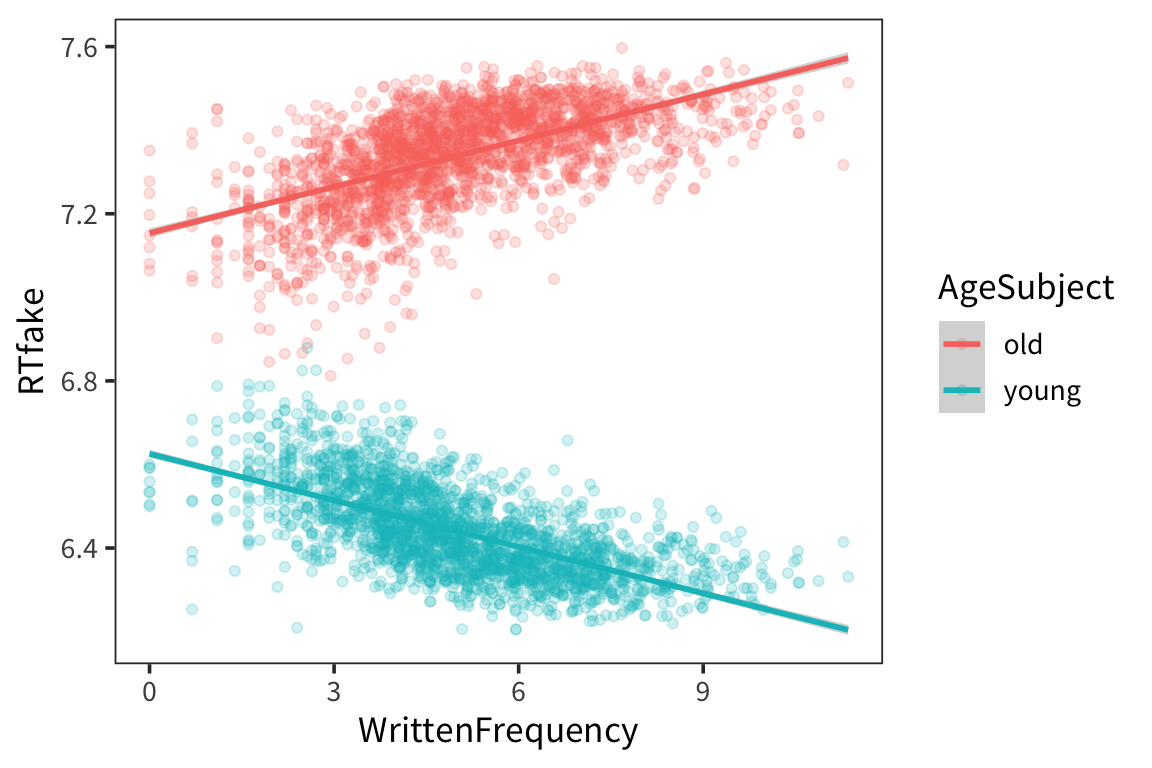
If we analyze this the way we did before:
##
## Call:
## lm(formula = RTfake ~ WrittenFrequency + AgeSubject, data = rts_mod)
##
## Residuals:
## Min 1Q Median 3Q Max
## -0.52705 -0.07503 0.00187 0.08003 0.43968
##
## Coefficients:
## Estimate Std. Error t value Pr(>|t|)
## (Intercept) 6.890e+00 4.768e-03 1444.846 <2e-16 ***
## WrittenFrequency -9.664e-05 8.915e-04 -0.108 0.914
## AgeSubject1 4.499e-01 1.643e-03 273.774 <2e-16 ***
## ---
## Signif. codes: 0 '***' 0.001 '**' 0.01 '*' 0.05 '.' 0.1 ' ' 1
##
## Residual standard error: 0.1111 on 4565 degrees of freedom
## Multiple R-squared: 0.9426, Adjusted R-squared: 0.9426
## F-statistic: 3.748e+04 on 2 and 4565 DF, p-value: < 2.2e-16We see no effect of WrittenFrequency which is clearly wrong it’s just that it’s getting obscured by the fact that it’s in opposite directions for each age group.
So how can we include the fact that the effect of WrittenFrequency varies depending on which value of AgeSubject:
\[ \text{RTlexdec} = \beta_0 + \beta_1 \cdot \text{WrittenFrequency} + \beta_2 \cdot \text{AgeSubject} + \beta_3 \cdot \text{WrittenFrequency} \cdot \text{AgeSubject} + \mathcal{N}(0, \sigma) \]
This multiplicative term is called an interaction.
##
## Call:
## lm(formula = RTfake ~ WrittenFrequency * AgeSubject, data = rts_mod)
##
## Residuals:
## Min 1Q Median 3Q Max
## -0.45019 -0.05438 0.00128 0.05936 0.34877
##
## Coefficients:
## Estimate Std. Error t value Pr(>|t|)
## (Intercept) 6.890e+00 3.762e-03 1831.138 <2e-16 ***
## WrittenFrequency -9.664e-05 7.034e-04 -0.137 0.891
## AgeSubject1 2.641e-01 3.762e-03 70.185 <2e-16 ***
## WrittenFrequency:AgeSubject1 3.701e-02 7.034e-04 52.615 <2e-16 ***
## ---
## Signif. codes: 0 '***' 0.001 '**' 0.01 '*' 0.05 '.' 0.1 ' ' 1
##
## Residual standard error: 0.08764 on 4564 degrees of freedom
## Multiple R-squared: 0.9643, Adjusted R-squared: 0.9642
## F-statistic: 4.105e+04 on 3 and 4564 DF, p-value: < 2.2e-16So what this is saying is that there is no main effect of WrittenFrequency but there is a main effect of AgeSubject (younger people are faster) and the interaction between AgeSubject and WrittenFrequency is significant. The significance of the interaction term here means that the slope on top is significantly different from the slope on the bottom.
A note about the coding:
So if we go back to the dummy coding and rerun the model…
##       [,1]
## old      1
## young -1## [,1]
## old 0
## young 1##
## Call:
## lm(formula = RTfake ~ WrittenFrequency * AgeSubject, data = rts_mod)
##
## Residuals:
## Min 1Q Median 3Q Max
## -0.45019 -0.05438 0.00128 0.05936 0.34877
##
## Coefficients:
## Estimate Std. Error t value Pr(>|t|)
## (Intercept) 7.1536932 0.0053210 1344.44 <2e-16 ***
## WrittenFrequency 0.0369136 0.0009948 37.11 <2e-16 ***
## AgeSubject1 -0.5281373 0.0075250 -70.19 <2e-16 ***
## WrittenFrequency:AgeSubject1 -0.0740206 0.0014068 -52.62 <2e-16 ***
## ---
## Signif. codes: 0 '***' 0.001 '**' 0.01 '*' 0.05 '.' 0.1 ' ' 1
##
## Residual standard error: 0.08764 on 4564 degrees of freedom
## Multiple R-squared: 0.9643, Adjusted R-squared: 0.9642
## F-statistic: 4.105e+04 on 3 and 4564 DF, p-value: < 2.2e-16What you’re getting here is a significant effect of WrittenFrequency because it’s looking only at the effect of WrittenFrequency for AgeSubject = 0 (i.e. old) –> this is a simple effect.
When we had the effects coding, WrittenFrequency was being measured across both levels Age so there was no main effect of WrittenFrequency. Everything else about the model looks about the same, but if you don’t know what coding scheme you used, you can’t interpret the effects. People misunderstand this ALL THE TIME.
Model comparison
Let’s consider the case of two real-valued predictors. Let’s look at the variable FrequencyInitialDiphoneWord which is the frequency of the first two phonemes in a word. Let’s say you think that frequency is what determines RT, but then someone else thinks initial diphone frequency is what matters. Let’s evaluate that claim.
##
## Call:
## lm(formula = RTlexdec ~ FrequencyInitialDiphoneWord, data = rts)
##
## Residuals:
##      Min       1Q   Median       3Q      Max
## -0.35822 -0.12515 -0.00013  0.10336  0.63291
##
## Coefficients:
##                              Estimate Std. Error t value Pr(>|t|)
## (Intercept)                  6.593868   0.015354 429.470  < 2e-16 ***
## FrequencyInitialDiphoneWord -0.004225   0.001465  -2.884  0.00395 **
## ---
## Signif. codes:  0 '***' 0.001 '**' 0.01 '*' 0.05 '.' 0.1 ' ' 1
##
## Residual standard error: 0.1568 on 4566 degrees of freedom
## Multiple R-squared:  0.001818,   Adjusted R-squared:  0.0016
## F-statistic: 8.317 on 1 and 4566 DF,  p-value: 0.003945
We see that initial diphone frequency does predict RT. But what if we include both predictors, initial diphone frequency and written frequency?
freq_diphone_lm <- lm(RTlexdec ~ WrittenFrequency + FrequencyInitialDiphoneWord, data = rts)
summary(freq_diphone_lm)
##
## Call:
## lm(formula = RTlexdec ~ WrittenFrequency + FrequencyInitialDiphoneWord,
## data = rts)
##
## Residuals:
## Min 1Q Median 3Q Max
## -0.45641 -0.11701 -0.00141 0.10359 0.56127
##
## Coefficients:
## Estimate Std. Error t value Pr(>|t|)
## (Intercept) 6.7315271 0.0144749 465.047 <2e-16 ***
## WrittenFrequency -0.0370517 0.0011412 -32.468 <2e-16 ***
## FrequencyInitialDiphoneWord 0.0004452 0.0013285 0.335 0.738
## ---
## Signif. codes: 0 '***' 0.001 '**' 0.01 '*' 0.05 '.' 0.1 ' ' 1
##
## Residual standard error: 0.1413 on 4565 degrees of freedom
## Multiple R-squared: 0.1891, Adjusted R-squared: 0.1887
## F-statistic: 532.2 on 2 and 4565 DF, p-value: < 2.2e-16What does this mean? When you have two linear predictors, and try to find coefficients that minimize the squared distance to datapoints, then to get the best coefficients, you try to estimate what is the effect of variable a while holding variable b constant, and what is the effect of variable b while holding variable a constant. So this means, approximately, whole holding WrittenFrequency constant, initial diphone has this effect on RTs, which is not significant. And controlling for initial diphone frequency – holding it constant – we estimate this is the slope for WrittenFrequency, basically the same slope as we found before.
This offers some evidence that WrittenFrequency is what matters here, not initial diphone frequency. You often find yourself in the position where there are multiple things that predict patterns in your dataset, and you want to figure out which one is more basic, or which one causes the others, or which one is real and which one is confounded.
This kind of test offers some evidence about that question, but there are lots and lots of caveats to interpreting this p-value this way. There are better tests to do. The principle thing that makes this hard to interpret is that the controlling is mutual here: this is the effect of written frequency after holding initial diphone frequency constant, and vice versa.
Basically, you can trust this kind of test for two variables that are not highly correlated.
These two variables aren’t highly correlated, so this kind of hypothesis testing makes sense.
## [1] 0.108279Try it yourself…
Using the
rts.csvdataset, pick an dependent variable (RTlexdecorRTnaming), a continuous predictor (e.g.WrittenFrequency), and a categorical predictor (e.g.AgeSubject) (see?languageR::englishfor info on the variables).Fit a linear model predicting your dependent variable from both of your predictors and their interaction.
Using the estimated parameters from your model, recreate the expected values of your dependent variable for a given value of your continuous predictor (e.g.
WrittenFrequency=6) and each possible value of your categorical predictor (e.g.oldandyoungforAgeSubject).Double check your values using
augment().contrasts(rts$AgeSubject) <- contr.sum freq_age_lm <- lm(RTlexdec ~ WrittenFrequency * AgeSubject, data = rts) freq_age_results <- tidy(freq_age_lm) intercept <- filter(freq_age_results, term == "(Intercept)")$estimate slope_age <- filter(freq_age_results, term == "AgeSubject1")$estimate slope_freq <- filter(freq_age_results, term == "WrittenFrequency")$estimate int_freq_age <- filter(freq_age_results, term == "WrittenFrequency:AgeSubject1")$estimate old_code <- contrasts(rts$AgeSubject)["old", ] young_code <- contrasts(rts$AgeSubject)["young", ] freq <- 6 # old RTs intercept + freq * slope_freq + old_code * slope_age + freq * old_code * int_freq_age## old ## 6.624825# young RTs intercept + freq * slope_freq + young_code * slope_age + freq * young_code * int_freq_age## young ## 6.402914test_data <- tibble(WrittenFrequency = c(6, 6), AgeSubject = c("old", "young")) augment(freq_age_lm, newdata = test_data)## # A tibble: 2 x 4 ## WrittenFrequency AgeSubject .fitted .se.fit ## <dbl> <chr> <dbl> <dbl> ## 1 6 old 6.62 0.00208 ## 2 6 young 6.40 0.00208